Sunday, June 14, 2009

Spring #9 (So Many Greens)


18" x 24"
oil on panel

As I paint dots I'm looking at other dots in paintings as well as references to circles in all the arts.  Aboriginal paintings from Australia are typically constructed of dots.  Some are done on bark. The bark connotes such a strong connection with nature that it is the substance of the image. Rather than depicting their surroundings in a literal way, the subjects are abstracted but often show nature via animals, fish, people, etc.  I found a source for their symbols.  The Kluge-Ruhe Aboriginal Art Collection at the University of Virginia has the largest collection of indigenous Australian art outside of Australia. 

Spring #9 (So Many Greens) draws heavily on visual perception done from direct observation, thus differing from Aboriginal art.  The commonalities are rhythm, nature, immersion in a particular place and way of life, and the abstract element of the dot as a vehicle for these things.  The greens can be spliced and spliced towards yellow, blue, violet, light and dark, etc.  Even the most representational painters have to simplify.  My family often looks out on such scenes from our dining room window as we eat meals together.  My son says that the greens are actually overwhelming from the window view but not when one is outside.  It is funny but it is like being overstimulated by flashing lights in a big city.  The painting is perhaps a bit less hyperactive due to its abstraction/simplification, my processing.  Some dots are more subtle than others like the ones in the sky.  I'm looking forward to looking at it through the winter.

Sunday, June 07, 2009

Spring 5 (Cabbage Field), Spring 7 (First Green), & Spring 8 (Through the Shower Door)


8"x 10"
6" x 12"
oil on panel


Maybe it is spring moving onto summer where you are, but I'm freezing my butt off with my fellow Rochesterians. It's been in the 50's and 60's lately which would have been thrilling in February but is now getting old. I stumbled upon the poem Early Spring by Rainer Maria Rilke (www.poemhunter.com is a really great site for poetry). It is about the moment when the harshness of winter and its grey are replaced by "country lanes are showing these unexpected subtle risings that find expression in the empty trees". This is the moment and subject I'm painting.
Rilke (German) falls into the category of Romanticism (1800-mid c.) which emphasized imagination and emotion as well as originality of the artist, a reaction to the reason and order of the Enlightenment after the French Revolution. Even though structure can be found in nature it was still seen as an alternative to order in its wildness (great article by Kathryn Calley Galitz, Department of 19th c. Modern and Contemporary Art at the Met). Art wasn't simply a mirror of nature anymore but also related to one's inner self. I haven't read anything reaching the conclusion that this wildness expressed the inner self, but would venture that it would after the perhaps restricting Enlightenment. Examples of Romanticism in America are the Hudson River School. Other European artists include Turner and Gericault and the poet Byron.
How did we get here after complaining that my butt is cold?! I think my painting comes out of Romanticism, although it was pejorative to be called "Romantic" in graduate school. I think that kind of romantic was the extreme, saccharine Hallmark. Painting a fluffy kitten might have been grounds for expulsion. I think my work is romantic in a similar way to the music of Andreas Sahar, which has emotion and originality as two of its many strengths. The song Take to the Sky references nature in a charged, uplifting way I can relate to. Perhaps the landscapes I paint are a tinge romanticised, but I prefer to think celebrated. Truth be told, a cabbage field looks beautiful but smells way worse than a farm full of manure.
Spring #8 was inspired by looking through my steamy glass shower door and then at the landscape through the bathroom window. My bathroom walls are turquoise and the lawn outside provided a field of spring green, a favorite of mine. The humidity provided watery distortion, effected the color, and made me think of Florida.

Sunday, May 31, 2009

Spring #6 (Before the Rain)


18" x 24"

oil on panel

Sometimes I dot, sometimes I don't.

I saw this while taking my son to school in the morning. The blue and pink are both sky and the gray is road, but it doesn't have to be interpreted as such. We passed a pink flowering tree on the left, which I think is a dogwood (I don't really know trees) and a dark, purple/red/black maple on the right. There is a duality about them, the light and dark and placement in opposition, like the Yin-Yang. The pink tree is similar to the feeling of cherry trees which are celebrated here in the Washington D.C. National Cherry Blossom Festival and in Japan. In Buddhism, the cherry tree blossoms symbolize the fleeting nature of life. In contemporary Japanese culture, the cherry blossom can even be found in tattoos symbolizing women's beauty and sexuality. A classic image is this one by Hiroshige.

The trees flank center stage to reveal the area of central importance, atmospheric, beyond reach yet there.

Sunday, May 24, 2009

Spring #4 (View of Central Park from the 21st Floor)


oil on canvas
36" x 42"
The artists Sigmar Polke and Roy Lichtenstein used Benday dots in their paintings as employed by printers (Lichtenstein modeled his work specifically after comics). I'm not so interested in the regularity of that method as I like the quirkiness of my hand as well as the option to change scale. The location of the dots is important to the space in the work. Think Cezanne, Giacometti, and Mondrian mapping space. Their playfulness as compared to a mechanized look make them more Polka than Benday and also differ from the seriousness of the aforementioned artists. I also do not want to limit myself to very saturated colors (spaced differently to appear like more of a range) as is often the case with the Benday dots, preferring to mix more, which works better with the larger dots. Mondrian, while not a dot painter, reduced his palette to the primaries. He found the problem of working with red, yellow, blue, as well as black and white very complex, changing the size and placement of rectangles and squares in order to create a vision resulting from this interplay.
In Spring #4 dots expand on a white ground, showing the bursting energy of the city and the green treetops of Central Park.

Sunday, May 17, 2009

Spring 2 (View From the Cobblestone School Playground)

oil on canvas
24" x 20"

I really like this purple house sitting beyond the green.

*****************************************************************************************

The paint gets very thick when I paint over old paintings. It reminds me of the Californian painter Jess as well as passages of heavily layered gouache (opaque watercolor) in the paintings of African-American artist Horace Pippin (1888 - 1946). There isn't a lot of air in Jess' paintings; they seem locked in, constructed of bumpy jigsaw pieces. Many of Pippin's paintings depict the bleak interiors of African-American homes he experienced in his lifetime. He frequently used flat shapes but his space is often airy however stark the scene. What I am talking about is very physical. I am beginning to work on clay reliefs which naturally connect to this idea. They will appear here if I am able to pull it off.

My physical and airy painting, Spring 2 (View from the Cobblestone School Playground), is exuberant. It is the moment when all of Rochester is altered into collective cheer at the sight of green. The grass is green first, which means the leaves are soon to follow. Old buildings that looked dingy under gray skies now sparkle in the sun. It has the excitement of Dippin' Dots (frozen tiny balls of ice cream that look like Styrofoam pellets) at the amusement park. Although totally artifice as the loud circles proclaim, it generates strong feeling. The form of the landscape is changed to mirror emotion.

I think the dots can sometimes be like a kind of collecting, think bottle caps, stamps, buttons. When I was a girl my passion was stickers. For years my allowance went to magical eye-candy that I loved to organize (this zeal for page layout may have served me well in many graphic design scenarios, but has recently intensely resurfaced through an innocent-looking recipe organizer given to me by a friend). I collected until adolescence, at which time I promptly gave them all, numbering in the thousands, to a woman with two daughters younger than me. It was an impractical past-time as a well-meaning aunt expressed, "All it is is a shiny piece of paper," a quote I remember from over twenty-five years ago. Blasphemy! She didn't understand the brain buzz (play Zynga's Scramble if you want a taste), the visual information I could process, finding comparisons and contrasts in shape, color, scale, texture, and sometimes even scent (scratch and sniffs were prizes given by my teachers). It is one kind of intelligence, which I often use to explain why the math section of my brain is the size of a raisin. Some kids were practicing piano, others dance or baseball, while my independent investigations of paper and design were in preparation to create this Dippin' Dots picture for you. Yum.

Sunday, May 10, 2009

Spring 1 and Spring 3 (Favorite Green Space)


oil on panel
12" x 12"


Spring 2 is coming (spring itself is already here)! These two worked best together for a post.

The sky in the painting is more subtle and has lighter areas than in this reproduction. The sky and grass are very high-key in this as in the original, while the woods are in that neutral-budding-just-before-leaves state. Marks are loose and help show the space and growth patterns of the woods. The top green and bottom blue, both very saturated, are visual bookends. The curve of the lower green band is lyrical and comforting, like gentle waves or lying on your sofa. It's a funny painting because it has serenity as well as the snap of a ping-pong ball, blue on one side, green on the other. Spring is like that, lovely yet energetic. The sky and grass were both really that bright, done from sight from my studio window. Without the treatment of the center, they look like David Hockney's palette, hyperactive, not quite naturalistic.


Spring 3 (Favorite Green Space) is a block away from my house. I'm in farmland with corn, sheep, horses, cows, and unfortunately veal calves tied to their little shelters their whole lives, all on the same road. The green hill takes up three-fourths or so of the rectangle and obscures the bottoms of the trees. I look forward to the moment it comes into sight when I'm driving back home; in the bright sun it gives me a rush (some people get that when looking at Matthew McConaughey, not that I don't...). In those last two sentences you get the formal elements of design backing my work, visual perception, emotional resonance, and let's not forget sensuality (paint is very sensual, as nerdy as that may sound). There is my recipe. It's the winging it kind.

Sunday, May 03, 2009

Primary Window (Early Spring)


oil on panel

24" x 18"


I love Matisse's Window at Tangier painted in Morocco in 1912. It is the type of window that opens in, which becomes the side panel of the painting. The painting deals with this rectangle of pink, the pinks and oranges in the view to the red-orange vase with flowers on the sill, and the blues including the large rectangle at the top. Paint is dappled in areas to reflect light. The title is due to its primary color composition of blue, red, and yellow (three central bands). It's what your eye wants to see, after all.

Primary Window (Early Spring) is frontal. Whites and grays frame it from bright on the left to dark on the sill. The colors aren't very exaggerated; it is a day of bright blue sky, bleached grass uncovered from snow, and bare trees more pink than brown. Vertical ripples of the curtains bracket the woods, drawn like the colors shimmer. The lightness of the colors and the paint handling make it airy. Vital are the space between the trees, their rhythm, as does the way the treetops mingle with sky.

Landscape consists of objects: rocks, trees, whatever, the place in the space they inhabit, and that space, coexistence, interdependence. I like seeing the connection between these named things and their context (colors isolated and interacting is the same idea). It is difficult to see oneself that way, maybe impossible. We try to see ourselves, our connections to each other and the world through photographs, Facebook, Google Earth. I think they are all good tools for trying to grasp this thing that can't be held. Sticking one's hand in dirt is another way, a relief to feel something real. Reverend Scott Taylor of the First Unitarian Universalist Church in Rochester describes the mystery between people almost as a force, as God if you are a believer in God. He seems to stick more to just the idea of mystery and something that's there but you don't know what it is; he has a hand gesture to describe it. I think this mystery or energy between people is the same as what I see in the landscape. Lots of people "see it", feel it; I'm just trying to paint it. For that matter, lots of people have tried and continue to try to make art about it. It is what makes painting so difficult, almost daunting at times, but draws one back over and over to engage in the impossible obsession of trying to nail it. Plenty of painters wouldn't have this agenda and would say that they are just trying to make a good picture, Pop Artists, for example. Western Modern Art from the beginning of the twentieth century through today reflects the ideas of Western Society, including religion. Artists ranged in their beliefs from a singular, all-powerful Creator as defined by Christianity and Judaism, to Atheism and everything in between. Painting is a spiritual/religious practice for me. As an undergrad I read Kandinsky's Concerning the Spiritual in Art which also delved into his ideas about color theory. I don't think there are many great books written since on the subject (let me know if you know of any!) because it is such an intangible area. I'll just keep making tangible things about the intangible and shut up like most painters do.

Sunday, April 26, 2009

Yellow Walls, Landscape


24" x 36"

oil on panel

A concern of painters and a downfall of students is the problem of white. Too much white mixed in colors can bleach out a picture, leaving the appearance pasty. It is difficult to keep the tints (white added to a color) clear and purposeful, not faded and dull. White can bring light into a picture or it can drain it. I made plenty of pasty student paintings. Then students often overcompensate by making paintings almost completely out of bright colors. This painting problem is a part of Yellow Walls, Landscape. The bright yellow interior contrasts with the very pale outside which is bathed in a cool light. If I made the blue and green darker or more saturated the effect would be lost. I think I pulled it off. The left yellow rectangle is slightly darker and greener than the right, adding a hint of dimension.

I have a feeling that sometimes people see the wavy lines in my pictures as an ineptitude, evidence of not being able to draw a straight line. Over and over people say they disposes this ability as concrete evidence of their lack of creativity. Drawing straight is something that can be learned like good handwriting and is not a reflection of an artistic mind. For the record, if my line is wobbly it is intentional. It is because I deliberately want to convey something organic or flexible, in this case something of a curtain, or if it is window moulding then it is there as a transition from the crisp yellow to the natural outside.

Ruth Miller is a painter whose work shows an excellent color sensibility. Her work is sophisticated in its relationships of color and its role in composition. Images are sensitively created embedding time in the paint. She is represented by the Lohin Geduld Gallery in New York city.

Painting as practiced by Ms. Miller is described well by art critic Peter Schjeldahl in an April 6th interview in The New Yorker Out Loud. The focus of the talk was the emotional power of painting in relation to the exhibit Master Pieces of European Painting from the Norton Simon Museum at the Frick Collection in New York City. He spoke for all painting in saying, "Paint is made of the same stuff as we are". He explained the importance of seeing art in person because paintings are made of paint while reproductions are made of ink (I will assert pixels as well). In reproductions we just get the image, what we want to see/believe. Seeing the original poses a more challenging experience. He emphasized the term "hand-made" which is often downplayed in the current trend of appropriation. Schjeldahl gives Spanish artist Francisco de Zurbaran's Still Life with Lemons, Oranges, and a Rose, 1633, as an example.
The exhibition will be open until May 10th, 2009. Go, go, go!!!

Sunday, April 19, 2009

Across From Cobblestone


26" x 20"
oil on canvas
The color structure of this one is very ROYGBIV (red, orange, yellow, green, blue, purple = full spectrum - rainbow). Such a color scheme often can be too sweet, too child-like for my purposes, but the balance of colors and their tonality evade the trap. There is playfulness, however, as in many of my paintings. While painting the branches of the gray tree running in front of the pine I thought of an earlier blog comment about dots, resolution, and the appearance of Christmas tree lights while one's glasses are off. That is a relaxing, dream-like moment based in vision. The activity of making the dots is an indulgence in that kind of state of mind. It is a form of meditation. Although we all get busy, often out of necessity, I think there is some wisdom in a quote of Socrates: "Beware the barrenness of a busy life". It is easy to miss things if we can't stand still.
Back to the formal aspects of painting. Color Theory was one of the classes I taught while a professor of fine arts. Some exercises I gave to students were invented by painter, teacher, and color theorist Joseph Albers. He had his students find color swatches from magazines, which takes forever. Color Aid paper is standard now.
Our color perception is effected by the surroundings of a color, their context.The first exercise is called "3=4" The coral colored square on the right is the color that is going to change its appearance based on the ground it is on. Thus three colors: left ground, right, ground, and swatch will now equal four perceptually. It seems like magic. So those little strips hugging the edges of the rectangles are both the same color, this coralish thing. To do the exercise one needs to flip through a variety of colors on the left and the right in order to change the appearance of the swatch. Backgrounds can vary in intensity, saturation, tone, and hue. It is much more difficult if the swatch is cut larger than those strips and is not recommended for this exercise. As you can see, the strip on the left is lighter and more yellow than the one on the right. Students are first able to see the difference of light and dark and then the difference in hue. Subtle changes aren't perceived initially and there is often a bit of disbelief that the professor is seeing something that they can't.


3 = 4


The second exercise is similar. The search for grounds this time will be focused on making two different colors look the same. Two grounds plus two swatches = 4 then made to look like 3 total. The more different the colors are, the more difficult the exercise. In such cases the two may be brought closer together, but an exact replication may be all but impossible. The study below has a bright middle-of-the-road green and a lighter, muted yellow-green. Differences in the exercise are fairly perceptible, but they look much more like the same color than when they are isolated.


4 = 3


This theory gets put into practice in my work as a dot of a particular hue in one area of a painting looks different when placed somewhere else. A harmony is created as the colors seem to relate, to have something in common that makes them easy on the eye.

Sunday, April 12, 2009

Trees and Green, Winter Landscape #11 Blue-Gray White


18" x 24" each
oil on panel


This week snow fell yet again in Rochester. There were many whining voices on Facebook. At first charmed in November by the snow scenes in Calvin and Hobbes, the effect wore off my son as he out the window before school remarking, "Curse snow." So I thought I'd pair this winter landscape with a spring one as we skirt the border between the two.


My husband described Trees and Green as being "fairy" as in the land of. I think there is something lush and unreal about it, although I thought of the image after going past a pair of tree trunks and seeing the grass in between. It was green for a few days! Space is created by the transition of green to yellow-green and the tactile quality of the foreground gradually moving toward a smoother top. The green almost seems hot in comparison with the cool tranquility of the winter landscape. The trees of the latter delicately reach into the winter air, less assertive that the trees in the former.


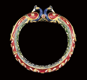
I enjoy the concentration and exactitude of the process of making the dot paintings but I also enjoy painting these expansive, fluid, more immediate pieces. In both cases, as in all my painting, paint is used as light. While on a visit to the MFA Boston during art school, artist Marcia LLoyd asked us in advance to select a piece or two from the collection that we connect with. I chose an enamel bracelet from the Indian Corridor. She saw that I was attracted to the luminous color (like my love of stained glass) and explained that there is a piece of metal inside the bracelet and light passes through the enamel, bouncing off the metal and returning to our eyes. This is the same way paintings often operate in which light passes through the paint to the white ground and back.

The nineteenth century landscape painter Boudin often made small paintings of the ocean with tiny figures in the dress of the times setting the scale and standing on the shore. They are vivid like how one sees in full sun. A quote of his seems to refer to this vibrancy, "To steep oneself in the sky. To capture the tenderness of the clouds. To let the cloud masses float in the background, far off in the gray mist, and then make the blue blaze forth." I am looking forward to dazzling spring and summer light.

Sunday, April 05, 2009

March


36" x 42"
oil on canvas
March is windy! The dots are blowing, springing out into space; invisible vectors seem to pull the eye back in. The center strip of landscape substitutes for a vertical person, the white the outside world. The dots' flow is symbolic of a personal connection with the life. Like an individual, the landscape is rich, layered, complete within itself as it sends out positive energy and receives it in turn. The circle is known to be a symbol of the self. As such, the dots can additionally be seen as a collection of individuals also radiating their uniqueness and place in the universe. [Do I sound New Age-y or what?] It is a picture of harmony but also fluctuation and change. We don't always know which way the wind will blow. Lyrics from one of my favorite songs, U2's Kite, "Who's to say where the wind will take you Who's to say what it is will break you I don't know Where the wind will blow".
A reoccurring theme is still there: a window looking out into the landscape. Pinpoints of the view appear through sheer curtains. As far as curtains go, I thought of those white ones with stitches forming tiny dots.
There is a good article describing the symbolism of the circle by two mathematicians: Reza Sarhangi and Bruce D. Martin.
A landscape I responded to as a kid that I think relates to this painting is the poppy scene in The Wizard of Oz. The plentiful poppies cause the journeying characters to become hallucinogenic. The sudden snow shower pinches them awake and they continue, not knowing if their destination will fulfill their longing. The grass, a neutral light ochre with variation, is newly uncovered from snow. The painting is the moment of awakening. There is more certainty in my painting than the movie scene, but I think the color and movement of the dots dazzle, kaleidoscopic, like the bright red of an expansive poppy field. In high school I painted a copy of Monet's Poppy Field in a Hollow Near Giverny at the request of a friend. I had forgotten until now.

Sunday, March 29, 2009

Winter Landscape #10 (My Backyard)


This photo of the woods in my yard is to show an example of what I'm looking at; I'm not painting from the photograph. I took the photo on a different day than I did the painting, but the two share similarities in color, air, and format.


oil on panel

24" x 18"


Colors jump out at me, dots bringing them to the front. When looking at nature, one often sees colors that stand out as well as many neutrals too plentiful to name. The dots isolate some of these colors, like a sample of the painter’s palette, perhaps like the theme of a musical composition. [The ring of hand bells, singular and brief, are part of a song just as the dots are to the painting. Check out Sonos Handbell Ensemble in this music sample of the Hallelujah Chorus by Handel.] Color theory is in play with a range of tints (white added to a color) creating unity and subtle contrast. The pale rose tone of the woods functions as a red contrasting with the high-key green, its complement


I think some of my landscapes are in similar to Claude Monet but with a twist. When first learning about Impressionism, many people marvel at the way a Monet landscape looks like the subject matter but on closer inspection the same picture reveals evidence of its making. Pieces of paint stand on their own. The artist’s thought and hand is in its construction is laid before us, unlike the classical painting tradition in which there were steps to making a painting that are invisible in the final layer (grisaille, then color; broader brushes to small, soft ones which even things out; varnish for a glossy surface, example: Claude Lorraine, Landschaft mit Apollo und Merkur, 1645). Sometimes the circles function like the brushstrokes of a Monet: the landscape is seen as a whole at a distance and some circles are visible, but not as well until observed close up. Others are composed of such large dots/circles that their geometry is up front, announcing straight off that they are not about realism, such as Winter Landscape #8 (Blue Dots) in a previous post. In other paintings I paint the whole picture in dots while at other times I only place a few or none at all.
A note relating to a comment on that painting: the term "pixel" is short for picture element (thank you Webopedia.com). Despite these nineteenth and twentieth century painterly sources I believe pixels also feed into my work. Pixels have changed the way we think about images: what they are made of or the way they can be reduced to a basic structure. Discontent with the mechanical aspect of pixelization, my work brings the human touch to this design element.

Painter, critic, and former Professor at Yale University, Andrew Forge is an inspiration. In the back of my mind I think of him, as he focused on paintings made of dots about nature and other subjects. He co-wrote a book on Monet with Robert Gordon. His friend, poet John Hollander wrote a poem "Effet de Neige" about Monet's painting La Route de la ferme Saint-Siméon dedicating it to Andrew Forge (in The Gazer's Spirit: Poems Speaking to Silent Works of Art). It is very moving speaks to the mystery in the space of landscape, life, and painting.

Sunday, March 22, 2009

Winter Landscape #9 (Fog) and Homage to 19th Century Painters


24" x 18"
oil on panel
8" x 10"
oil on canvas

These paintings comment on nineteenth century landscape painting like the
Hudson River School. Painters like Thomas Cole and Asher B. Durand set out to depict the American landscape as new territory, untouched, close to God, and unique. Their outlook was optimistic, like Obama's vision for America in the face of crisis es including environmental.
Dark trees often contrast with luminous sky in these works. Foliage is very textural and heavy while the skies are smooth and light. The second painting is a smaller jpeg of the third to show the naturalistic illusion of the painting which can't be seen except by stepping back. Close up the texture reads that this is painting and illusion is secondary. A band of black defines the right edge while the left is allowed to be atmospheric, a tension that makes the eye scan back and forth.

Charles Darwin was active at about the time as the Hudson River School. The subject of Darwin, art and evolution was the focus of a recent Brian Lehrer Show. The book: The Art Instinct – Beauty, Pleasure and Human Evolution by Denis Dutton , editor of http://artsandlettersdaily.com was the impetus for the discussion and Dutton was the guest. The book's premise is that evolution, not culture, determine’s taste through natural selection. It is a Darwinian take on aesthetics. Dutton thinks that our early ancestors were imprinted with certain landscape views in their travels and that is what makes us respond to such views in art. It takes Joseph Cambell's ideas on art and Jung's collective unconscious further by connecting it with evolution. As a painter I find this fascinating but I don't plan on making any art deliberately tailored to exemplify it.

The Yale Center for British Art is featuring an exhibit on Darwin's influence on the visual arts titled "Endless Forms': Charles Darwin, Natural Science and the Visual Arts" which closes May 3, 2009.

Sunday, March 15, 2009

Winter Landscape #8 (Blue Dots)

oil on canvas
52" x 30"
PRIVATE COLLECTION

I often see or think of things that make me smile. The dots will hopefully have that effect on you, especially while looking at the originals, where they might come into view unexpectedly. The dots sometimes seem surprising as you scan the surface. During a grad school crit, Nigel Rolfe remarked of my paintings, “the color wants to reward you.” This quality persists.

A comment (thanks, Rob) about the blurry but beautiful effect of seeing Christmas lights without glasses (for nearsightedness) is not off the mark. Christmas comes at the darkest time of the year and the lights we decorate with are attempts to restore some of the absent daylight. The light and color in my paintings also aim to lift spirits. The combinations of colors often make me smile as do a flock of birds turning in the wind, a patch of sun, pink toenail polish, and a dog whisker found while sweeping. This list is parallel to Rodger and Hammerstein’s My Favorite Things from The Sound of Music. Meant also to cheer one’s self, it funny that some of the lyrics include wild geese, the moon/sun, and kitten whiskers, not unlike my own favorite things. John Coltrane’s version (available to sample in I-Tunes) embodies the philosophy. In that way my paintings celebrate the silver lining.
On a similar note, in a The New York Times article Bruno Shultz, a Polish-Jewish artist killed in the Holocaust is heralded for creating paintings that help one "get through the long winter."

Sunday, March 08, 2009

Window (Late Fall)


oil on panel

24" x 18"


I recently commented on Vermeer's View of Delft. Another thing, among many, I like about his paintings are the way he treated windows and light. He painted many domestic interiors including solitary women. The window is secondary to the figure, but it is the source of the beautiful light that tenderly illuminates the woman. Unlike Renoir who portrays women as ornamental (basically the only thing I like of his are the peaches which are as boobilicious as his nudes but not offensive to the feminist), it seems that Vermeer respected women. It is the difference between the derogatory term "soccer mom" and mentioning Michelle Obama's name.

This issue concerns me as a mother who is very domestic, shuffling between the studio and kitchen. I love both and don't like my mother/wife role to be dismissed as lesser than my husband's as breadwinner. In this context my vocation as an artist sometimes is perceived as a hobby, especially if the conversation turns to sales and other marketplace-based evaluation. Luckily it doesn't seem to happen as often as it used. Enough venting, I'll leave the rest to Whitney Chadwick who addresses gender roles and societal views in her book, Women, Art, and Society. To be fair, I've heard a musician say that people equate his profession with unemployment and an actor in New York City with waiting tables.

On the male experience of the home and workplace, I found out about an early telecommuter before the "tele". 2009 is the bicentennial of the birthday of Charles Darwin. A recent BBC program, In Our Time with Melvyn Bragg, focused on Darwin's domesticity. He lived in the country with his wife and children in a home where he based his laboratory and garden used for his experiments. Apparently this quiet setting and family support fostered his studies.

Domesticity is the back story to Window (Late Fall), another view from my bathroom window. The landscape, this rectangle, glows. It is like stained glass when fully illuminated by the brightest day. The landscape is far, based on its scale, but then it overtakes you as it presses forward into your space before receding again. The landscape is burned into my retina, seen in quiet moments between the laundry.

Sunday, March 01, 2009

Winter Landscape #7, Sledding Hill and Beautiful Rochester Gray


24" x 18" and 8" x 10"
oil on panel

I heard someone say while looking at the Vermeer's View of Delft in the expansive exhibition at the National Gallery (11/1995 - 2/1996) artists must want to throw down their brushes when they see the accomplishment of this painting. I say we all have our own song to sing and painter/educator Robert Slutsky told me, "Those times are gone." He didn't mean that it is impossible to achieve excellence anymore, rather that the path to that excellence doesn't lie in a mirroring of past approaches.
I think what makes the View of Delft astonishing is its state of heightened awareness. The vision is hyper-real, conveying an acutely awakened state sensitive to the world. Seeing the real thing forces one's eyes to open widely like after being pinched. It is sad if you glance at the painting and seeing an old Dutch town, continue on, bored and indifferent. Don't do that! I got so worked up when two women walked by a small Rembrandt self-portrait (etching) that I told them to go back to see what they missed.

Notes on my work:

The top is another painting inspired by sledding. It is a clear winter day as opposed to the painting below. It has a deeper space than some of my other work and I got a bit obsessed with it, working the idea with a few watercolors in addition to this oil painting. I like the contrast between the treatment of the cloud and snow; although both white, they each feel like what they are. The loose handling of the trees convey their essence without getting caught in minutia.

Most people groan when talking about the cloudy, gray skies of Rochester, especially the natives. This painting focuses on the beauty of the grays which vary so much in weather conditions and offer endless possibilities. The title frames the idea as do the black edges.

The
Wikipedia article on Vermeer says that he continued to use expensive paint through a financial crisis in Holland due to the support of a patron. Artists will have to find ways to continue in our times; here is a great article in Newsweek by Peter Plagen about where the art world has been and where it is now during the recession:


http://www.newsweek.com/id/185786/page/1

Sunday, February 22, 2009

View from the Bathroom Window


12" x 12"
oil on panel

Art and the changes in the economy is addressed in a February 12th article by Holland Cotter in the NY Times, "The Boom is Over. Long Live the Art!" Cotter suggests that art often gets better when artists are left to do it for the sake of doing it, removed from any market driven pressures. He advises artists in this financial climate not to quit their day jobs.

I remember a children's book which exemplifies art's true value in society. Frederick is about a mouse who is a dreamer while all the other mice are working to prepare for winter. In the story (spoiler : ) Fredrick is able to tell stories of all he saw and imagined to the other mice while they were waiting for winter to end. While they were storing up provisions, he was immersing his senses, saving them for this collective sharing. I loved this book as a child and remember the colorful illustrations, often with round elements.
My paintings are bits of color and sensation stored up from the observed. Although I make them year-round, the ones made in winter are very much in keeping with the spirit of the book.
Notes on this painting:
It was done from the memory of looking out my bathroom window. The bright blues at the bottom were the color of the shadow of the house, the pale pinks, blues, and whites were the sparkling snow, and the top is the colors of the bare trees as well as some sky. I hope it buoy's you up while you wait for spring.

Sunday, February 15, 2009

Winter Landscapes #5 and #6


both are 24" x 18"

oil on panel

These two paintings contrast stylistically enough that someone might think they were painted by two different artists. They make for an interesting comparison and contrast, although saying so makes me think of high school writing assignments, standards I'm not sure I can uphold at this point. I'll move along anyway.
The top painting, #5, is Expressionist in handling. After painting some more controlled pieces, it is nice to let loose. This was done at the end of a painting day, a memory of taking my son sledding at Highland Park in Rochester at twilight. I love that time of day because everything turns blue. The cobalt upper right corner is different from the more cerulean blue of the snow, but the colors make sense. The trees are somewhat anthropomorphic, seeming like a crowd of people with arms waving. They have a sureness about them, bold and planted despite the tilting slope.
#6 is curvaceous and crystalline, the qualities I like best about it. The shapely center is dictated by the trees. Large areas of clarity meet wood with edginess, saved for the edges. In #5, color is reflected but in #6 the snow is all white. The latter is more frontal & relies on gradation of blue light and contrast to make space while #5 is more atmospheric.
These experiences of looking, feeling, and painting are what I do. At my Unitarian Church, I listened to the beautiful music created by the choir after being told that this was their gift and to receive it as such. Painting here in relative obscurity, it is hard to know to what extent my art will be heard. It is kind of like those balloons people send out with messages to write if found. I came across this quote which I think is an impetus for much art-making.

Dag Hammarskjöld in his diary, Markings, wrote that “Only what you have given is salvaged from the nothing which will some day have been your life.”


Sunday, February 08, 2009

The Neighbor's Shed


36" x 24"

oil on panel

Okay, you might notice this is a fall painting when we are in winter. I did an oil pastel of the view out one of my studio windows and this is a painting done from the drawing. I think the dots are kind of perky, not in a bubblegum snapping teenager way, but in a playful way. Rather than crunching leaves, one feels as if it is possible to bounce on the treetops like with moonboots. This playfulness is a quality that keeps the work, harkening back to Pointillism, from being dry and redundant. A fellow student in art school complained on our trips to the museum that it was "like going to a cemetery. It is full of dead art by dead artists." Perhaps some artists might agree, maybe those trying to find the cutting edge. For me the art is timeless while of its time, as full of life as Mozart is today.
The neighbors put up a new shed and it creeped into my work. The Post-Impressionists found Impressionism limiting because the short marks didn't lend themselves to clearly defining form. It was almost a focusing problem. Cezanne delineated form, but I think his bathers walked the line. I didn't want to make the thin trees out of dots and used line with dots weaving in and out of them. I see so many variations in the color of what I am looking at that I am not always content to make one or two stand for all, thus this pixelization. This painting makes me think of Pissarro, especially one at the Guggenheim, The Hermitage at Pontoise, where I studied how he handled paint. His work strikes me as quieter than a lot of the other Impressionists, a little less bang, but the paintings are very thoughtful, carefully and beautifully seen and made. If you check out this painting: Landscape at Chaponval, you can see what I admire about his treatment of houses in a landscape. I like the way they are nestled there, part of the patterning of the picture with the greenery coming in front of, behind, and through. Imagine what would have happened if he had heard rock 'n' roll?!

Sunday, February 01, 2009

Winter on the Left, Spring on the Right


Winter on the Left, Spring on the Right, 24" x 18", oil on panel

From Norman's View, 12" x 12", oil on panel
While winter is in full swing here in Western New York and I am fully enjoying it, I confess to having one eye looking ahead to spring. Winter on the Left, Spring on the Right has that duality. The fairly symmetrical composition lends itself to the content. Earlier on in the painting the road was basically paved the same color as the sky. It fell short; the blue sky's compliment, orange, did the trick.
From Norman's View has that blend of what is seen and imagined. The invented, the synthetic can add zing. Picasso said, "Art is a lie." He meant that what is observed as it is in life may not have the right chemistry to turn into kicking art. Hollywood knows it well, as does advertising. Blue and orange also play opposing roles in this painting, creating tension, drama. Their intensity brackets the calm landscape.
This week I came across the work of artist Chris Cook from Georgia. I really like his landscapes which have a Milton Avery flair but are very original. He has a unique way of inventing space with shape and color. I especially like the unselfconsiousness in his portrayal of horses in Two Horses. I'm so excited that we might trade paintings!
I recently traded with artists Rita Baragona and Naomi Nemtzow. It is very encouraging and stimulating to have one's own work as well as the work of other artists in one's living space. Thanks, guys!

Sunday, January 25, 2009

Winter Landscape #4


18" x 24"
oil on panel
The space is interesting in this one. The center area, which I often enjoy framing, is shapped by the two clusters of trees. The ones on the left are set back further, trunks ending at about one-third from the bottom, while the ones on the right go to the edge. This, in combination with the angles of the trees, create a diagonal tension, giving a feeling of the distance between the clusters. The space also works from front to back as the blue tracks lead to the center of the painting, although remaining fairly parallel, unlike the one point perspective exercise of the railroad tracks. Yellow lines on the left delineate an area, and one can sense space wrapping around behind the trees.
I like the blinding light of snow in winter and the colors I see in it, exaggerated here in the pink solid. Milton Avery reassures me that simple, color, and lyrical have their place next to an encapsulated shark.