Showing posts with label politics and art. Show all posts

Sunday, March 01, 2009

Winter Landscape #7, Sledding Hill and Beautiful Rochester Gray


24" x 18" and 8" x 10"
oil on panel

I heard someone say while looking at the Vermeer's View of Delft in the expansive exhibition at the National Gallery (11/1995 - 2/1996) artists must want to throw down their brushes when they see the accomplishment of this painting. I say we all have our own song to sing and painter/educator Robert Slutsky told me, "Those times are gone." He didn't mean that it is impossible to achieve excellence anymore, rather that the path to that excellence doesn't lie in a mirroring of past approaches.
I think what makes the View of Delft astonishing is its state of heightened awareness. The vision is hyper-real, conveying an acutely awakened state sensitive to the world. Seeing the real thing forces one's eyes to open widely like after being pinched. It is sad if you glance at the painting and seeing an old Dutch town, continue on, bored and indifferent. Don't do that! I got so worked up when two women walked by a small Rembrandt self-portrait (etching) that I told them to go back to see what they missed.

Notes on my work:

The top is another painting inspired by sledding. It is a clear winter day as opposed to the painting below. It has a deeper space than some of my other work and I got a bit obsessed with it, working the idea with a few watercolors in addition to this oil painting. I like the contrast between the treatment of the cloud and snow; although both white, they each feel like what they are. The loose handling of the trees convey their essence without getting caught in minutia.

Most people groan when talking about the cloudy, gray skies of Rochester, especially the natives. This painting focuses on the beauty of the grays which vary so much in weather conditions and offer endless possibilities. The title frames the idea as do the black edges.

The
Wikipedia article on Vermeer says that he continued to use expensive paint through a financial crisis in Holland due to the support of a patron. Artists will have to find ways to continue in our times; here is a great article in Newsweek by Peter Plagen about where the art world has been and where it is now during the recession:


http://www.newsweek.com/id/185786/page/1

Sunday, December 14, 2008

Late Fall


oil on canvas
36" x 42"

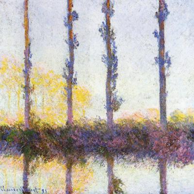
The column filled with gumball-like multi-colored dots gets narrower on top, channeling movement. Optics are a big part of the painting, and I was inspired by an artist once criticized as being a big eye because of his almost scientific approach to color and light. Monet's poplar trees, came to mind to solve the compositional problem of tree trunks amidst leaves. The four vertical streaks of brown/maroon dots add another structural element, in harmony with the three main vertical sections of the painting. Despite the formalities, Monet's paintings aren't cool and unemotional, and neither are mine.

Two black rectangles are like black velvet curtains drawing back to reveal the magical center stage (as close to painting on velvet as I will ever get). They also can be seen as pressing on the center strip, like shorter days in winter and the down turn of the news vs. optimism. I resist letting the dark news be the focal point. I prefer to stay in the frame of mind (I love the at phrase, "frame of mind", like your thoughts fit in a frame, which mine can do, and then there is thinking outside the frame/box...) that Barrack Obama eloquently presented in his acceptance speech as President Elect, "While we breathe we hope." Those dots move as though effervescent, breathing, whimsically bubbling upward. There is blue-sky air, a purple tonality to the bottom, and a golden tonality in the center. The black is not flatly painted but has texture, and colors from underneath richly peak through, signs that it is permeable, vulnerable.

Sunday, November 23, 2008

Earth, Sky-Window


8" x 8"

oil on canvas

First impression: Anselm Keifer. The converging marks in this angsty landscape make use of perspective, creating a vast space. It has the scale of Keifer, but the actual size is a fraction of his enormous canvases. This 8" x 8" is small for me, but everything I do is small compared to his. Women artists in the past were told to "paint like a man" in attitude as well as scale. I'd like to think we're past that. I'm not a miniature painter and would never describe my small paintings as such, because it sounds diminutive, like they are supposed to be a small version of something else, when they really are themselves. Keifer's paintings are heroic and approach the size of theater scenery, although unwilling to leave center stage. I love his big paintings and I am glad they are the way they are, but I am happy with what I have.


I respond most to art with intensity, no matter the type of emotion. Keifer's work focuses on post-war Germany and it is nothing if not intense. Often people will hate a piece of art (this goes for any art form) not because it is poorly done, but because they hate what it expresses or because it makes them uncomfortable. As discomfort is a necessary part of challenging preconceptions, which a lot of artists like to do, a great deal of art thus makes people uncomfortable. During the Mapplethorpe controversy I wore a pin that said "Fear No Art". It was to the point; when people become afraid censorship isn't far behind.
Earth, Sky-Window isn't controversial, but it is intense. It is specific, but in a way that isn't easy to pin down, not easily named, which I like. I seem to be painting out of that place now, almost an anti-narrative. Still, the stage is set, implying there is a story after all.


Saturday, July 19, 2008

New Yorker Obama Cartoon

My two cents regarding the Obama cartoon by Barry Blitt on the cover of the recent New Yorker http://news.bbc.co.uk/1/hi/world/americas/7505953.stm is different from my opinion on the Danish cartoon of Muhammad. The right's uses fear and rumor tactics to discredit Obama. Blitt's illustration of these misconceptions (lies) is shocking and horrid because it made the lies visible. It gave them a new form, something that shows them for what they are. There is the risk, however, that anyone ignorant enough to believe these lies in the first place will see the picture as confirmation. The scariest thing about America today is the number of people unable to discern fact and fiction from the media. It seems that many are easily manipulated. It would serve the country well if a course in understanding journalism and images were included with English literature classes in high school (as well as a semester in mediation and keep those art and music classes, by the way).
I don't think Blitt's cartoon was a mistake. I think the outrage shouldn't be that someone made it and published it, but for the situation it reflects.
In contrast, the cartoons published of Muhammad in a Danish newspaper took an image that is holy and satirized it. The sacred should be left sacred and the pictures were unthinking instigation. Obama's integrity shouldn't be slandered, but such high standards aren't reached in U.S. politics, as the New Yorker cartoon makes evident.