

This is an art archive by Nicole Maynard from 2005 until Jan. 2017. For recent work, go to nicolemaynard.studio Images may only be used with permission from the artist.
Showing posts with label landscape. Show all posts
Showing posts with label landscape. Show all posts
Saturday, June 07, 2014

Sunday, August 21, 2011

Wednesday, August 10, 2011

Thursday, June 16, 2011

Sunday, January 30, 2011
Oil Pastels: Studio #1-4


Studio #1 (gray orange tree)
Studio #2 (Window View)
Studio #3 (Gray Purple Tree)
Studio #4 (Blue Tree)
all are 18" x 12", oil pastel on paper
"I look forward to an America which will not be afraid of grace
and beauty...an America which will reward achievement in the
arts as we reward achievement in business or statecraft."
Remarks at Amherst College, 1963 - JFK
Sunday, January 10, 2010
Western NY Landscape Ceramic Relief #10, #11, #12

Western NY Landscape 10 Ceramic Relief 3 1/2x4 1/2_2009

Western NY Landscape 11 Ceramic Relief 3x5_2009

Western NY Landscape 12 Ceramic Relief 3 1/2x7_2009
Here's a little summer for you in January. Our move from the Rochester area to Rhode Island had eventful weather. We hit white out blizzard conditions and needed to sleep just off the road from three to six a.m. Our new town had an uncharacteristic six inches of snow, while back in Rochester a friend reported snow up to mid-thigh. While I like the snow, dangerous driving conditions and salt and dirt tracked through my new house by five movers makes me less than appreciative at the current moment.
The bottom two reliefs remind me a bit of the landscape paintings of the 18th century Rococo artist, Jean-Honore Fragonard. Landscape with Three Washerwomen has the pastel coloring that makes me consider the comparison. His work is exuberant which I think is another quality these reliefs share. I see my reliefs as not only objects but as images. Despite their solidity and material resistant to deterioration, they carry a fleeting moment, and particular weather conditions. Not made to look fully illusionistic, "real", they are somehow hyper-real. I used to hate Fragonard and Rococo art for its frivolity, regarding it as "foo foo". It seems that some points in history disdain others but appreciation comes around eventually. I never heard anyone in art school going around saying how much they were influenced by Rococo art, in keeping with the style's initial dismissal by art critics as "frivolity". These are as close to it as I get and I admit some discomfort at getting so close, but I now see subtlety, light, space, and passion in this time period and would like to claim those qualities for myself.

Sunday, October 25, 2009
Self-Portrait October 2009

12" x 9"
oil on panel
Hi. It is time for a new self-portrait. I don't have a time-frame in mind for how often to make them, but time is marching on so Carpe Diem.
My face is not fractured as in previous paintings. Fracture/facture. The facture of a self-portrait is often more noticeable in ones that are fractured, when pieces of paint are laid to denote the framework of a head, related to the planes of Cubism. Cezanne, who came before Cubism, studied such planes in space but was also sensitive to color as form rather than decoration, frosting on a cake. [I love making sentences with "Cubism" and "cake frosting" in them.] In Self-Portrait with Rose Background [c. 1875 (140 Kb); Oil on canvas, 66 x 55 cm (26 x 21 5/8")], he defines the facets of his head with pieces of paint and even turns one such stroke into his delicate lower eyelid, the pedestal for his piercing gaze. He is as intense as the red-rose background. It swirls, breaks into his form, defining his ear, the space between his beard and moustache, his lips, and even cuts into his neck threatening decapitation like Nearly Headless Nick from Harry Potter. He plays a similar game with the background and figure interacting in his Self-Portrait 1878-80 [(160 Kb); Oil on canvas, 60.3 x 46.9 cm (23 3/4 x 18 1/2 in); The Phillips Collection, Washington, D.C.] He is supposed to have been a quiet person and I've noticed his mouth is often obscured in his self-portraits while his eyes are very alert. His voice is his vision. The mouth in this gets lost in his beard of yellow ochre and greens with black marks, exactly like the background. His hairline continues in the sharp line of his collar, accentuating his vertical, solid presence. The word for his stare that keeps coming to me is "shrewd". Even a used car salesman would back down.

Now back to me. I don't want it to be all about me, but it is self-portraits we are talking about and they are reflexive in nature. I'm not looking shrewd. I can't say no to Girl Scouts selling cookies, but I am old enough to see a scam despite the clarity of my face. Landscape colors are the background with dots like my current paintings. They visually interplay with the blue circles of my collar and eye; this is what I see. A patch of purple background is the springboard for the purple turn of the collar; its blue is the mixture of the landscape yellow and green, completing the land with sky, blue hollow circles make for white cloud centers. The curl of my hair and its red highlights (not natural : ) suggest playfulness, very different than Cezanne's brewing. You can check out my blog of archives for my own brewing Self-Portrait With Gloved Hand from 1999. Both Cezanne paintings and the Degas Self-Portrait in the Getty Museum that I haven't forgotten (I saw it more than ten years ago) are in three quarter view, as is mine. Answers.com defines three-quarter view as, "A view of an object which is midway between a front and a side view." We don't disclose all but you get a good look. Speaking of museums, art museum lovers will get a laugh from this article in The Onion. Take time to play.

Sunday, July 05, 2009
Ceramics!

Hill, Dark Trees

Winter to Spring Window

Tilting Field
all approximately 5" x 7"
The kiln works!!!!!! I got a used kiln and a dream come true in one. I mainly want to make landscape reliefs. I don't know if I'll make vessels, maybe hand-built incorporating relief. These can be hung on the wall by an indentation in the back. I love that these landscapes are made from earth, clay. The layers of the land, its undulations; the space between expanses of field, woods, hill, and sky are the subject. Here in the country these areas, their textures, color and expanse fill my eyeballs. We are fortunate to have the undeveloped lot across the street and we don't feel hemmed in. I love moving the clay, forming vision into something I can handle, like building with hammers, nails, and wood. In addition to form there is the stretching of the ground and the sky that is over and around. Making this experience into a solid is challenging and fascinating.
Greek bas reliefs are narratives telling history and myth pulled out of marble with the perfection of structure embodied in that culture's architecture. I admire them greatly, but am not interested in pursuing their figuration and Platonic purity of the ideal. My things are crude, reflective of the mud they are made from and the mud they represent. Beautiful in the organic qualities like the range of compost to thriving plants. They have the cultural context of a Bostonian relocating and embracing the middle of nowhere. Local doesn't have to mean provincial. I am just beginning.
Sunday, April 05, 2009
March

36" x 42"
oil on canvas
March is windy! The dots are blowing, springing out into space; invisible vectors seem to pull the eye back in. The center strip of landscape substitutes for a vertical person, the white the outside world. The dots' flow is symbolic of a personal connection with the life. Like an individual, the landscape is rich, layered, complete within itself as it sends out positive energy and receives it in turn. The circle is known to be a symbol of the self. As such, the dots can additionally be seen as a collection of individuals also radiating their uniqueness and place in the universe. [Do I sound New Age-y or what?] It is a picture of harmony but also fluctuation and change. We don't always know which way the wind will blow. Lyrics from one of my favorite songs, U2's Kite, "Who's to say where the wind will take you Who's to say what it is will break you I don't know Where the wind will blow".
A reoccurring theme is still there: a window looking out into the landscape. Pinpoints of the view appear through sheer curtains. As far as curtains go, I thought of those white ones with stitches forming tiny dots.
There is a good article describing the symbolism of the circle by two mathematicians: Reza Sarhangi and Bruce D. Martin.
A landscape I responded to as a kid that I think relates to this painting is the poppy scene in The Wizard of Oz. The plentiful poppies cause the journeying characters to become hallucinogenic. The sudden snow shower pinches them awake and they continue, not knowing if their destination will fulfill their longing. The grass, a neutral light ochre with variation, is newly uncovered from snow. The painting is the moment of awakening. There is more certainty in my painting than the movie scene, but I think the color and movement of the dots dazzle, kaleidoscopic, like the bright red of an expansive poppy field. In high school I painted a copy of Monet's Poppy Field in a Hollow Near Giverny at the request of a friend. I had forgotten until now.
Sunday, March 08, 2009
Window (Late Fall)

oil on panel
24" x 18"
I recently commented on Vermeer's View of Delft. Another thing, among many, I like about his paintings are the way he treated windows and light. He painted many domestic interiors including solitary women. The window is secondary to the figure, but it is the source of the beautiful light that tenderly illuminates the woman. Unlike Renoir who portrays women as ornamental (basically the only thing I like of his are the peaches which are as boobilicious as his nudes but not offensive to the feminist), it seems that Vermeer respected women. It is the difference between the derogatory term "soccer mom" and mentioning Michelle Obama's name.


This issue concerns me as a mother who is very domestic, shuffling between the studio and kitchen. I love both and don't like my mother/wife role to be dismissed as lesser than my husband's as breadwinner. In this context my vocation as an artist sometimes is perceived as a hobby, especially if the conversation turns to sales and other marketplace-based evaluation. Luckily it doesn't seem to happen as often as it used. Enough venting, I'll leave the rest to Whitney Chadwick who addresses gender roles and societal views in her book, Women, Art, and Society. To be fair, I've heard a musician say that people equate his profession with unemployment and an actor in New York City with waiting tables.
On the male experience of the home and workplace, I found out about an early telecommuter before the "tele". 2009 is the bicentennial of the birthday of Charles Darwin. A recent BBC program, In Our Time with Melvyn Bragg, focused on Darwin's domesticity. He lived in the country with his wife and children in a home where he based his laboratory and garden used for his experiments. Apparently this quiet setting and family support fostered his studies.
Domesticity is the back story to Window (Late Fall), another view from my bathroom window. The landscape, this rectangle, glows. It is like stained glass when fully illuminated by the brightest day. The landscape is far, based on its scale, but then it overtakes you as it presses forward into your space before receding again. The landscape is burned into my retina, seen in quiet moments between the laundry.
Sunday, March 01, 2009
Winter Landscape #7, Sledding Hill and Beautiful Rochester Gray


24" x 18" and 8" x 10"
oil on panel
I heard someone say while looking at the Vermeer's View of Delft in the expansive exhibition at the National Gallery (11/1995 - 2/1996) artists must want to throw down their brushes when they see the accomplishment of this painting. I say we all have our own song to sing and painter/educator Robert Slutsky told me, "Those times are gone." He didn't mean that it is impossible to achieve excellence anymore, rather that the path to that excellence doesn't lie in a mirroring of past approaches.
I think what makes the View of Delft astonishing is its state of heightened awareness. The vision is hyper-real, conveying an acutely awakened state sensitive to the world. Seeing the real thing forces one's eyes to open widely like after being pinched. It is sad if you glance at the painting and seeing an old Dutch town, continue on, bored and indifferent. Don't do that! I got so worked up when two women walked by a small Rembrandt self-portrait (etching) that I told them to go back to see what they missed.

Notes on my work:
The top is another painting inspired by sledding. It is a clear winter day as opposed to the painting below. It has a deeper space than some of my other work and I got a bit obsessed with it, working the idea with a few watercolors in addition to this oil painting. I like the contrast between the treatment of the cloud and snow; although both white, they each feel like what they are. The loose handling of the trees convey their essence without getting caught in minutia.
Most people groan when talking about the cloudy, gray skies of Rochester, especially the natives. This painting focuses on the beauty of the grays which vary so much in weather conditions and offer endless possibilities. The title frames the idea as do the black edges.
The Wikipedia article on Vermeer says that he continued to use expensive paint through a financial crisis in Holland due to the support of a patron. Artists will have to find ways to continue in our times; here is a great article in Newsweek by Peter Plagen about where the art world has been and where it is now during the recession:
http://www.newsweek.com/id/185786/page/1
Sunday, February 22, 2009
View from the Bathroom Window

12" x 12"
oil on panel
Art and the changes in the economy is addressed in a February 12th article by Holland Cotter in the NY Times, "The Boom is Over. Long Live the Art!" Cotter suggests that art often gets better when artists are left to do it for the sake of doing it, removed from any market driven pressures. He advises artists in this financial climate not to quit their day jobs.
I remember a children's book which exemplifies art's true value in society. Frederick is about a mouse who is a dreamer while all the other mice are working to prepare for winter. In the story (spoiler : ) Fredrick is able to tell stories of all he saw and imagined to the other mice while they were waiting for winter to end. While they were storing up provisions, he was immersing his senses, saving them for this collective sharing. I loved this book as a child and remember the colorful illustrations, often with round elements.
My paintings are bits of color and sensation stored up from the observed. Although I make them year-round, the ones made in winter are very much in keeping with the spirit of the book.
Notes on this painting:
It was done from the memory of looking out my bathroom window. The bright blues at the bottom were the color of the shadow of the house, the pale pinks, blues, and whites were the sparkling snow, and the top is the colors of the bare trees as well as some sky. I hope it buoy's you up while you wait for spring.
Sunday, February 15, 2009
Winter Landscapes #5 and #6


both are 24" x 18"
oil on panel
These two paintings contrast stylistically enough that someone might think they were painted by two different artists. They make for an interesting comparison and contrast, although saying so makes me think of high school writing assignments, standards I'm not sure I can uphold at this point. I'll move along anyway.
The top painting, #5, is Expressionist in handling. After painting some more controlled pieces, it is nice to let loose. This was done at the end of a painting day, a memory of taking my son sledding at Highland Park in Rochester at twilight. I love that time of day because everything turns blue. The cobalt upper right corner is different from the more cerulean blue of the snow, but the colors make sense. The trees are somewhat anthropomorphic, seeming like a crowd of people with arms waving. They have a sureness about them, bold and planted despite the tilting slope.
#6 is curvaceous and crystalline, the qualities I like best about it. The shapely center is dictated by the trees. Large areas of clarity meet wood with edginess, saved for the edges. In #5, color is reflected but in #6 the snow is all white. The latter is more frontal & relies on gradation of blue light and contrast to make space while #5 is more atmospheric.
These experiences of looking, feeling, and painting are what I do. At my Unitarian Church, I listened to the beautiful music created by the choir after being told that this was their gift and to receive it as such. Painting here in relative obscurity, it is hard to know to what extent my art will be heard. It is kind of like those balloons people send out with messages to write if found. I came across this quote which I think is an impetus for much art-making.
Dag Hammarskjöld in his diary, Markings, wrote that “Only what you have given is salvaged from the nothing which will some day have been your life.”
Sunday, February 01, 2009
Winter on the Left, Spring on the Right


Winter on the Left, Spring on the Right, 24" x 18", oil on panel
From Norman's View, 12" x 12", oil on panel
While winter is in full swing here in Western New York and I am fully enjoying it, I confess to having one eye looking ahead to spring. Winter on the Left, Spring on the Right has that duality. The fairly symmetrical composition lends itself to the content. Earlier on in the painting the road was basically paved the same color as the sky. It fell short; the blue sky's compliment, orange, did the trick.
From Norman's View has that blend of what is seen and imagined. The invented, the synthetic can add zing. Picasso said, "Art is a lie." He meant that what is observed as it is in life may not have the right chemistry to turn into kicking art. Hollywood knows it well, as does advertising. Blue and orange also play opposing roles in this painting, creating tension, drama. Their intensity brackets the calm landscape.
This week I came across the work of artist Chris Cook from Georgia. I really like his landscapes which have a Milton Avery flair but are very original. He has a unique way of inventing space with shape and color. I especially like the unselfconsiousness in his portrayal of horses in Two Horses. I'm so excited that we might trade paintings!

I recently traded with artists Rita Baragona and Naomi Nemtzow. It is very encouraging and stimulating to have one's own work as well as the work of other artists in one's living space. Thanks, guys!
Sunday, January 25, 2009
Winter Landscape #4

18" x 24"
oil on panel
The space is interesting in this one. The center area, which I often enjoy framing, is shapped by the two clusters of trees. The ones on the left are set back further, trunks ending at about one-third from the bottom, while the ones on the right go to the edge. This, in combination with the angles of the trees, create a diagonal tension, giving a feeling of the distance between the clusters. The space also works from front to back as the blue tracks lead to the center of the painting, although remaining fairly parallel, unlike the one point perspective exercise of the railroad tracks. Yellow lines on the left delineate an area, and one can sense space wrapping around behind the trees.
I like the blinding light of snow in winter and the colors I see in it, exaggerated here in the pink solid. Milton Avery reassures me that simple, color, and lyrical have their place next to an encapsulated shark.


Sunday, January 18, 2009
Three Winter Watercolors


watercolors in Moleskin watercolor book
pages 16, 17, and 18
5" x 9"
I'll tell you what I enjoy about these (go ahead and call this a vanity blog, but are there any other kind? Besides, this is about artistic independence). I like the sense of scale in the first one with the little strip of land at the bottom. The bright blue rings out clearly, harmonizing with the other colors. The green edges suggest curtains or some kind of vegetation.
I am very interested in expansive space like where I live. The second picture has that openness, with the hint of a window frame or a camera viewfinder, distancing oneself from the cold and the elements. It is reflective of the no-stopping-it-now western quest to contain (and often possess) nature.
The daytime of deep winter has many variations of white and gray. Sometimes bright, sometimes dim, the snow often blindingly contrasts with the sky, forcing me to wear sunglasses while driving even though I'm craving the sun. White-out conditions blows the snow in every direction, blending the differences between up, down, and middle.
The third picture is about the sharp contrast of an overcast day without precipitation as viewed from an interior. The white and black are flat and bold while the gray has soft subtleties in color and paint handling, meeting with the snow in a line meant to convey the two substances.
My brother tells me it is eighty-one degrees in Ft. Lauderdale. He is keeping company with iguanas near the pool. It is enticing, but I would miss the grays. Alright, a few days might be nice...
Sunday, January 04, 2009
Late Fall 2
 oil on canvas
40" x 28"
More gumballs! Well, they're not really gumballs, but they do make me think of the game of guessing how many jelly beans are in a jar. The dots are compressed toward the picture plane, accentuating the surface of the canvas. The edging on three sides sets them back a bit, setting up a dialogue between in vs. out, the world of circles as opposed to something else.
Dots of fall treetops are layered on the bottom like piles of leaves while the second fourth of the painting shows the darker structure of bare trees. The third fourth is made up of blue and white (falling snow or cool air?), while the upper fourth is an attempt at the many varieties of crystalline blue there are no paints for (sigh). The height of the canvas compared to width is important as the circles are like bubbles. They have a good enough length to travel and convey their effervescence. When looking at the actual painting (I'm not sure it works in the jpeg) one's eyes dilate, getting lost in the movement, stimulated by the bouncing color.
For all the special effects computers offer in pixelization and making things random, less mechanical, more naturalistic, a computer could not make this painting. I work intuitively, sometimes impulsively, and sometimes calculated. I think the location and color of the dots (or other design elements I use in other pictures) end up conveying my personal energy and the feeling I am expressing. A friend's parent in 1989, when I was in high school and deciding to go to art school to study painting laughed at my decision, saying that computers would make all the art of the future. It is like saying we would happily accept the superiority of the machines we create. Our souls could give up, obsolete.
Sunday, December 28, 2008
Monoprints! (#1, #2, #3)


monoprints
3" x 4" image size on Arches paper
In the history of art, many artists individually and collectively issued manifestos. The degree of relevancy these manifestos have to the actual art varies. Often there is a disclaimer written about an artist of a particular group that they were really doing their own thing. Reactionary as artists tend to be, many made this statement themselves, declaring they didn't believe in "isms", thus making their manifesto be about rejecting manifestos.
I have an artist's statement which is a kind of statement of purpose trying to put into words this ineffable activity I engage in. If I were to have a manifesto, however, it would be the poem, The Invitation, by a writer known as Oriah Mountain Dreamer. It is truly great. It is with her permission that her work is linked here. Please enjoy the monoprints and keep this poem in mind while viewing all my work, my life's work.
Sunday, December 14, 2008
Late Fall

oil on canvas
36" x 42"
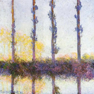
The column filled with gumball-like multi-colored dots gets narrower on top, channeling movement. Optics are a big part of the painting, and I was inspired by an artist once criticized as being a big eye because of his almost scientific approach to color and light. Monet's poplar trees, came to mind to solve the compositional problem of tree trunks amidst leaves. The four vertical streaks of brown/maroon dots add another structural element, in harmony with the three main vertical sections of the painting. Despite the formalities, Monet's paintings aren't cool and unemotional, and neither are mine.
Two black rectangles are like black velvet curtains drawing back to reveal the magical center stage (as close to painting on velvet as I will ever get). They also can be seen as pressing on the center strip, like shorter days in winter and the down turn of the news vs. optimism. I resist letting the dark news be the focal point. I prefer to stay in the frame of mind (I love the at phrase, "frame of mind", like your thoughts fit in a frame, which mine can do, and then there is thinking outside the frame/box...) that Barrack Obama eloquently presented in his acceptance speech as President Elect, "While we breathe we hope." Those dots move as though effervescent, breathing, whimsically bubbling upward. There is blue-sky air, a purple tonality to the bottom, and a golden tonality in the center. The black is not flatly painted but has texture, and colors from underneath richly peak through, signs that it is permeable, vulnerable.
Sunday, December 07, 2008
Yellow Sky

20" x 16"
The tropical feel and the red tree remind me of Gauguin. I love his Where do We Come From? What are we? Where are we going? masterpiece at the MFA Boston. He uses rich colors, sometimes bright. I think the sky and the sea in my painting feel somewhat translucent, a luminous blue with orange, the leaves airy, not stiff. Although the geometry is very rectilinear, it breathes. I like the suggestion of leaves on the dark tree on the left. That little triangle has gray marks that hint at what is on the other side, a defining limb curves, echoing the base of the tree. Such subtleties contribute to the impact of the image as a whole, but if a viewer lingers, they are there to be noticed.
Painting provides respite to maker and viewer. The artist is in the unique position of being both. I want to treat myself. I want to see color, space, and light hit my retina. I want to bask in these things.
Subscribe to:
Posts (Atom)