Showing posts with label Pointillism. Show all posts

Sunday, April 24, 2011

From the Hydrangea


9" x 12", oil on panel


I took a break from the studio to go to the opening reception of "Scale: Experiencing Size, Surface, & Story" at the Attleboro Arts Museum in Massachusetts. The show features the work of three artists, Juan Jose Barboza-Gubo, Jodi Colella, and Richard Kattman.

From the museum's press release:
"Barboza-Gubo (painting and sculpture), Colella (mixed media sculpture) and Kattman (painting) deliver visual expressions that truly absorb the viewer thanks to either their strategically planned size, detailed texture, significant message – or all of the above.
“In some cases the highly appropriate grand scale of this artwork engulfs the viewer – yet, we also have the chance to rise above work that is extremely exaggerated – but doesn’t tower over gallery-goers,” comments Mim Brooks Fawcett, Executive Director of the Attleboro Arts Museum.” “Scale controls our relationship with these authentic expressions and we are compelled to explore,” she added.
Click here for the full article.

Barboza-Gubo's work struck me in a way that doesn't happen very often. His self-portraits with antlers remind me of Joseph Beuys' watercolors also because of the limited color and alchemical properties as the former's are done in blood, gouache, and graphite. In the show is an impressive carved wood sculpture with twisting forms like a Van Gogh cypress tree with a narrative. Large-scale paintings of Barboza-Gubo's are also on view, forms reminding me of the violent chaos of Gericault's Raft of the Medusa. Not in the show is his his Pieta Series 3 that blows me away. It has the mastery of Picasso's fragmented form and the layers of transparency and graphics combined with figuration as in Sigmar Polke. You can imagine that I'm jumping out of my skin even more to learn that he received his MFA from Massachusetts College of Art and Design (my alma mater) and is a faculty member there.

"Scale: Experiencing Size, Surface, & Story" runs April 15 – May 7, 2011

On the home front, this is what I'm doing:

This painting comes out of the work I'm doing of Hydrangeas including an oil paintings, watercolors, and oil pastels. My oil painting, Blue Hydrangea, is focused on capturing the globes of petals while this new painting allows the globes to diffuse into layered colored points that go back and forth in space. They may be seen as part of the plant or as their own system. Painted in April during a series of cloudy days, I kept the edges of the circles soft. They are thinly glazed in contrast to the heavier applications in other paintings. I think they have a wet, earthy feel to them, the modulated brown ground reflects light like the dark backgrounds in old master paintings. Someone seeing the original asked if I use stencils. They are all freehand. Too much unnatural uniformity makes them too mechanical looking. I also draw the dots when using the iPad and don't use any of the tools that make automatic dots. I think there is an emotional tenderness that comes through in the hand no matter how perfect or imperfect the circles appear to be. Perfection isn't my goal. I'm involved in each moment. A dot is a moment but not an instant. I can't paint them in quick dabs. It's like patiently trying to catch rain drop by drop but not wanting the drops to combine. Maybe it's more like catching snowflakes on a mitten in order to look at each one.

Sunday, February 13, 2011

Hydrangea Oil Pastels (PRIVATE COLLECTION)


Blue, Pink, & White, 18" x 12", oil pastel on black paper, PRIVATE COLLECTION

I'm working on a pink hydrangea oil painting - slow going.

The Poetry Foundation has a great podcast, Poetry Off the Shelf. I came across the July 9, 2010 installment where poets Edward Hirsch (President of the Simon Guggenheim Memorial Foundation) and Nick Flynn read Israeli and Slovenian poems in translation. One of the poems read by Hirsch was by an Israeli poet about his father. Hirsch commented on the particular tenderness in the poem, so unlike American Modernism. A hallmark of the latter is a coolness and rejection of anything with feeling for fear of sentimentality. This has continued in American Art and I am certain my bubbly and joyful images made out of color would be deemed frivolous and less serious through this lens. Today is my fortieth birthday. At forty, opinions about my art which run contrary to their truth are irrelevant. Just as certain as wrinkles beginning to set, so is my self-confidence. Dot I will.

Sunday, September 12, 2010

Blue Hydrangea


Blue Hydrangea, 24" x 24", oil on panel, PRIVATE COLLECTION


Blue Hydrangeas popped up all over my neighborhood this summer, a burst of color along my runs. I have a bush on my doorstep and was disappointed it isn't blue, but then I learned changing fertilizers can determine their color from pink to blue.

"The color of the hydrangea's flower is based on the acidity or pH level of the soil. The plant will maintain a blue flower color if the soil is between 5 to 5.5." It apparently has to do with an amount of aluminum in the soil. I know this thanks to EHow. I'm a terrible gardener.

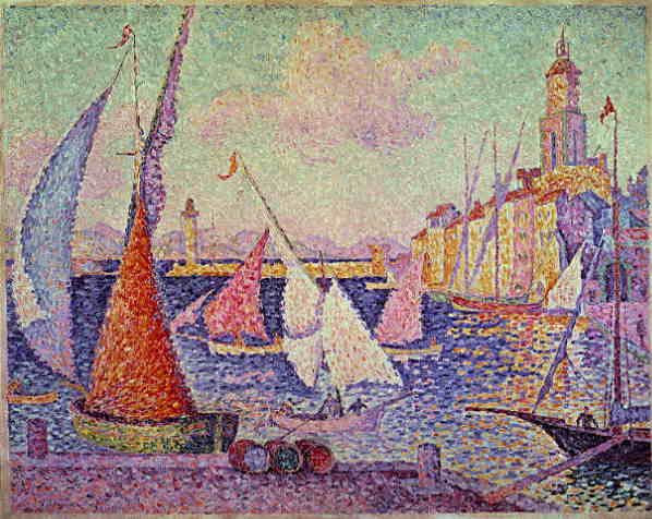
I had to think of how I would translate them to paint, how much I would embrace or deny the volume of their spherical blossoms. I worked through it as I went along, having a general feeling of what I was after but not knowing what it would look like in the end. I painted in extended and brief sessions, sometimes stealing moments in the evening to throw in a few more dots. The dots are drawn, as it is impossible for me to make a dab of the brush that would make a circle. Impressionists worked with dabs like the painting Port St. Tropez by Paul Signac.

Dabs, circles require diligence, labor is evident. It isn't drudgery, however. Each piece of paint is painted with joy, or at least the belief in joy. There is an insistence fulfilled through the repetition, a sense of certainty. It is an attitude to bring to the start of each day, hoping it will sparkle.

Sunday, May 23, 2010

Spring Landscapes #19, #20, #21


Spring Landscape #19 Sky 12" x 12", oil on canvas


Spring Landscape #20 Buds 12" x 12", oil on panel


Spring Landscape #21 Green and Pink Trees 12" x 12", oil on panel


On June 1st, 2010, The Guggenheim Museum of Art, New York City, will announce the winners of its competition, Contemplating The Void.

Competition Description:
To celebrate the close of the Guggenheim’s 50
th Anniversary year, we invite you to create your own dream intervention of the Guggenheim Museum. Now you can take on the same challenge that 200 artists, designers, and architects took on for the exhibition Contemplating the Void: Interventions in the Guggenheim Museum.

Contestants were asked to:


"• Design your own intervention of the Guggenheim’s iconic rotunda.

• Your submission can be a hand sketch, a computer rendering, a watercolor, a painting, a photo collage—in other words, any 2-D format that helps communicate your ideas. "


These ideas were then uploaded to flickr, where they are still on view.


I saw in person the actual exhibit at the museum which was the spring board for the on-line contest. It was like seeing professionals doing an art school assignment,, creative people stretching their imaginations to solve the same problem uniquely. Some filled the center of the museum with trees, chocolate, a butterfly garden, gay pride stripes, laundry on a clothesline, glitter, and an inverted spiral. It epitomized the brainstorming necessary in any creative endeavor.


My creative endeavors this week include the use of the center spatially, though not in any way involving the Guggenheim or its architect, Frank Lloyd Wright. #19 and #21 are squares with circular compositions. #19 is about the sky filling the void, the space framed by a circlet of trees and leaves. The green dots get smaller towards the center, pulling you up, while the blue central dots are somewhere in between, ambiguously falling or rising. The sky is a solid but thinner. It holds promise.


#21 appears to people differently. My husband thinks it looks like a pink moon through the trees. My son says it is like looking up through a tunnel at the them, "Cool!". I made it by looking through my hand like it was a telescope at the trees across the street, one of which is a pink magnolia. Pink, a type of red, complements the green and is echoed by the red-brown, large dots in the foreground. The dots are like the tiles of a mosaic or the sections of glass in a rose window. The paint is velvety, something the those media are not. It is like a kaleidoscopic mandala, having motion while mandalas are still. Similar to a mandala, however, I think the image invites meditation, daydreaming and glazing over. A friend suggested they look like the images used to check color blindness. They do resemble them in their construction, their elements, but the paintings are obviously much more.


#20 is left out of this conversation. It sits vertically, angular, with dots rebelling, buoyantly asserting their individuality. I like that.

Sunday, April 11, 2010

Spring #13,14, & 15


Spring Landscape #15 Lincoln Woods 24" x 18" oil on panel


Spring Landscape #14 Rainy March 27" x 21" oil on canvas


Spring Landscape #13 It Stopped Raining 12" x 12" oil on panel


"Avery is first a great poet. His is the poetry of sheer loveliness, of sheer beauty... This - alone - took great courage in a generation which felt that it could be heard only through clamor, force and a show of power..." - Rothko's eulogy for PAINTER Milton Avery, (appearing in Milton Avery The Late Paintings, by Robert Hobbs 1946, Abrams Inc.).

I can relate to Avery in the way he painted, as a colorist favoring landscape, and the difficulty of being engaged with natural beauty in a tumultuous and increasingly technological world. I see this tension in my new painting, Spring Landscape #15; the branches electrified and pointing to a focal point in one-point perspective. The struggle of art in contemporary life seems to be coming up more and more. In her book Finding Beauty in a Broken World, writer Terry Tempest Williams considers beauty and art and its place in the world. She places art in juxtaposition with the environmental crisis and the Rwandan genocide. She believes art is a way of survival, and so do I.

We've recently recuperated from flooding here in Rhode Island. I had to scramble to bring many of my large paintings up from the basement, packing my dining room and studio. I only got a half-inch of water, nothing like neighboring towns needing evacuation. Numbers thirteen and fourteen came out what seemed like an endless string of rainy days leading up to the flooding of parts of I-95 South. My backyard was squishy and the greens brilliant and mossy. The back story of these paintings involves joyfully finding my imitation Wellies from our recent move, composting in downpours, stir crazy dogs barking and missing walks, and the basement reaching the humidity level of 50%, the ideal for art. All this is real to me just as much as the health care debate and anything else in The New York Times. Like Avery, I am guilty of loving light, color, and loveliness and am not detached.

Sunday, November 08, 2009

Fall #9 Gray Sky


8x8
oil on canvas

In this painting I wanted to convey the dense fall treetops outside my studio window,
the muted, bluish trees on the horizon, and the particular gray of the sky that day. It
was a purplish haze, complementing the warm, mainly yellow middle ground. It is a quiet
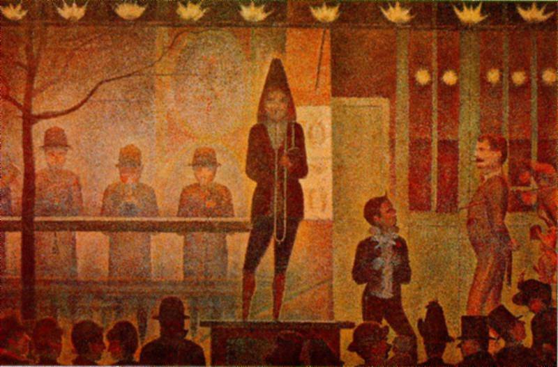
little thing with bounce. Seurat worked with Pointillism in a very different way. First, he
didn't really paint complete circles but rather used short brush strokes. Secondly, he was
very aware of the edges between things. He defines form while also diffusing it, which
I do, but he has a much harder edge. The daylight paintings like A Sunday on the
Grande Jatte retain a softness because of the light quality and a rather tender manner
of applying the paint. His night paintings like The Side Show or the painting The Circus
tend to have harsh light and the paint application is different, more graphic, I think. My
work usually isn't so hard-edged, more concerned with paint handling than tight form.
Tenderness really comes through in his drawings, a quality perceived by art critic
Michael Kimmelman. At a lecture at the Memorial Art Gallery in Rochester, I asked
him what art moves him the most and he said Seurat's drawings, the "why" we didn't get to.
The drawings have the feeling of a photograph, not at all in the amount of detailed
description but in the feeling of a moment in time, a concept true to the origins of
Impressionism. Their tonality and softness captures this to more of a degree than his work
in color. I think my September self-portrait depicting myself as shadow is similar in intent.
It is not always easy to discern the subtler qualities between oneself and others, not just in
art, but it is important in defining oneself. "She paints with dots" is about as informative
about what I do as "she is a basketball player" is to conveying who a person is. Trying to
convey what I do in words is so difficult that it takes weeks of circling around it
in this blog to come close. Sometimes I think I should just post the pictures.