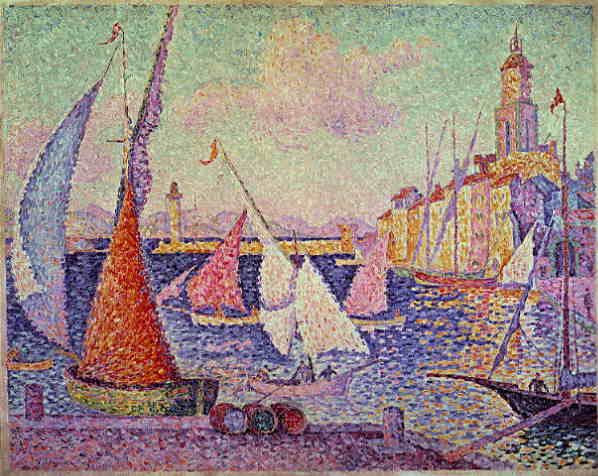
12" x 9" oil on panel

This is an art archive by Nicole Maynard from 2005 until Jan. 2017. For recent work, go to nicolemaynard.studio Images may only be used with permission from the artist.


Summer #8 The Yellow House, 17" x 21", oil canvas, 2010
This week's post focuses on landscape painter Rackstraw Downes. He's very different from me but he's good. I became aware of his work in 1992. This month while watching my niece and nephews in Ridgefield, Connecticut, I was able to trade off with my husband to run to the Aldrich Museum of Art, conveniently located in the same town. An intimate exhibit of Downes' paintings, drawings, and sketchbooks in cases awaited. [Two other Rackstraw Downes' exhibits are concurrently on view at the Parrish Art Museum in Southampton, New York and at the Betty Cunningham Gallery in Chelsea.]
You must click on these links to see examples of his work to follow along.
The paintings are panoramic views of the underneath of the Westside Highway painted from direct observation in 2008-2009. Downes says he likes to be left alone to paint so if you see him, just keep walking. In a sketchbook, Downes writes that he gets annoyed with the changing weather. Light effects everything, after all. Downes isn't after an amplified, enveloping view like I do. He wants to see everything, to put it all into form. He wants to take it all in, process it, be present in it. In doing this he makes use of perspective: arcs and vectors structure the deep space, constructing the construction of the underpass. The horizon is stretched. I look to the left, straight, and right, seeing the other end in peripheral vision. There is a turn of the head in the gaze; the painting demands a slow scan (and then more of your attention). Bikers are painted as whole people, not shirts and pants painted separately. I couldn't care less about painting cars, but it matters to Downes and he makes me look. They aren't as dreamy as my visions, but they are still a dream as the picture is artifice. An angled stop sign becomes oval, striped like a buoy. Bike wheels function like the circles of barbed wire painted in another area. There is a glimpse of a building between trees, a poetic bit of painting; it's all poetry despite being concrete. In fact, he paints pictures of concrete.
Many painters ascribe to this kind of description, a factual world to ground us. What makes Rackstraw Downes more than amateurs who don't paint as well as they think they do? It has to do with the degree of perception, care, patience, skill in translating sight into paint, experience, and discipline.
I have some thoughts on what he does. Change of color temperature and light gives form and distinction to each piece. Orange, plastic construction fence is woven with the spaces in between its holes. The degree of thickness of paint is important - too thin, it would most likely be too dry, less personal, while too thick it would get clogged, loose a degree of legibility that is so much a part of his clear vision.
Treetops are made of small pieces like Vuillard but not as regular a pattern. They are fuller but sometimes fall flat, seemingly intentional. There is more space, more of a rustle, than in Vuillard. Again, as seen in Vuillard and positively delicious to painters, are shiny horizontal colored stripes with lines oily, like I like. There are also light, thin lines defining sections and what's between, simultaneously views and pieces of paint, many of which could be paintings on their own, if larger. I see the framing of spaces between sections of trees and leaves, made central in my hands, in my paintings.
As for the drawings, they are pinned to the walls, unframed. I've drifted away from frames and this is another professional example. Pieces of paper are taped together to make a longer drawing surface for the panoramas. Squiggly fibers in the paper remind one of the leaves in the paintings.
I couldn't stop looking; the pictures are full. My dots are here to fill you.

Spring Landscape #19 Sky 12" x 12", oil on canvas

Spring Landscape #20 Buds 12" x 12", oil on panel

Spring Landscape #21 Green and Pink Trees 12" x 12", oil on panel
On June 1st, 2010, The Guggenheim Museum of Art, New York City, will announce the winners of its competition, Contemplating The Void.
Competition Description:
To celebrate the close of the Guggenheim’s 50th Anniversary year, we invite you to create your own dream intervention of the Guggenheim Museum. Now you can take on the same challenge that 200 artists, designers, and architects took on for the exhibition Contemplating the Void: Interventions in the Guggenheim Museum.
Contestants were asked to:
• Your submission can be a hand sketch, a computer rendering, a watercolor, a painting, a photo collage—in other words, any 2-D format that helps communicate your ideas. "
These ideas were then uploaded to flickr, where they are still on view.
I saw in person the actual exhibit at the museum which was the spring board for the on-line contest. It was like seeing professionals doing an art school assignment,, creative people stretching their imaginations to solve the same problem uniquely. Some filled the center of the museum with trees, chocolate, a butterfly garden, gay pride stripes, laundry on a clothesline, glitter, and an inverted spiral. It epitomized the brainstorming necessary in any creative endeavor.
My creative endeavors this week include the use of the center spatially, though not in any way involving the Guggenheim or its architect, Frank Lloyd Wright. #19 and #21 are squares with circular compositions. #19 is about the sky filling the void, the space framed by a circlet of trees and leaves. The green dots get smaller towards the center, pulling you up, while the blue central dots are somewhere in between, ambiguously falling or rising. The sky is a solid but thinner. It holds promise.
#21 appears to people differently. My husband thinks it looks like a pink moon through the trees. My son says it is like looking up through a tunnel at the them, "Cool!". I made it by looking through my hand like it was a telescope at the trees across the street, one of which is a pink magnolia. Pink, a type of red, complements the green and is echoed by the red-brown, large dots in the foreground. The dots are like the tiles of a mosaic or the sections of glass in a rose window. The paint is velvety, something the those media are not. It is like a kaleidoscopic mandala, having motion while mandalas are still. Similar to a mandala, however, I think the image invites meditation, daydreaming and glazing over. A friend suggested they look like the images used to check color blindness. They do resemble them in their construction, their elements, but the paintings are obviously much more.
#20 is left out of this conversation. It sits vertically, angular, with dots rebelling, buoyantly asserting their individuality. I like that.

12" x 9"
oil on panel
Hi. It is time for a new self-portrait. I don't have a time-frame in mind for how often to make them, but time is marching on so Carpe Diem.
My face is not fractured as in previous paintings. Fracture/facture. The facture of a self-portrait is often more noticeable in ones that are fractured, when pieces of paint are laid to denote the framework of a head, related to the planes of Cubism. Cezanne, who came before Cubism, studied such planes in space but was also sensitive to color as form rather than decoration, frosting on a cake. [I love making sentences with "Cubism" and "cake frosting" in them.] In Self-Portrait with Rose Background [c. 1875 (140 Kb); Oil on canvas, 66 x 55 cm (26 x 21 5/8")], he defines the facets of his head with pieces of paint and even turns one such stroke into his delicate lower eyelid, the pedestal for his piercing gaze. He is as intense as the red-rose background. It swirls, breaks into his form, defining his ear, the space between his beard and moustache, his lips, and even cuts into his neck threatening decapitation like Nearly Headless Nick from Harry Potter. He plays a similar game with the background and figure interacting in his Self-Portrait 1878-80 [(160 Kb); Oil on canvas, 60.3 x 46.9 cm (23 3/4 x 18 1/2 in); The Phillips Collection, Washington, D.C.] He is supposed to have been a quiet person and I've noticed his mouth is often obscured in his self-portraits while his eyes are very alert. His voice is his vision. The mouth in this gets lost in his beard of yellow ochre and greens with black marks, exactly like the background. His hairline continues in the sharp line of his collar, accentuating his vertical, solid presence. The word for his stare that keeps coming to me is "shrewd". Even a used car salesman would back down.
Now back to me. I don't want it to be all about me, but it is self-portraits we are talking about and they are reflexive in nature. I'm not looking shrewd. I can't say no to Girl Scouts selling cookies, but I am old enough to see a scam despite the clarity of my face. Landscape colors are the background with dots like my current paintings. They visually interplay with the blue circles of my collar and eye; this is what I see. A patch of purple background is the springboard for the purple turn of the collar; its blue is the mixture of the landscape yellow and green, completing the land with sky, blue hollow circles make for white cloud centers. The curl of my hair and its red highlights (not natural : ) suggest playfulness, very different than Cezanne's brewing. You can check out my blog of archives for my own brewing Self-Portrait With Gloved Hand from 1999. Both Cezanne paintings and the Degas Self-Portrait in the Getty Museum that I haven't forgotten (I saw it more than ten years ago) are in three quarter view, as is mine. Answers.com defines three-quarter view as, "A view of an object which is midway between a front and a side view." We don't disclose all but you get a good look. Speaking of museums, art museum lovers will get a laugh from this article in The Onion. Take time to play.