Showing posts with label drawings. Show all posts

Sunday, May 08, 2011

Rusty & Biscuit on a Walk, The Neighborhood Out the Window


Rusty and Biscuit On a Walk 8"x 6", pencil on paper


The Neighborhood Out the Window, 12" x 14", oil pastel on black paper

The Public Radio International podcast, To the Best of Our Knowledge, called "Creative Pairs" (March 27, 2011) is fascinating. It's description is as follows:

"Joshua Wolf Shenk has written a detailed analysis of the working relationship between the prolific and influential songwriting duo, John Lennon and Paul McCartney. Lan Samantha Chang's novel follows the lives of students and one particular professor in a creative writing program in the Midwest. Joelle Biele describes what happened to Elizabeth Bishop's poems when they were submitted to The New Yorker. Ben Folds joined forces with Nick Hornby and collaborated on an album called Lonely Avenue."

The part featuring Lan Samantha Chang, the Director of the Iowa Writers' Workshop and author of All is Forgotten, Nothing is Lost has a couple quotes about studying writing (you can substitute "art") and entering it into the world. I've been doing a lot of writing lately so that added another dimension for me. She spoke with Steve Paulson who asked her if writing can be taught. Here's what she said:

"I think that talent cannot be taught. It can be encouraged. I don't think it's possible to bring everyone up to the same level of accomplishment. But I do think it's possible for a teacher to encourage students to do much, much better in a shorter amount of time than they would have if they hadn't studied."

"An artist's life is full of rejection and there is no way to get around it. I think that back in the day when this story is set it was par for the course that teachers would do some of the rejecting."

I've been through a rigorous MFA program, have won awards, exhibited in juried shows but I've also had plenty of rejection. I know the graduate school experience did for me just what Chang describes. Teachers do push your back to the wall, make you turn yourself inside out in order to find the place from which to make art with integrity. The critic/teachers can smell a bullshitter a mile away. I've been writing a lot lately and it's funny because my MFA is in painting but I'm crossing into an area in which I'm almost self-taught. I will reach out to others who have experience in writing and in that way receive some of the mentoring teachers provide but I'm sure it won't be the same as a graduate school critique. Brutal honesty isn't typically socially acceptable.

The two pictures I'm posting this week are a kind of mapping, trying to find one's way. There's a sense of feeling along not just seeing; forms aren't fully planted. The same place will look the same and different tomorrow. Honesty accepts doubt and flux. Stepping out of one's usual areas of strength really underscores uncertainty and change. We'll see what's around the corner and I might stop to hug my dogs on the way.

Sunday, May 30, 2010

Spring Landscapes #22, #23, #24 Farms & Windmill


Spring Landscape #22 Windmill, 24" x 18", oil on panel


Spring Landscape #23 Farm, 18" x 24", oil on panel


Spring Landscape #24 Land, Cloud, Trees, 18" x 24" oil on panel


The top three images are done on an iPad with the Brushes application. I consider them art but also wanted to do the ideas in oil, which is different. The color in Spring Landscape #24 Land, Cloud, Trees isn't right but it was the best I could capture and rework in iphoto; don't know why. The bottom half should be more luminous and the top half less bright. The iPad pictures translate perfectly, as is the nature of the beast, in this case the screen. The iPad pics were done in the car while passing these views. Sketchbooks are getting very sophisticated. I find the digital images are subtly changing my painting sensibility. The iPad work is less dense, not being bound to a material form in the same way as a painting. It's color and light differs from the observable world and as well as the painted one. Some people may prefer it. I don't but I confess that I like it just as much. [audible gasp from a good percentage of painters] I feel the need to say over and over that there is nothing like painting but I really LIKE this. Maybe because it is also painting just as making marks in the sand with a stick is drawing; no artist would argue that it isn't. Look at how artist Andy Goldsworthy draws. [Looking at his stick sculpture on site with a circular opening framing the landscape I think that maybe he's better at doing what I'm trying to express. Maybe we're just on the same wavelength and he has his methods and I have mine. See similarities in last week's post.] If drawing can happen with any material then digital drawing shouldn't be inferior. The material doesn't make for greatness, however, as a stick of charcoal makes drawings in a wide range of quality depending on the person holding it.

Onto a discussion about the work. It is too much for me to talk about all three images because I need to spend more time in the studio than on this blog. I enjoy the scale and pattern and exuberance in these. I'd like to focus on Spring Landscape #22 Windmill. The hill looks like the earth/globe. The painting is a positive picture of renewable energy. The depiction shows wind energy is far-reaching, energizing the atmosphere as well as the surrounding air. A thin cloud acts as an extension of on of the windmill's blades. Space is arching. The analogous color scheme of blue/green/yellow and flowing lines help to create a feeling of harmony. Windmills aren't a source of harmonic discussion, however. A wind farm proposal for perhaps what would be the largest in the world, is on the table for Cape Cod, close to where I live in Rhode Island. The controversy involves the trade offs for clean, renewable energy including concerns for wildlife, marine life, land rights, decreased property values, and of particular interest to me, aesthetics. I LOVE how these turbines look. They are sleek and elegant like Brancusi's polished brass Bird in Space. Van Gogh loved windmills as did Rembrandt before him. They not only accepted this "modern" addition to the landscape but found poetry in its structure. Maybe people see them as vertical obstructions in a horizontal ocean view or a sign of contemporary life encroaching on nature. Nature is at stake and while I'm not qualified to lecture on the negative effects of windmills to the immediate surrounding area vs. their benefit to our environment globally, (a great site for this is the American Wind Energy Association) I have looked at both sides of the argument and firmly believe they are for the greater good. If you are on the fence and the main issue for you is aesthetics, this art chick says to get over it.

Sunday, April 18, 2010

Drawings and Economic Events

March 16 2010 ink 6"x6"


Woods Inspired By Jake Berthot 12x9 pencil


Woods Across the Street 18x12 colored pencil


Woods and Window 12x18 charcoal on paper


Sunset 9x12 colored pencil


Sunset Snow 12x9 colored pencil


February Trees 12x9 ink


February 12th 12x9 pencil


This is a techi week for me. I set up accounts on Twitter and YouTube:follow Art Weekly on Twitter: Art_WeeklyNM.
My YouTube channel where I uploaded three videos this week is under tofupoweredartchick.

**************
Three recent events, not all negative, reflect the effects of the economy on the arts:

Art school friends told me the Nielsen Gallery in Boston is closing. There's a post about it on the blog Gregcookland.com. I left a comment. The gallery represents many painters whom I love including Jake Berthot, who I have written about before. Now open by appointment only, I rue not being able to see exhibitions by their artists. Berthot's Untitled (3475), graphite from 2008 shows a mapping of light and form, vectors visible as thin lines structuring the drawing. It is truly amazing and shows an depth of concentrated looking rarely seen in art. Patches of light coming down through leaves and branches are subtly integrated with the rest of the environment. If the number 3475 is the number of untitled pieces he has made, it is a sign of someone who has put in their time.

Dennis Kois, the new director of the Decordova Sculpture Park and Museum in Lincoln, Massachusetts, has gotten the museum into the black, raising one million dollars. At first the decision to return twenty-five sculptures on loan seemed dismaying. I am reassured to learn it un-clutters the thirty-five acre grounds, making it easier to see the work as well as making room for the acquisition of two new works.

This week the Ford Foundation announced it is donating ONE HUNDRED MILLION dollars to renovate art spaces and fund art projects in culturally diverse spaces (see the article in The Huffington Post. YAY!!! I almost couldn't believe it. It is not unlike Providence, RI's commitment to the arts and belief in art's ability to revitalize communities. Art centers, studios, and events bring new residents and foot traffic with businesses such as restaurants and stores not far behind. Providence is called "The Creative Capital".

I hope you enjoy the drawings this week. Drawing is the beginning of many artistic ideas, immediate and direct visual thinking. It can also be an end in itself. It is still important.

Speaking of important art, blogger Amy Cook sent me this:

100 Awe-Inspiring Artists You Should Follow On Twitterhttp://graphicdesigndegrees.org/100-awe-inspiring-artists-you-should-follow-on-twitter/ .

Sunday, November 08, 2009

Fall #9 Gray Sky


8x8
oil on canvas

In this painting I wanted to convey the dense fall treetops outside my studio window,
the muted, bluish trees on the horizon, and the particular gray of the sky that day. It
was a purplish haze, complementing the warm, mainly yellow middle ground. It is a quiet
little thing with bounce. Seurat worked with Pointillism in a very different way. First, he
didn't really paint complete circles but rather used short brush strokes. Secondly, he was
very aware of the edges between things. He defines form while also diffusing it, which
I do, but he has a much harder edge. The daylight paintings like A Sunday on the
Grande Jatte retain a softness because of the light quality and a rather tender manner
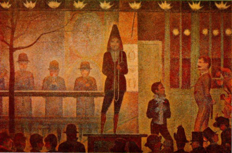
of applying the paint. His night paintings like The Side Show or the painting The Circus
tend to have harsh light and the paint application is different, more graphic, I think. My
work usually isn't so hard-edged, more concerned with paint handling than tight form.
Tenderness really comes through in his drawings, a quality perceived by art critic
Michael Kimmelman. At a lecture at the Memorial Art Gallery in Rochester, I asked
him what art moves him the most and he said Seurat's drawings, the "why" we didn't get to.
The drawings have the feeling of a photograph, not at all in the amount of detailed
description but in the feeling of a moment in time, a concept true to the origins of
Impressionism. Their tonality and softness captures this to more of a degree than his work
in color. I think my September self-portrait depicting myself as shadow is similar in intent.
It is not always easy to discern the subtler qualities between oneself and others, not just in
art, but it is important in defining oneself. "She paints with dots" is about as informative
about what I do as "she is a basketball player" is to conveying who a person is. Trying to
convey what I do in words is so difficult that it takes weeks of circling around it
in this blog to come close. Sometimes I think I should just post the pictures.