Sunday, August 14, 2011
Sunday, July 03, 2011
Sunday, October 04, 2009
Self-Portrait 9 2009 #1


Sunday, June 28, 2009
Spring #11 May Field

Sunday, March 01, 2009
Winter Landscape #7, Sledding Hill and Beautiful Rochester Gray

24" x 18" and 8" x 10"
oil on panel
I heard someone say while looking at the Vermeer's View of Delft in the expansive exhibition at the National Gallery (11/1995 - 2/1996) artists must want to throw down their brushes when they see the accomplishment of this painting. I say we all have our own song to sing and painter/educator Robert Slutsky told me, "Those times are gone." He didn't mean that it is impossible to achieve excellence anymore, rather that the path to that excellence doesn't lie in a mirroring of past approaches.
I think what makes the View of Delft astonishing is its state of heightened awareness. The vision is hyper-real, conveying an acutely awakened state sensitive to the world. Seeing the real thing forces one's eyes to open widely like after being pinched. It is sad if you glance at the painting and seeing an old Dutch town, continue on, bored and indifferent. Don't do that! I got so worked up when two women walked by a small Rembrandt self-portrait (etching) that I told them to go back to see what they missed.
Notes on my work:
The top is another painting inspired by sledding. It is a clear winter day as opposed to the painting below. It has a deeper space than some of my other work and I got a bit obsessed with it, working the idea with a few watercolors in addition to this oil painting. I like the contrast between the treatment of the cloud and snow; although both white, they each feel like what they are. The loose handling of the trees convey their essence without getting caught in minutia.
Most people groan when talking about the cloudy, gray skies of Rochester, especially the natives. This painting focuses on the beauty of the grays which vary so much in weather conditions and offer endless possibilities. The title frames the idea as do the black edges.
The Wikipedia article on Vermeer says that he continued to use expensive paint through a financial crisis in Holland due to the support of a patron. Artists will have to find ways to continue in our times; here is a great article in Newsweek by Peter Plagen about where the art world has been and where it is now during the recession:
http://www.newsweek.com/id/185786/page/1
Sunday, January 18, 2009
Three Winter Watercolors


Sunday, January 11, 2009
Homage to Painting

oil on panel
20" x 16"
I saw some of my favorite paintings while walking through the permanent collection at the MOMA. Rothko, Agnes Martin, Lee Krasner; they're all so good. The paintings are made of color and light and create respite. On the edgier side there is DeKooning's Woman I, ferocious and so strong. I love Pollock's Gothic, especially his blue. Whatever is being expressed in an artwork, I respond mostly to art that is intense, like these. I want to see life squeezed into the canvas.
Homage to Painting came out of this museum experience (museums are NOT boring!). I had the impulse to lay flowers in front of the paintings, as I am so appreciative of the life lived, the achievement, the art that is passed on. The pictures are living testimonies to the artists who made them. The light and hope that emanates from them reminds me of the white paper of
Schindler's List that held the names of the people he was trying to save. The paintings save me.
Sunday, December 21, 2008
Pink Rectangle Landscape

Sunday, December 14, 2008
Late Fall
oil on canvas
36" x 42"
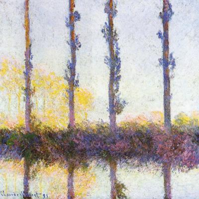
The column filled with gumball-like multi-colored dots gets narrower on top, channeling movement. Optics are a big part of the painting, and I was inspired by an artist once criticized as being a big eye because of his almost scientific approach to color and light. Monet's poplar trees, came to mind to solve the compositional problem of tree trunks amidst leaves. The four vertical streaks of brown/maroon dots add another structural element, in harmony with the three main vertical sections of the painting. Despite the formalities, Monet's paintings aren't cool and unemotional, and neither are mine.
Two black rectangles are like black velvet curtains drawing back to reveal the magical center stage (as close to painting on velvet as I will ever get). They also can be seen as pressing on the center strip, like shorter days in winter and the down turn of the news vs. optimism. I resist letting the dark news be the focal point. I prefer to stay in the frame of mind (I love the at phrase, "frame of mind", like your thoughts fit in a frame, which mine can do, and then there is thinking outside the frame/box...) that Barrack Obama eloquently presented in his acceptance speech as President Elect, "While we breathe we hope." Those dots move as though effervescent, breathing, whimsically bubbling upward. There is blue-sky air, a purple tonality to the bottom, and a golden tonality in the center. The black is not flatly painted but has texture, and colors from underneath richly peak through, signs that it is permeable, vulnerable.
Sunday, December 07, 2008
Yellow Sky
20" x 16"
The tropical feel and the red tree remind me of Gauguin. I love his Where do We Come From? What are we? Where are we going? masterpiece at the MFA Boston. He uses rich colors, sometimes bright. I think the sky and the sea in my painting feel somewhat translucent, a luminous blue with orange, the leaves airy, not stiff. Although the geometry is very rectilinear, it breathes. I like the suggestion of leaves on the dark tree on the left. That little triangle has gray marks that hint at what is on the other side, a defining limb curves, echoing the base of the tree. Such subtleties contribute to the impact of the image as a whole, but if a viewer lingers, they are there to be noticed.
Painting provides respite to maker and viewer. The artist is in the unique position of being both. I want to treat myself. I want to see color, space, and light hit my retina. I want to bask in these things.
Sunday, October 05, 2008
Fall II
Saturday, August 23, 2008
The Green Has It

Sunday, June 29, 2008
Burnt Orange Square
14" x 14"oil on canvas
I painted over an older painting and the (color of the) frame is now a part of the art work. It is a very physical thing, painting-as-object, in addition to the burnt orange square feeling dense like a Richard Serra paintstick piece or sculpture. It is some kind of hybrid of Serra, O'Keefe adobe houses and Josef Albers. The blue in the gray is complementary to the orange, but it isn't a picture about transparency like the Albers painting in the previous link. It's a tough painting, a Tae-Bo kick painting, not a Celine Dion painting. I don't usually paint this way, but here it is. Perhaps painting over an older piece made me think more about the physicality of the thing, the work as artifact.
Sunday, May 04, 2008
Spring Sublimation
18" x 24"oil on panel
"Measured objectively, what a man can wrest from Truth by passionate striving is utterly infinitesimal. But the striving frees us from the bonds of the self and makes us comrades of those who are the best and the greatest. " - Albert Einstein
I'm always looking for motivators. I mean, I am self-motivated, but even so it is good to get external reinforcement that I'm not wasting my time trying when it sometimes seems futile. It's kind of like looking for the cups of water and orange slices from people when running a marathon.
I painted over another painting to make this one. It is a put-the-past-behind kind of thing which accompanied my spring cleaning and multiple trips to the Volunteers of America. Roberta Smith wrote an article in The New York Times recently about how there seems to be a new trend in painting of working small, as opposed to the large works of the Abstract-Expressionists. She suggests it relates to the economy. It is a kind of simplification, reduction. The short but brilliantly succinct film, The Story of Stuff shows the current state of world affairs better than anything I've come across. My nine-year-old was able to grasp the problems that elude much of society because of its straightforward and appeal graphics. I didn't want to watch it at first, but was glad I did. I think it definitely relates to my art and why I'm making it the way I am.
As far as this particular work, there is a lot of texture visible in this photo of it, but in person the center square seems to hover and seems to be able to go in front as well as behind the green. I'm obsessed with green. Plants are supposed to relax people. The expansive green fields and luminous blue skies of Western New York helped to inspire this picture.