

This is an art archive by Nicole Maynard from 2005 until Jan. 2017. For recent work, go to nicolemaynard.studio Images may only be used with permission from the artist.
Showing posts with label minimalism. Show all posts
Showing posts with label minimalism. Show all posts
Sunday, August 07, 2011

Sunday, July 31, 2011

Sunday, April 17, 2011
Night

12" x 9"oil on panel 2010-2011
I wasn't fully satisfied with this painting, Yellow Sun that I did in early 2010:
Sunday, January 16, 2011
Two Oil Pastels
Red-Violet Maple, 18" x 15", oil on canvas

Maple, Purple, Green, 18" x 12", oil pastel on black paper

Night Maple, 18" x 12", oil pastel on black paper
Hip Hop artist Jay Z spun his song Hard Knock Life from Charles Strouse's It's a Hard Knock Life written for the musical Annie (Strouse says he was flattered). Jay Z was attracted to the lyrics because of the grit; he liked that it showed how it really is for some kids.
These works of mine have grit, an edge. They aren't pastoral. They have expressive marks and are skeletal, a builder's framing of a tree.
The bare canvas lights the form of the tree in Red-Violet Maple. The black paper provides atmosphere for Maple, Purple, Green and Night Maple. Their limited palette shows restraint, minimalism in service to form.
I love drawing in color. Here I wasn't willing to totally abandon it; I still wanted it for feeling. I draw with color when I use the iPad. It is some kind of drawing/painting hybrid just like pastels. I also love Hard Knock Life and hip hop dancing even though I'm a generally quiet white girl (o.k., it's been a long time since I've been a girl). The images are hybrids of my internal quiet and energy, strong from years of abrasive grit.
Friday, December 24, 2010
iPad Advent Calendar!
 Play
PlayCheck in daily to Art Weekly for an iPad Advent Calendar! Each post will feature one or more of my artworks done on the iPad using the apps Brushes, Sketchbook Pro, Inspire Pro, Art Studio, or Type Drawing.
Wednesday, December 22, 2010
iPad Advent Calendar!

Circle and Dots Green and Black
Check in daily to Art Weekly for an iPad Advent Calendar! Each post will feature one or more of my artworks done on the iPad using the apps Brushes, Sketchbook Pro, Inspire Pro, Art Studio, or Type Drawing.
Tuesday, December 21, 2010
iPad Advent Calendar!

Red Rectangle Blue Circle
Check in daily to Art Weekly for an iPad Advent Calendar! Each post will feature one or more of my artworks done on the iPad using the apps Brushes, Sketchbook Pro, Inspire Pro, Art Studio, or Type Drawing.
Tuesday, December 14, 2010
iPad Advent Calendar!


Black with Circles Series and Spiral Stones
Check in daily to Art Weekly for an iPad Advent Calendar! Each post will feature one or more of my artworks done on the iPad using the apps Brushes, Sketchbook Pro, Inspire Pro, Art Studio, or Type Drawing.
Monday, December 06, 2010
iPad Advent Calendar!

Iron Grid

Arch

Orange-Yellow in the Middle
Check in daily to Art Weekly for an iPad Advent Calendar! Each post will feature one or more of my artworks done on the iPad using the apps Brushes, Sketchbook Pro, Inspire Pro, Art Studio, or Type Drawing.
Sunday, January 17, 2010
Looking Up

12" x 12" oil on panel
Oil paint! There's nothing like it. I couldn't have more pleasure eating an ice cream sundae. Amidst all the boxes from our January third move to Rhode Island I stole a small amount of time to break in my new studio. It is very modest, a third bedroom, compared to my former dream studio, but the press and flat files fit in the basement and we'll be setting up a small shed for the kiln.
Pressed for time, I made a picture as if I could only paint one dot and had to get everything I wanted to say into it, distilled like a haiku. The picture relates to other "minimalist" works I've done as well as a painting I did in 2005 called The Veil. The image came to me while watching Shaun the Sheep Off the Baa with my son. No kidding, the claymation cartoon by Aardman Animations. It is set on a farm so the setting is pastoral. There was a shot of Shaun looking up from a pit or something; I don't quite recall the scenario. My husband thought of artist Andy Goldsworthy (he makes art out of nature while in nature, stunning, check him out) when he saw it. Funny, I looked at the cover of my book of his work in passing as I unpacked it, finding it too large to fit on my bookshelf. It is perhaps an unconscious influence but there is definitely a relationship.


The view is from underground looking up at the sky. There's a little Alice in Wonderland to it, a surreal journey from one place to another that is unknown. It is definitely about my move. You can never quite know exactly what it will be like until you get there. The brown vortex suggests climbing through an earthy, murky tunnel with eyes set on getting out. The central focus is air, breathe-ability. My family has been looking forward to much shorter work hours for my husband, friends in the neighborhood for my son, and an art community for me. The goal is more breathe-ability and already we've experienced a significant difference. For the first time in our eighteen-year relationship my husband has been home for breakfast and dinner every day. My son has plans to see three friends outside of school this week, and I've had a close artist friend from college over and will be getting together with three others shortly.
Back to the painting, the lighter and warmer brown towards the cooler brown/black surrounding the center is a transitional space. It isn't static but propellant. It also isn't negative like solid, flat black but like fertile soil, implying growth through change. It isn't a smooth transition, however, and one could imagine it being a bit slippery, something one has to slug oneself through in order to make it, similar to climbing a rope but messier. The view is also telescopic, the blue circle like a planet, a new world for which there is little detail, little information except something placid, pleasant, promising. I think everyone needs to carve out a space in their days, their lives to have such a place.
Sunday, March 08, 2009
Window (Late Fall)

oil on panel
24" x 18"
I recently commented on Vermeer's View of Delft. Another thing, among many, I like about his paintings are the way he treated windows and light. He painted many domestic interiors including solitary women. The window is secondary to the figure, but it is the source of the beautiful light that tenderly illuminates the woman. Unlike Renoir who portrays women as ornamental (basically the only thing I like of his are the peaches which are as boobilicious as his nudes but not offensive to the feminist), it seems that Vermeer respected women. It is the difference between the derogatory term "soccer mom" and mentioning Michelle Obama's name.


This issue concerns me as a mother who is very domestic, shuffling between the studio and kitchen. I love both and don't like my mother/wife role to be dismissed as lesser than my husband's as breadwinner. In this context my vocation as an artist sometimes is perceived as a hobby, especially if the conversation turns to sales and other marketplace-based evaluation. Luckily it doesn't seem to happen as often as it used. Enough venting, I'll leave the rest to Whitney Chadwick who addresses gender roles and societal views in her book, Women, Art, and Society. To be fair, I've heard a musician say that people equate his profession with unemployment and an actor in New York City with waiting tables.
On the male experience of the home and workplace, I found out about an early telecommuter before the "tele". 2009 is the bicentennial of the birthday of Charles Darwin. A recent BBC program, In Our Time with Melvyn Bragg, focused on Darwin's domesticity. He lived in the country with his wife and children in a home where he based his laboratory and garden used for his experiments. Apparently this quiet setting and family support fostered his studies.
Domesticity is the back story to Window (Late Fall), another view from my bathroom window. The landscape, this rectangle, glows. It is like stained glass when fully illuminated by the brightest day. The landscape is far, based on its scale, but then it overtakes you as it presses forward into your space before receding again. The landscape is burned into my retina, seen in quiet moments between the laundry.
Sunday, February 22, 2009
View from the Bathroom Window

12" x 12"
oil on panel
Art and the changes in the economy is addressed in a February 12th article by Holland Cotter in the NY Times, "The Boom is Over. Long Live the Art!" Cotter suggests that art often gets better when artists are left to do it for the sake of doing it, removed from any market driven pressures. He advises artists in this financial climate not to quit their day jobs.
I remember a children's book which exemplifies art's true value in society. Frederick is about a mouse who is a dreamer while all the other mice are working to prepare for winter. In the story (spoiler : ) Fredrick is able to tell stories of all he saw and imagined to the other mice while they were waiting for winter to end. While they were storing up provisions, he was immersing his senses, saving them for this collective sharing. I loved this book as a child and remember the colorful illustrations, often with round elements.
My paintings are bits of color and sensation stored up from the observed. Although I make them year-round, the ones made in winter are very much in keeping with the spirit of the book.
Notes on this painting:
It was done from the memory of looking out my bathroom window. The bright blues at the bottom were the color of the shadow of the house, the pale pinks, blues, and whites were the sparkling snow, and the top is the colors of the bare trees as well as some sky. I hope it buoy's you up while you wait for spring.
Sunday, January 11, 2009
Homage to Painting

oil on panel
20" x 16"
I saw some of my favorite paintings while walking through the permanent collection at the MOMA. Rothko, Agnes Martin, Lee Krasner; they're all so good. The paintings are made of color and light and create respite. On the edgier side there is DeKooning's Woman I, ferocious and so strong. I love Pollock's Gothic, especially his blue. Whatever is being expressed in an artwork, I respond mostly to art that is intense, like these. I want to see life squeezed into the canvas.
Homage to Painting came out of this museum experience (museums are NOT boring!). I had the impulse to lay flowers in front of the paintings, as I am so appreciative of the life lived, the achievement, the art that is passed on. The pictures are living testimonies to the artists who made them. The light and hope that emanates from them reminds me of the white paper of
Schindler's List that held the names of the people he was trying to save. The paintings save me.
Sunday, December 21, 2008
Pink Rectangle Landscape


24" x 18"
oil on panel
You may not think of driving a car when you look at this picture, yet it is influenced by the view I have as a motorist (other influences are the structures of windows and the theatre stage). I spend a lot of time driving through pastoral landscape. The road or highway cuts the the landscape centrally in my line of sight, as in a one-point perspective drawing. While I don't often paint that convergence but rather square it off, the middle remains, flanked by opposing elements. Just as one gets very set in the way one parts one's hair, I find myself drawn to do this repeatedly now; it is cemented in my brain and the picture doesn't look right and is unsatisfying otherwise. It is still too new to be a bad habit in need of breaking (besides, you try to change the way you part your hair). I think it is more a "given" and the experimentation will spring off of it, just as many modern artists used the grid (nifty link, by the way). I am very attracted to the way the central rectangle in this and most of my pictures with this composition can advance or recede. There is something important about the viewing experience of that shift. I think the painting pulses. A warm painting with golden monoliths, it affirms something unnameable but not unknowable.
Sunday, December 14, 2008
Late Fall

oil on canvas
36" x 42"
The column filled with gumball-like multi-colored dots gets narrower on top, channeling movement. Optics are a big part of the painting, and I was inspired by an artist once criticized as being a big eye because of his almost scientific approach to color and light. Monet's poplar trees, came to mind to solve the compositional problem of tree trunks amidst leaves. The four vertical streaks of brown/maroon dots add another structural element, in harmony with the three main vertical sections of the painting. Despite the formalities, Monet's paintings aren't cool and unemotional, and neither are mine.
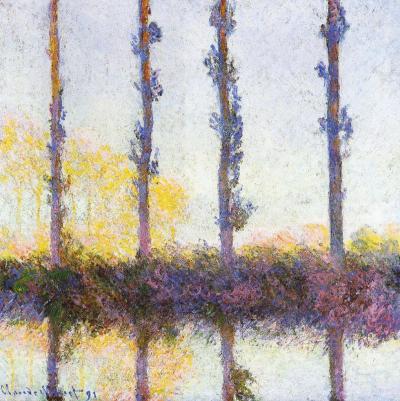
Two black rectangles are like black velvet curtains drawing back to reveal the magical center stage (as close to painting on velvet as I will ever get). They also can be seen as pressing on the center strip, like shorter days in winter and the down turn of the news vs. optimism. I resist letting the dark news be the focal point. I prefer to stay in the frame of mind (I love the at phrase, "frame of mind", like your thoughts fit in a frame, which mine can do, and then there is thinking outside the frame/box...) that Barrack Obama eloquently presented in his acceptance speech as President Elect, "While we breathe we hope." Those dots move as though effervescent, breathing, whimsically bubbling upward. There is blue-sky air, a purple tonality to the bottom, and a golden tonality in the center. The black is not flatly painted but has texture, and colors from underneath richly peak through, signs that it is permeable, vulnerable.
Sunday, September 14, 2008
Watercolors!


5" x 8"
Moleskin watercolor book
I am enjoying working in this Moleskin watercolor book. My son didn't go to camp very much this summer and we took a lot of vacations, so the ability to paint as increments of time open up to me is wonderful. The travel watercolor set and book stay close to me, even now that the trips are over. I need to think in color; a single pencil isn't enough for the kind of painting I am working on. Sometimes pencil makes it into the watercolors, though, like in the first three here. It is used to sharpen, delineate form, and add texture.
The first image is about a framed, fluid space. The second is like a landscape of choppy waters or those waters can be read as grass. The horizontal lines also read as two things: delineations of sky or some kind of telephone lines. The third picture is more about atmosphere/gauze and tangibility. The fourth is a singular, light tree in a landscape. The fifth is effervescent landscape dots. If the latter seems too abstract for you, think of sunspots and vision.
Meanwhile, I'm working on publicity for "Nicole Maynard: Images of Optimism" opening at the Bowery Gallery on October 28th. I just updated my website with revised resume, statement, and portfolio - check it out!
Saturday, August 30, 2008
From the West

24" x 20"
oil on panel
Inspired by my trip to New Mexico this summer, this painting has a lot of the Grand Canyon in it. My family did a small amount of hiking there as well as driving throughout New Mexico and a trip to Mesa Verde. It was my third or fourth trip to New Mexico and I am continually fascinated by the ruins of the Anscestral Puebloans, petroglyphs, and land formations/landscape.
From the West is a dialogue with the personal past (painted over another painting) and its thick texture resulted from this layering as well as through the use of chunky oil sticks. It has a compressed space, as if you are against a canyon wall or zooming close with a camera. The oranges change hue and tone, showing light and shade, defining rugged planes. The green square is not solid, so it comes to the surface and then seems to dwell with the rock, like the plants that grow in the dessert. The green substantiates that life can exist in seemingly inhospitable territory.
Sunday, August 17, 2008
Butterfly Window
 oil on panel
24" x 18"

dry point (for the butterfly book, edition of 10)
The painting came first after a sketch. It is rather Matisse-like, bright, glowing color with black, flatly painted. My friend, the painter, Michelle Albert helped me with the printing technique. She did a bit of work in my studio while visiting me with her husband and daughter. I showed her plexiglass for dry point and basic supplies and she got a little time to herself to putter around. What she came up with surprised me - she spotted Akua-Kolor water based inks on the floor and used them monotype style with the oil based etching ink in the lines. It is always inspiring to see how someone else does something. I couldn't wait to try the technique myself because it is so painterly. To get painterly qualities in my prints I either make monotypes or hand-color etchings later. This was just what I was looking for! Sure enough, the lines were inky black and the areas of color were vibrant but not too flat. Every print I pull is pure joy. They have the feeling of rightness as when a painting comes together.
The black has a transparency to it and the location of the butterfly, either in front of or behind the window, is ambiguous. Maybe it is in the process of bursting through. The butterfly is a tangible, familiar life form, organic in contrast to the stark black and light pink architecture. The painting also has paint applied in washy areas, not completely flat solids, which energize the geometry. The butterflies are like dancers.
Sunday, August 10, 2008
Curtains

oil on panel
24" x 18"
Another form of the square or the box in my work is this curtain. It is essentially a rectangle billowing in the breeze, inspired from a curtain hanging in a door of a stage at the Sterling Renaissance Festival in New York State. While waiting for the acrobat, Daniel, the Duke of Danger (GREAT act, by the way) I became instantly mesmerized by the form. That happens with me - sometimes images come in a flash, either imagined or triggered by something in view. I took out my sketchbook and studied the form in the wind, also intrigued by the darkness behind it. In reality the curtain was patterned, but in my painting I wanted to have it be white (it is white with grays made of green and pink). It retains a carnival feel, and I think I managed to capture the pull it had for me, an archetypal form. My first year of graduate school I painted three pictures of my grandmother hanging the laundry; only one was successful enough to keep. The figure held the ends of a sheet, attaching them to a clothesline. This billowing shape isn't new to me. It is interesting to forget about something and have it return. I look forward to seeing what else I've forgotten.
Sunday, July 27, 2008
New York City Solo Show Dates

 Pink, Green
oil on panel
24" x 24"
"Nicole Maynard: Images of Optimism" runs October 28 - November 22, 2008, at the Bowery Gallery, 530 West 25th Street, 4th floor, NY, NY 10001 646.230.6655. The opening reception will be Saturday, November 1st from 4 - 6 p.m.; the public is invited. A full press release will be posted sometime in September.
"Nicole Maynard: Images of Optimism" runs October 28 - November 22, 2008, at the Bowery Gallery, 530 West 25th Street, 4th floor, NY, NY 10001 646.230.6655. The opening reception will be Saturday, November 1st from 4 - 6 p.m.; the public is invited. A full press release will be posted sometime in September.
I am looking forward to the show. I am still painting towards it and have some ideas which works to put in. I began this blog immediately after my last show, so I have quite a bit of work to choose from. It will mainly be paintings, but I am thinking of showing a folio of small prints (The Butterfly Book) on a pedestal for visitors to handle with gloves like many artists books (check out this on-line collection at Otis College of Art and Design ) are exhibited. I will do the same for a book of watercolors I am working on, if I am happy with it in the end.
I am just glad the show closes after opening night of Harry Potter and the Half-Blood Prince because my husband, son, and I are die-hards. I'm hoping we can see it in IMAX 3D. Taking down isn't as hard as hanging, but it is still quite a job; this will give us something extra to chat about while we spackle.

,+web.jpg)
Subscribe to:
Posts (Atom)