Sunday, January 25, 2009
Winter Landscape #4
Sunday, January 18, 2009
Three Winter Watercolors


Sunday, January 11, 2009
Homage to Painting

oil on panel
20" x 16"
I saw some of my favorite paintings while walking through the permanent collection at the MOMA. Rothko, Agnes Martin, Lee Krasner; they're all so good. The paintings are made of color and light and create respite. On the edgier side there is DeKooning's Woman I, ferocious and so strong. I love Pollock's Gothic, especially his blue. Whatever is being expressed in an artwork, I respond mostly to art that is intense, like these. I want to see life squeezed into the canvas.
Homage to Painting came out of this museum experience (museums are NOT boring!). I had the impulse to lay flowers in front of the paintings, as I am so appreciative of the life lived, the achievement, the art that is passed on. The pictures are living testimonies to the artists who made them. The light and hope that emanates from them reminds me of the white paper of
Schindler's List that held the names of the people he was trying to save. The paintings save me.
Sunday, January 04, 2009
Late Fall 2
More gumballs! Well, they're not really gumballs, but they do make me think of the game of guessing how many jelly beans are in a jar. The dots are compressed toward the picture plane, accentuating the surface of the canvas. The edging on three sides sets them back a bit, setting up a dialogue between in vs. out, the world of circles as opposed to something else.
Dots of fall treetops are layered on the bottom like piles of leaves while the second fourth of the painting shows the darker structure of bare trees. The third fourth is made up of blue and white (falling snow or cool air?), while the upper fourth is an attempt at the many varieties of crystalline blue there are no paints for (sigh). The height of the canvas compared to width is important as the circles are like bubbles. They have a good enough length to travel and convey their effervescence. When looking at the actual painting (I'm not sure it works in the jpeg) one's eyes dilate, getting lost in the movement, stimulated by the bouncing color.
For all the special effects computers offer in pixelization and making things random, less mechanical, more naturalistic, a computer could not make this painting. I work intuitively, sometimes impulsively, and sometimes calculated. I think the location and color of the dots (or other design elements I use in other pictures) end up conveying my personal energy and the feeling I am expressing. A friend's parent in 1989, when I was in high school and deciding to go to art school to study painting laughed at my decision, saying that computers would make all the art of the future. It is like saying we would happily accept the superiority of the machines we create. Our souls could give up, obsolete.
Thursday, January 01, 2009
Resume and Artist's Statement
Education
1989 – Dec. 1993 Massachusetts College of Art, BFA
"Expressing Christian Imagery"
"Feminist Icons: Paintings, Drawings, and Prints"
"Paintings in Response to Sept. 11th; The Stations of the Cross"
2003 St. Andrew's Lutheran Church; Easton, PA
"The Stations of the Cross"
2000 Printmaking Council of New Jersey, North Branch, NJ
Bowery Gallery; SoHo, New York City
1999 Villanova University, Villanova, PA
1999 Johnson and Johnson World Headquarters;
New Brunswick, NJ
Juror: Charles Cajori, artist, former Professor of Art at the NY Studio School
International Juried Show, Juror: John Begley, Director of the Hite Art Institute, Univ. of Louisville, KY
Curator: Sally Winslow, Director
"Life With Pocket Change and Other Pleasures" artists' books
Curator: Nancy Einreinhofer, Director
2002 "NorthEast Prints 2002", Juror: Ms. Judith Hecker, Assistant Curator, Department of Prints and Illustrated Books, The Museum of Modern Art, New York, NY
2001 "NorthEast Prints 2001", Juror: Marilyn Symmes
Curator of Prints and Drawings, Cooper-Hewitt National Design Museum, Smithsonian Institution, New York, NY.
46th and 47th Annual National Print Exhibition
Juror: Lisa Mackie, Master Printer, Professor At Stony Brook and N.Y.U.
2003 Bowery Gallery: Group Show
2002 Artists and the Art of the Book, Traveling to the following locations: The Banana Factory, Bethlehem, PA; Artists' Image Resource Inc., Pittsburgh, PA; Contemporary Museum of Design and Art, San Jose, Costa Rica; Spaces Gallery, Cleveland, OH; Mexico City; Costa Rica, Chicago, University of Kyoto, Japan; University of Gloucestershire, England
Curator: Curlee Raven Holton, Experimental Printmaking Institute
2002 Bowery Gallery: Five Painters
2002 Lafayette College, Grossman Gallery:
Faculty Exhibition
Juror: Susan Cross
Assistant Curator, Guggenheim Museum, New York
2001 Boston University, 808 Gallery
The Boston Printmakers, North American Print Biennial; Juror: David Kiehl, Curator of Prints at the Whitney Museum of American Art
2000 Mountain Art Show; Bernardsville, NJ
Juror: Eileen Foti, Printmaker, Professor at Rutgers University
2000 Mesa Arts Center; Mesa, AZ
Juror: John Armstrong, Master Printer
2000 Wayne Art Center; Wayne, PA; Juror: Barbara Grossman, Artist/Critic – NY Studio School, Chattaqua
2000 Makeready Press Gallery; Montclair, NJ
Juror: Sid Sachs, Gallery Director, University of the Arts
1999 Printmaking Council of New Jersey; North Branch, NJ
"Responding to Chinese Printmaking"
1999 Brookdale Community College; Lincroft, NJ Faculty Exhibition
1997 Washington Art Association; Washington Depot, CT
"Young Talent Juried Show"
1995 Gallery 37; Summit, NJ; Steamroller Gallery; Frenchtown, NJ
Awards
Purchase Award, Juror: Ms. Judith Hecker, Assistant Curator, Dept. of Prints and Illustrated Books, The Museum of Modern Art, New York, NY
2001 Harrisburg Art Association, 73rd Annual Juried Exhibition
Second Place, Juror: Susan Cross, Assistant Curator, Guggenheim Museum, NY
2001 New Jersey Medical Society Alliance Art Exhibition, First Place
2000 Mountain Art Show, Award of Excellence
2000 www.artadvocate.com, Curator's Choice
1996 University of Pennsylvania, Sewall Sillman Color Prize
1995 University of Pennsylvania, Angelo Savelli Painting Prize
1993 & 1994 Liquitex Excellence in Art Student Grant Competition
2005 Memorial Art Gallery, Rochester, NY; Intermediate Painting; Beginning, Intermediate, & Life Drawing
Courses: Principles of Studio Art, Drawing I, II
Courses: Basic Design, Color Theory, Drawing I,
Art History: Renaissance through Contemporary
1997 Printmaking Council of New Jersey, North Branch, NJ
Silkscreen workshop for parents and children
Sunday, December 28, 2008
Monoprints! (#1, #2, #3)


monoprints
3" x 4" image size on Arches paper
In the history of art, many artists individually and collectively issued manifestos. The degree of relevancy these manifestos have to the actual art varies. Often there is a disclaimer written about an artist of a particular group that they were really doing their own thing. Reactionary as artists tend to be, many made this statement themselves, declaring they didn't believe in "isms", thus making their manifesto be about rejecting manifestos.
I have an artist's statement which is a kind of statement of purpose trying to put into words this ineffable activity I engage in. If I were to have a manifesto, however, it would be the poem, The Invitation, by a writer known as Oriah Mountain Dreamer. It is truly great. It is with her permission that her work is linked here. Please enjoy the monoprints and keep this poem in mind while viewing all my work, my life's work.
Sunday, December 21, 2008
Pink Rectangle Landscape

Sunday, December 14, 2008
Late Fall
oil on canvas
36" x 42"
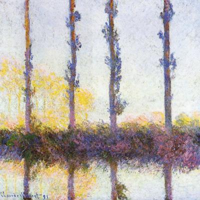
The column filled with gumball-like multi-colored dots gets narrower on top, channeling movement. Optics are a big part of the painting, and I was inspired by an artist once criticized as being a big eye because of his almost scientific approach to color and light. Monet's poplar trees, came to mind to solve the compositional problem of tree trunks amidst leaves. The four vertical streaks of brown/maroon dots add another structural element, in harmony with the three main vertical sections of the painting. Despite the formalities, Monet's paintings aren't cool and unemotional, and neither are mine.
Two black rectangles are like black velvet curtains drawing back to reveal the magical center stage (as close to painting on velvet as I will ever get). They also can be seen as pressing on the center strip, like shorter days in winter and the down turn of the news vs. optimism. I resist letting the dark news be the focal point. I prefer to stay in the frame of mind (I love the at phrase, "frame of mind", like your thoughts fit in a frame, which mine can do, and then there is thinking outside the frame/box...) that Barrack Obama eloquently presented in his acceptance speech as President Elect, "While we breathe we hope." Those dots move as though effervescent, breathing, whimsically bubbling upward. There is blue-sky air, a purple tonality to the bottom, and a golden tonality in the center. The black is not flatly painted but has texture, and colors from underneath richly peak through, signs that it is permeable, vulnerable.
Sunday, December 07, 2008
Yellow Sky
20" x 16"
The tropical feel and the red tree remind me of Gauguin. I love his Where do We Come From? What are we? Where are we going? masterpiece at the MFA Boston. He uses rich colors, sometimes bright. I think the sky and the sea in my painting feel somewhat translucent, a luminous blue with orange, the leaves airy, not stiff. Although the geometry is very rectilinear, it breathes. I like the suggestion of leaves on the dark tree on the left. That little triangle has gray marks that hint at what is on the other side, a defining limb curves, echoing the base of the tree. Such subtleties contribute to the impact of the image as a whole, but if a viewer lingers, they are there to be noticed.
Painting provides respite to maker and viewer. The artist is in the unique position of being both. I want to treat myself. I want to see color, space, and light hit my retina. I want to bask in these things.
Sunday, November 30, 2008
Pastels!
Early Morning Fog
Sunday, November 23, 2008
Earth, Sky-Window

8" x 8"
oil on canvas
First impression: Anselm Keifer. The converging marks in this angsty landscape make use of perspective, creating a vast space. It has the scale of Keifer, but the actual size is a fraction of his enormous canvases. This 8" x 8" is small for me, but everything I do is small compared to his. Women artists in the past were told to "paint like a man" in attitude as well as scale. I'd like to think we're past that. I'm not a miniature painter and would never describe my small paintings as such, because it sounds diminutive, like they are supposed to be a small version of something else, when they really are themselves. Keifer's paintings are heroic and approach the size of theater scenery, although unwilling to leave center stage. I love his big paintings and I am glad they are the way they are, but I am happy with what I have.
I respond most to art with intensity, no matter the type of emotion. Keifer's work focuses on post-war Germany and it is nothing if not intense. Often people will hate a piece of art (this goes for any art form) not because it is poorly done, but because they hate what it expresses or because it makes them uncomfortable. As discomfort is a necessary part of challenging preconceptions, which a lot of artists like to do, a great deal of art thus makes people uncomfortable. During the Mapplethorpe controversy I wore a pin that said "Fear No Art". It was to the point; when people become afraid censorship isn't far behind.
Earth, Sky-Window isn't controversial, but it is intense. It is specific, but in a way that isn't easy to pin down, not easily named, which I like. I seem to be painting out of that place now, almost an anti-narrative. Still, the stage is set, implying there is a story after all.
Sunday, November 16, 2008
Fall V, & Fall VI


Sunday, November 09, 2008
Reception


The opening reception for Images of Optimism, my current show at the Bowery Gallery in New York was a lot of fun; thank you to all who attended. I made sure not to over-hang the show and felt good about the work. You can take a virtual tour here beginning at the entrance.
After the opening I went to the cd release party for my cool brother-in-law, musician Andreas Sahar. I love his new cd, Crossing Over, & he is so passionate that to me he seems like a musical Van Gogh. He's in ITunes if you'd like to look him up.

My friend, the writer Rob Staeger, had some observations of the show. Of particular interest to me is how he notes the difference between my work and landscapes done on site.
http://robstaeger.blogspot.com/2008/11/oasis.html
Barbara Grossman, a painter, friend, and former professor of mine had this to say, "I love the way you have found strength in the summarizing of your view. They are not plein air paintings in the traditional sense but you take us there." To me it parallels what Rob said.
Once while in grad school at Penn, Barbara saw what I was working on and said, "Don't do that again!" among other constructive things. Uncompromising and visually brilliant, I can always count on her to tell me the truth and bring insight as well. She is a great teacher.
Tuesday, November 04, 2008
President Obama
Sunday, November 02, 2008
Butterflies (for the book) & artist's statement


Artist's Statement
September 2008
I make paintings, prints, and drawings. Imagery varies but may include landscape, other natural forms, and geometry. Form and color are combined with expressionist paint handling. Expressionism comes from the search for truth and the acknowledgement that growth comes from change and sometimes trauma. If glossing things over is a lie (think of magazines and advertising), then Expressionism is the antithesis. It is not cold; paint is infused with feeling. Some of my images are Minimalist, focusing more on large areas of color and light rather than on marks. Paint handling and surface are still important to these works, but are subdued in favor of sublime tranquility.
I am interested in getting closer to the mystery in non-verbal experiences. I am after what is intrinsic to the human condition, what can be sensed but is difficult to grasp. I am seeking the temporal and the eternal. I want my paintings to function like poetry and prayer, without words; to be objects for spiritual reflection and experience. The essence of something is conveyed through their substance, through their materiality, through the paint (there is nothing like paint, but paint can be like so much). Optimism is present, but there is an underlying toughness, backbone that keeps these images from being overly romantic, offering credibility to redemption. This intense presence is the unifying factor in everything I do. They are objects embodying sensual and spiritual experience, icons of renewal.
A note on The Butterfly Book:
The Butterfly Book is a collection of hand-pulled intaglio prints made in an edition of ten. The first five pulls of each image will be kept as folios or books, while the remaining five pulls will be sold individually. All the images are butterfly related, 8" x 6" paper size (Arches) and are made using 5" x 3" plates. Inspired by Goya's Los Caprichos, especially the print, The Sleep of Reason Produces Monsters. In place of the monsters (or owls, bats, whatever they are) flying around the slumped figure in Goya's print, I made my self-portrait in Intellect and Optimism Create Butterflies with raised arms, interacting with the butterflies.
Sunday, October 26, 2008
Fall III and Fall IV


oil on canvas, 36" x 32"
oil on panel, 20" x 16"
So I wonder sometimes why I'm painting something pedestrian like a landscape, why to paint at all when there are so many artists taking on ENORMOUS (in every sense of the word) projects in new media. I don't feel like such an old fashioned girl. I do believe in those small, quiet acts of looking, seeing, and being that can be transposed onto canvas through a person. There is no substitute. I can't fix the world. I'm a small ripple: mailing Obama postcards to swing states, helping to register a few new voters at a rally, casting my single vote, sticking a bumper sticker to my car (someone stole it!), recycling & buying Fair Trade, taking care of my family, and painting. The paintings reflect my unique way of seeing. I don't want to back away from experiencing the world through paint. This is what I do.
Sunday, October 19, 2008
Don't Be Afraid to Be Vibrant
20" x 16"
Vibrancy in this case, to me, means to be full of life. The painting is about being unafraid to be one's best; to be one's best self without worrying about how one measures up to someone else, nor to worry about outshining anyone. It is about existing outside of someones shadow. Sometimes being one's best means standing out, not conforming. Geoffrey Canada, director of the Harlem Children's Zone, said in an interview with Terry Gross (Fresh Air) that part of a students' success depends on cultural attitudes changing: for academic success to be seen as cool, not as joining the establishment.
To be one's best for one's self-fulfillment, to really live and pursue what makes one truly happy is a calling. The journey and answers are different for each of us. The flowers are together in one vase, in one situation, but there are a variety, needing different amounts of space to flourish.
After painting this, the Unitarian Church I go to had a similar theme for the day. We were encouraged to strive and celebrate life, to do what I just described without being distracted by glitz or the many forms of escapism available. If we all have the courage, the hope needed to pursue our best selves, to encourage others in this pursuit, we will all be lifted up. Sunflowers filled the altar and at the end of the service we were all invited to pick one up, return to our seats and hold them up together.
Sunday, October 12, 2008
Fall Tree
Sunday, October 05, 2008
Fall II


