Sunday, January 18, 2009

Three Winter Watercolors


watercolors in Moleskin watercolor book
pages 16, 17, and 18
5" x 9"
I'll tell you what I enjoy about these (go ahead and call this a vanity blog, but are there any other kind? Besides, this is about artistic independence). I like the sense of scale in the first one with the little strip of land at the bottom. The bright blue rings out clearly, harmonizing with the other colors. The green edges suggest curtains or some kind of vegetation.
I am very interested in expansive space like where I live. The second picture has that openness, with the hint of a window frame or a camera viewfinder, distancing oneself from the cold and the elements. It is reflective of the no-stopping-it-now western quest to contain (and often possess) nature.
The daytime of deep winter has many variations of white and gray. Sometimes bright, sometimes dim, the snow often blindingly contrasts with the sky, forcing me to wear sunglasses while driving even though I'm craving the sun. White-out conditions blows the snow in every direction, blending the differences between up, down, and middle.
The third picture is about the sharp contrast of an overcast day without precipitation as viewed from an interior. The white and black are flat and bold while the gray has soft subtleties in color and paint handling, meeting with the snow in a line meant to convey the two substances.
My brother tells me it is eighty-one degrees in Ft. Lauderdale. He is keeping company with iguanas near the pool. It is enticing, but I would miss the grays. Alright, a few days might be nice...

Sunday, January 11, 2009

Homage to Painting


oil on panel
20" x 16"

I saw some of my favorite paintings while walking through the permanent collection at the MOMA. Rothko, Agnes Martin, Lee Krasner; they're all so good. The paintings are made of color and light and create respite. On the edgier side there is DeKooning's Woman I, ferocious and so strong. I love Pollock's Gothic, especially his blue. Whatever is being expressed in an artwork, I respond mostly to art that is intense, like these. I want to see life squeezed into the canvas.

Homage to Painting came out of this museum experience (museums are NOT boring!). I had the impulse to lay flowers in front of the paintings, as I am so appreciative of the life lived, the achievement, the art that is passed on. The pictures are living testimonies to the artists who made them. The light and hope that emanates from them reminds me of the white paper of
Schindler's List that held the names of the people he was trying to save. The paintings save me.

Sunday, January 04, 2009

Late Fall 2

oil on canvas
40" x 28"

More gumballs! Well, they're not really gumballs, but they do make me think of the game of guessing how many jelly beans are in a jar. The dots are compressed toward the picture plane, accentuating the surface of the canvas. The edging on three sides sets them back a bit, setting up a dialogue between in vs. out, the world of circles as opposed to something else.

Dots of fall treetops are layered on the bottom like piles of leaves while the second fourth of the painting shows the darker structure of bare trees. The third fourth is made up of blue and white (falling snow or cool air?), while the upper fourth is an attempt at the many varieties of crystalline blue there are no paints for (sigh). The height of the canvas compared to width is important as the circles are like bubbles. They have a good enough length to travel and convey their effervescence. When looking at the actual painting (I'm not sure it works in the jpeg) one's eyes dilate, getting lost in the movement, stimulated by the bouncing color.

For all the special effects computers offer in pixelization and making things random, less mechanical, more naturalistic, a computer could not make this painting. I work intuitively, sometimes impulsively, and sometimes calculated. I think the location and color of the dots (or other design elements I use in other pictures) end up conveying my personal energy and the feeling I am expressing. A friend's parent in 1989, when I was in high school and deciding to go to art school to study painting laughed at my decision, saying that computers would make all the art of the future. It is like saying we would happily accept the superiority of the machines we create. Our souls could give up, obsolete.

Thursday, January 01, 2009

Resume and Artist's Statement


Resume

Education
1994 – 1996 University of Pennsylvania, MFA
1989 – Dec. 1993 Massachusetts College of Art, BFA


Solo Exhibitions
2008 Bowery Gallery, Chelsea, New York City, “Images of Optimism”
2007 Washington Art Association, Washington Depot, CT
2006 Bowery Gallery, Chelsea, New York City, "Sex, Death, and the Spirit"
2005 Rochester Contemporary, Rochester, NY, “Women and Bulls”
2005 Roberts Wesleyan College, Davison Gallery, Rochester, NY
"Expressing Christian Imagery"

2004 Bowery Gallery; Chelsea, New York City
"Feminist Icons: Paintings, Drawings, and Prints"

2003 Bowery Gallery; Chelsea, New York City
"Paintings in Response to Sept. 11th; The Stations of the Cross"
2003 St. Andrew's Lutheran Church; Easton, PA
"The Stations of the Cross"
2000 Printmaking Council of New Jersey, North Branch, NJ
Bowery Gallery; SoHo, New York City
1999 Villanova University, Villanova, PA
1999 Johnson and Johnson World Headquarters;
New Brunswick, NJ


Group Exhibitions
2008  Memorial Art Gallery Faculty Exhibition at The Gallery at One Bausch and Lomb Place, Rochester, NY
2007-2008  Rochester Contemporary (RoCo) Members Exhibition
2007 Massachusetts State House, Boston, MA, “Violence Transformed”
2006 Episcopal Church 75th National Convention, Columbus, OH,  “Visual Preludes”
2005 RoCo, Rochester, NY, "Unbound - Artist's Books", Jurors: Elizabeth Switzer, 
Director, and Mary Giehl, Professor of Art, Syracuse University
2005 Bowery Gallery, Chelsea, New York City, "Drawings"
2004 Wright State University, "Drawing from Perception V", Dayton, OH
Juror: Charles Cajori, artist, former Professor of Art at the NY Studio School

2004 The Cathedral Basilica, Covington, KY, "Visions VIII",
International Juried Show, Juror: John Begley, Director of the Hite Art Institute, Univ. of Louisville, KY

2004 High Falls Gallery, Buffalo, NY
Curator: Sally Winslow, Director

2004 Upstream Gallery National Juried Show, "Small Works", Dobbs Ferry, NY
2004 HallsWalls Art Center, Buffalo, NY
2004 Bowery Gallery, Chelsea, New York City, "Small Works"
2001 - 2003 William Paterson University, Ben Shahn Galleries,Wayne, NJ
"Life With Pocket Change and Other Pleasures" artists' books
Curator: Nancy Einreinhofer, Director
2002 "NorthEast Prints 2002", Juror: Ms. Judith Hecker, Assistant Curator, Department of Prints and Illustrated Books, The Museum of Modern Art, New York, NY
2001 "NorthEast Prints 2001", Juror: Marilyn Symmes
Curator of Prints and Drawings, Cooper-Hewitt National Design Museum, Smithsonian Institution, New York, NY.

2002 - 2003 Hunterdon Art Center; Clinton, NJ
46th and 47th Annual National Print Exhibition
Juror: Lisa Mackie, Master Printer, Professor At Stony Brook and N.Y.U.
2003 Bowery Gallery: Group Show
2002 Artists and the Art of the Book, Traveling to the following locations: The Banana Factory, Bethlehem, PA; Artists' Image Resource Inc., Pittsburgh, PA; Contemporary Museum of Design and Art, San Jose, Costa Rica; Spaces Gallery, Cleveland, OH; Mexico City; Costa Rica, Chicago, University of Kyoto, Japan; University of Gloucestershire, England
Curator: Curlee Raven Holton, Experimental Printmaking Institute
2002 Bowery Gallery: Five Painters
2002 Lafayette College, Grossman Gallery:
Faculty Exhibition 

2001 Art Association of Harrisburg; Harrisburg, PA
Juror: Susan Cross
Assistant Curator, Guggenheim Museum, New York
2001 Boston University, 808 Gallery
The Boston Printmakers, North American Print Biennial; Juror: David Kiehl, Curator of Prints at the Whitney Museum of American Art
2000 Mountain Art Show; Bernardsville, NJ
Juror: Eileen Foti, Printmaker, Professor at Rutgers University
2000 Mesa Arts Center; Mesa, AZ
Juror: John Armstrong, Master Printer
2000 Wayne Art Center; Wayne, PA; Juror: Barbara Grossman, Artist/Critic – NY Studio School, Chattaqua
2000 Makeready Press Gallery; Montclair, NJ
Juror: Sid Sachs, Gallery Director, University of the Arts
1999 Printmaking Council of New Jersey; North Branch, NJ
"Responding to Chinese Printmaking"
1999 Brookdale Community College; Lincroft, NJ Faculty Exhibition

1998 Monmouth Museum; Lincroft, NJ - Annual Juried Show
1997 Washington Art Association; Washington Depot, CT
"Young Talent Juried Show"
1995 Gallery 37; Summit, NJ; Steamroller Gallery; Frenchtown, NJ


Awards
2002 Ben Shahn Galleries, William Paterson University,
Purchase Award, Juror: Ms. Judith Hecker, Assistant Curator, Dept. of Prints and Illustrated Books, The Museum of Modern Art, New York, NY
2001 Harrisburg Art Association, 73rd Annual Juried Exhibition
Second Place, Juror: Susan Cross, Assistant Curator, Guggenheim Museum, NY
2001 New Jersey Medical Society Alliance Art Exhibition, First Place
2000 Mountain Art Show, Award of Excellence
2000 www.artadvocate.com, Curator's Choice
1996 University of Pennsylvania, Sewall Sillman Color Prize
1995 University of Pennsylvania, Angelo Savelli Painting Prize
1993 & 1994 Liquitex Excellence in Art Student Grant Competition 


Teaching Experience
2005 Memorial Art Gallery, Rochester, NY; Intermediate Painting; Beginning, Intermediate, & Life Drawing 
2005 Irondequoit High School, Rochester, NY; Visiting Artist
2001-2003 Lafayette College, Easton, PA – Visiting Professor of Fine Arts
Courses: Principles of Studio Art, Drawing I, II

1996 – 1998 Brookdale Community College, Lincroft, NJ 
Adjunct Professor of Fine Arts
Courses: Basic Design, Color Theory, Drawing I,
Art History: Renaissance through Contemporary
1997 Printmaking Council of New Jersey, North Branch, NJ
Silkscreen workshop for parents and children


Private and Public Collections
Lafayette College, Easton, PA
William Paterson University, Ben Shahn Galleries, Wayne, NJ
St. Luke’s Episcopal Church, New Orleans, LA
Numerous Private Collections


Sunday, December 28, 2008

Monoprints! (#1, #2, #3)


monoprints


3" x 4" image size on Arches paper


In the history of art, many artists individually and collectively issued manifestos. The degree of relevancy these manifestos have to the actual art varies. Often there is a disclaimer written about an artist of a particular group that they were really doing their own thing. Reactionary as artists tend to be, many made this statement themselves, declaring they didn't believe in "isms", thus making their manifesto be about rejecting manifestos.

I have an artist's statement which is a kind of statement of purpose trying to put into words this ineffable activity I engage in. If I were to have a manifesto, however, it would be the poem, The Invitation, by a writer known as Oriah Mountain Dreamer. It is truly great. It is with her permission that her work is linked here. Please enjoy the monoprints and keep this poem in mind while viewing all my work, my life's work.

Sunday, December 21, 2008

Pink Rectangle Landscape


24" x 18"

oil on panel


You may not think of driving a car when you look at this picture, yet it is influenced by the view I have as a motorist (other influences are the structures of windows and the theatre stage). I spend a lot of time driving through pastoral landscape. The road or highway cuts the the landscape centrally in my line of sight, as in a one-point perspective drawing. While I don't often paint that convergence but rather square it off, the middle remains, flanked by opposing elements. Just as one gets very set in the way one parts one's hair, I find myself drawn to do this repeatedly now; it is cemented in my brain and the picture doesn't look right and is unsatisfying otherwise. It is still too new to be a bad habit in need of breaking (besides, you try to change the way you part your hair). I think it is more a "given" and the experimentation will spring off of it, just as many modern artists used the grid (nifty link, by the way). I am very attracted to the way the central rectangle in this and most of my pictures with this composition can advance or recede. There is something important about the viewing experience of that shift. I think the painting pulses. A warm painting with golden monoliths, it affirms something unnameable but not unknowable.

Sunday, December 14, 2008

Late Fall


oil on canvas
36" x 42"

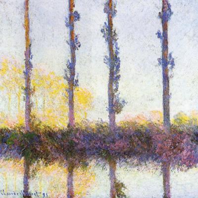
The column filled with gumball-like multi-colored dots gets narrower on top, channeling movement. Optics are a big part of the painting, and I was inspired by an artist once criticized as being a big eye because of his almost scientific approach to color and light. Monet's poplar trees, came to mind to solve the compositional problem of tree trunks amidst leaves. The four vertical streaks of brown/maroon dots add another structural element, in harmony with the three main vertical sections of the painting. Despite the formalities, Monet's paintings aren't cool and unemotional, and neither are mine.

Two black rectangles are like black velvet curtains drawing back to reveal the magical center stage (as close to painting on velvet as I will ever get). They also can be seen as pressing on the center strip, like shorter days in winter and the down turn of the news vs. optimism. I resist letting the dark news be the focal point. I prefer to stay in the frame of mind (I love the at phrase, "frame of mind", like your thoughts fit in a frame, which mine can do, and then there is thinking outside the frame/box...) that Barrack Obama eloquently presented in his acceptance speech as President Elect, "While we breathe we hope." Those dots move as though effervescent, breathing, whimsically bubbling upward. There is blue-sky air, a purple tonality to the bottom, and a golden tonality in the center. The black is not flatly painted but has texture, and colors from underneath richly peak through, signs that it is permeable, vulnerable.

Sunday, December 07, 2008

Yellow Sky


oil on panel

20" x 16"

The tropical feel and the red tree remind me of Gauguin. I love his Where do We Come From? What are we? Where are we going? masterpiece at the MFA Boston. He uses rich colors, sometimes bright. I think the sky and the sea in my painting feel somewhat translucent, a luminous blue with orange, the leaves airy, not stiff. Although the geometry is very rectilinear, it breathes. I like the suggestion of leaves on the dark tree on the left. That little triangle has gray marks that hint at what is on the other side, a defining limb curves, echoing the base of the tree. Such subtleties contribute to the impact of the image as a whole, but if a viewer lingers, they are there to be noticed.

Painting provides respite to maker and viewer. The artist is in the unique position of being both. I want to treat myself. I want to see color, space, and light hit my retina. I want to bask in these things.

Sunday, November 30, 2008

Pastels!


Window, Twilight

Early Morning Fog

oil pastel
12" x 18" paper size
Marks can be very important elements in pastel drawings. Pastel paper usually comes with a tooth; the colored sticks drag across the surface in a particular way, clinging mainly to the raised surface. I don't like too bumpy a tooth, in fact, the paper I use is fairly smooth. I tend to have a heavy hand, layering the material thickly, but not completely evenly throughout the picture. Some areas have less, allowing for density changes expressing weight, air, the edges/solidity of things. The scale of these marks, their delivery, and the decision of what to make solid are some of the issues in this medium.
I never use chalk pastels because some of the pigments are carcinogens and the dust makes for easy exposure. Oil pastels bind the pigments tightly; gloves are all that's needed. I prefer Holbein oil pastels. Sennelier are beautiful, but they positively melt (not quite as much as R&F paintsticks, though, yummy as they are). Holbein are buttery, precious (vibrant, rich colors don't come cheap), but hold their form. I like them more than jewelry. Odion Redon probably thought his chalk pastels were jewel-like. He is much admired for his "crushed color".
This post is fairly techie for me, so let me say something about the works in particular. Window, Twilight is the view from my studio, tree tops as the sun is almost down. Early Morning Fog is my reward for excercising before the birds are awake. The blue fog and surrounding sky are quite remarkable here, and I don't think I fully captured them. I hope to try again in a painting. I like the boldness of these two pictures; they're not shy. They are energetic and unapologetically settled into themselves. Window and nature are one, a single view like an instant captured by a snapping shutter. Look closer and the material, the bits of pigment clinging to the paper and to itself, reveals the artist's hand, cement left by the mason.

Sunday, November 23, 2008

Earth, Sky-Window


8" x 8"

oil on canvas

First impression: Anselm Keifer. The converging marks in this angsty landscape make use of perspective, creating a vast space. It has the scale of Keifer, but the actual size is a fraction of his enormous canvases. This 8" x 8" is small for me, but everything I do is small compared to his. Women artists in the past were told to "paint like a man" in attitude as well as scale. I'd like to think we're past that. I'm not a miniature painter and would never describe my small paintings as such, because it sounds diminutive, like they are supposed to be a small version of something else, when they really are themselves. Keifer's paintings are heroic and approach the size of theater scenery, although unwilling to leave center stage. I love his big paintings and I am glad they are the way they are, but I am happy with what I have.


I respond most to art with intensity, no matter the type of emotion. Keifer's work focuses on post-war Germany and it is nothing if not intense. Often people will hate a piece of art (this goes for any art form) not because it is poorly done, but because they hate what it expresses or because it makes them uncomfortable. As discomfort is a necessary part of challenging preconceptions, which a lot of artists like to do, a great deal of art thus makes people uncomfortable. During the Mapplethorpe controversy I wore a pin that said "Fear No Art". It was to the point; when people become afraid censorship isn't far behind.
Earth, Sky-Window isn't controversial, but it is intense. It is specific, but in a way that isn't easy to pin down, not easily named, which I like. I seem to be painting out of that place now, almost an anti-narrative. Still, the stage is set, implying there is a story after all.


Sunday, November 16, 2008

Fall V, & Fall VI


both are 20" x 16", oil on panel
While tending to my show I took time to go to the MoMA to see Van Gogh, and the Colors of the Night, up through January 9th. His blues bite like dark chocolate, luscious with an edge. For the first time ever I stared at a painting (The Sower) so intently that my eyes began burning and my nose started running. I love the timelessness of art or the timefullness of it, that a painting made over a hundred years ago can enter my immediate experience and make me feel so much. Van Gogh layered strokes, weaving color, making land/light/substance, yet still of that paste, passionately applied. So much sensation, so much meaning was packed into that material.
I recently saw the BBC production about the paintings of the child artist, Marla Olmstead, from Binghamton, NY. The director of the gallery representing her, Anthony Brunelli, is a photo-realist painter who admitted to not fully appreciating the work of famous abstract artists such as Jackson Pollock. It is funny to me that he could appreciate Marla's but not the critically acclaimed artists, commenting that their fame was mostly due to marketing.
The absence of a recognizable subject is often a stumbling block for many viewers and often they will try to pull out forms like looking for pictures in clouds thinking they have unlocked the big mystery. A buyer of Marla's work observing a brushstroke of rectangular blue paint, insisted she had painted a picture of a door. I have to tell you that this line of thinking makes painters' eyes roll.
While I'm not about to claim that Marla's work is on par with Van Gogh and Pollock (I have never seen it in real life), my point is that people responded to her work because of its clarity, spontaneity, and evident joy in handling the material. This can be said of all three artists, Van Gogh using the form of a landscape and Pollock using color, viscosity, scale, speed, etc.
I have worked in both manners, abstract and figurative, and often find myself with a foot in each. I believe have made a comfortable synthesis. Not verbose (despite this blog!), I like the way abstraction conveys the essence of something. This week I met an older woman who would like to take watercolor classes but is afraid her tremor from her medication would interfere. She didn't want to work on something for a long time and then make a mistake, ruining it. I told her that there are other ways of working with watercolor, that it can be fluid and not so tight. The images of what she thought watercolor paintings should look like held her back and I don' t think she could see another way.
Artists become visionary when they can see beyond the cliches. Like all children, Marla is too young to know about the cliches and that may be where the freshness comes in her work. It is why Picasso said artists should draw like children. When she is older she will become more self-conscious. If she pursues painting, she will have to learn to unlearn, i.e. learn to see for herself. That is why painting can be so hard. That is why we celebrate the achievements of mature artists.

Sunday, November 09, 2008

Reception


The opening reception for Images of Optimism, my current show at the
Bowery Gallery in New York was a lot of fun; thank you to all who attended. I made sure not to over-hang the show and felt good about the work. You can take a virtual tour here beginning at the entrance.


After the opening I went to the cd release party for my cool brother-in-law, musician Andreas Sahar. I love his new cd, Crossing Over, & he is so passionate that to me he seems like a musical Van Gogh. He's in ITunes if you'd like to look him up.


My friend, the writer Rob Staeger, had some observations of the show. Of particular interest to me is how he notes the difference between my work and landscapes done on site.


http://robstaeger.blogspot.com/2008/11/oasis.html

Barbara Grossman, a painter, friend, and former professor of mine had this to say, "I love the way you have found strength in the summarizing of your view. They are not plein air paintings in the traditional sense but you take us there." To me it parallels what Rob said.

Once while in grad school at Penn, Barbara saw what I was working on and said, "Don't do that again!" among other constructive things. Uncompromising and visually brilliant, I can always count on her to tell me the truth and bring insight as well. She is a great teacher.


Tuesday, November 04, 2008

Sunday, November 02, 2008

Butterflies (for the book) & artist's statement


etchings

4" x 3" image size
Note: The butterflies are bursting above the box, like Pandora in spring.
Nicole Maynard
Artist's Statement
September 2008

I make paintings, prints, and drawings. Imagery varies but may include landscape, other natural forms, and geometry. Form and color are combined with expressionist paint handling. Expressionism comes from the search for truth and the acknowledgement that growth comes from change and sometimes trauma. If glossing things over is a lie (think of magazines and advertising), then Expressionism is the antithesis. It is not cold; paint is infused with feeling. Some of my images are Minimalist, focusing more on large areas of color and light rather than on marks. Paint handling and surface are still important to these works, but are subdued in favor of sublime tranquility.
I am interested in getting closer to the mystery in non-verbal experiences. I am after what is intrinsic to the human condition, what can be sensed but is difficult to grasp. I am seeking the temporal and the eternal. I want my paintings to function like poetry and prayer, without words; to be objects for spiritual reflection and experience. The essence of something is conveyed through their substance, through their materiality, through the paint (there is nothing like paint, but paint can be like so much). Optimism is present, but there is an underlying toughness, backbone that keeps these images from being overly romantic, offering credibility to redemption. This intense presence is the unifying factor in everything I do. They are objects embodying sensual and spiritual experience, icons of renewal.

A note on The Butterfly Book:

The Butterfly Book is a collection of hand-pulled intaglio prints made in an edition of ten. The first five pulls of each image will be kept as folios or books, while the remaining five pulls will be sold individually. All the images are butterfly related, 8" x 6" paper size (Arches) and are made using 5" x 3" plates. Inspired by Goya's Los Caprichos, especially the print, The Sleep of Reason Produces Monsters. In place of the monsters (or owls, bats, whatever they are) flying around the slumped figure in Goya's print, I made my self-portrait in Intellect and Optimism Create Butterflies with raised arms, interacting with the butterflies.

Sunday, October 26, 2008

Fall III and Fall IV


oil on canvas, 36" x 32"
oil on panel, 20" x 16"
A friend of mine came into my studio as I was selecting work for my show, Images of Optimism, which opens October 28th at the Bowery Gallery. She was excited about what she saw after telling my husband a few years before to watch the landscape where we live work its way into my paintings. I didn't believe it then. Even though I loved trees and sky, I thought it didn't reconcile the political issues I wanted to address. Maybe the thing is that I see it all and want to respond. In any case, the next thing she exclaimed really made the connection for me clear, "The paintings seem to say, 'The world has gone to hell in a hand basket, but look out your window because there is more to life than that!'" So it is not so much with an escapist's searching that I turn to the view, but with an interest in seeing, experiencing, and affirming that there is life outside politics. I still gaze with the knowledge that politics effects everything, however. It is impossible to look at nature and not think of climate change, for example, just as the BBC podcast, "The Best of Natural History" investigates the changing migration patterns of eels most likely due to global warming's effect on the Gulf Stream.
Bonnard painted scenes of domesticity and landscape during wartime; a search produced a painting unfamiliar to me. In 1916 he was assigned to make paintings of the First World War; the painting, Un village en ruines près du Ham (A Village in Ruins near Ham), depicts French troops near ruins. To me it is obvious that his heart wasn't in it, although his mark-making is unmistakable and the isolated contrasting colors of blue and orange hint at the colorist within, handcuffed in the task at hand.
So I wonder sometimes why I'm painting something pedestrian like a landscape, why to paint at all when there are so many artists taking on ENORMOUS (in every sense of the word) projects in new media. I don't feel like such an old fashioned girl. I do believe in those small, quiet acts of looking, seeing, and being that can be transposed onto canvas through a person. There is no substitute. I can't fix the world. I'm a small ripple: mailing
Obama postcards to swing states, helping to register a few new voters at a rally, casting my single vote, sticking a bumper sticker to my car (someone stole it!), recycling & buying Fair Trade, taking care of my family, and painting. The paintings reflect my unique way of seeing. I don't want to back away from experiencing the world through paint. This is what I do.


Sunday, October 19, 2008

Don't Be Afraid to Be Vibrant


oil on panel
20" x 16"

Vibrancy in this case, to me, means to be full of life. The painting is about being unafraid to be one's best; to be one's best self without worrying about how one measures up to someone else, nor to worry about outshining anyone. It is about existing outside of someones shadow. Sometimes being one's best means standing out, not conforming. Geoffrey Canada, director of the Harlem Children's Zone, said in an interview with Terry Gross (Fresh Air) that part of a students' success depends on cultural attitudes changing: for academic success to be seen as cool, not as joining the establishment.
The artist Ben Shahn said that conformity was a failure of hope, belief, and rebellion.

To be one's best for one's self-fulfillment, to really live and pursue what makes one truly happy is a calling. The journey and answers are different for each of us. The flowers are together in one vase, in one situation, but there are a variety, needing different amounts of space to flourish.

After painting this, the Unitarian Church I go to had a similar theme for the day. We were encouraged to strive and celebrate life, to do what I just described without being distracted by glitz or the many forms of escapism available. If we all have the courage, the hope needed to pursue our best selves, to encourage others in this pursuit, we will all be lifted up. Sunflowers filled the altar and at the end of the service we were all invited to pick one up, return to our seats and hold them up together.

Sunday, October 12, 2008

Fall Tree


16" x 20"
oil on panel
This is a celebration painting. The leaves in fall know how to go out in style. They make a final burst of color before their descent. Pierre Bonnard squeezed the last bit of life in himself just as he squeezed paint out of tubes in order to paint Almond Tree in Blossom. It was done the week he died. As such it deserves our special attention.
I recently saw the Julian Schnabel film, The Diving Bell and the Butterfly, made after the book of the same title "by Elle France editor Jean-Dominique Bauby, who, in 1995 at the age of 43, suffered a stroke that paralyzed his entire body, except his left eye. Using that eye to blink out his memoir, Bauby eloquently described the aspects of his interior world, from the psychological torment of being trapped inside his body to his imagined stories from lands he'd only visited in his mind. Written by Anonymous , IMDb"
While Bonnard uses his sight to make his last statement, he also uses his imagination and is aware of his mortality. Both Bonnard and Bauby embrace life, continuing to absorb and respond until the end, exploring their humanity, and the mystery of pain and beauty.
I am not in such dire straits, but this is my painting.

Sunday, October 05, 2008

Fall II


16" x 20"
oil on panel
It seems that I am doing the seasons. Like many, I loved Vivaldi's Four Seasons in high school and was into the Omnimax movie featuring the music while I worked at the Boston Museum of Science. The rhythms in nature, music, and art are energizing but they also have a framework of something that makes sense, truth. Many people say that math is very reassuring to them because there is an objective rightness to it. I think the same could be said for rhythm, echoes of our heart beats, of life around us.
In Fall II there is a rhythm in the brushwork, a fracturing of the space not unlike Cezanne, but more with an eye for an all-over area of color predominating. The simple composition emphasises the space and scale, the vastness of the sky and grass bisected by a distant band of trees. This ability to see far, to take the long view invites relaxed contemplation. It drew my husband and I to make our home in Western New York, where the seasons, weather, and agriculture are an active part of life.


Sunday, September 28, 2008

Fall I


16" x 20"
oil on panel
This is as close to Impressionism as I get. Maybe it's too close, I don't know. I like it, it feels like me, and the trees/curtains aren't particularly Impressionistic; they're of a different nature. It is a celebration of color and the color changes of fall. There is the dark of the left vertical, the neutral gray of the right, the horizontal clouds are white, while the rest of the painting is representative of the spectrum, although altered, sometimes subdued. The light is special in autumn, my favorite for taking pictures of my work. Crisp, warm in tone, the light and the air both sparkle.

Sunday, September 21, 2008

Landscape in Grays


24" x 18"
oil on panel

This painting follows the basic schema used in Winter Landscape I in which the opposing verticals can be read as trees or curtains (domestic at a window sill or those for a stage). When I explained this reading to my mother-in-law, she had the correct observation that one gets the feeling of the first moment the stage curtains are drawn back to reveal the scenery. That moment is full of freshness, excitement, and anticipation. Perhaps, if I am lucky, I am able to show the long familiar subject of landscape anew. The pictures are unveiled and are about clarity. In Landscape in Grays, the crystalline, pale blue sky is captivating as it encapsulates the gray and stretches over the next layer of gray-green. Painting students learn to see the rainbow in whites and the dingiest institutional gray floors and surroundings. This painting makes use of a limited palette (a pared-down selection of colors), but still achieves luminosity. The proportion of the verticals is different than my other paintings and it gives the feeling of collosal scale like the columns of the Acropolis.


Sunday, September 14, 2008

Watercolors!


5" x 8"
Moleskin watercolor book

I am enjoying working in this Moleskin watercolor book. My son didn't go to camp very much this summer and we took a lot of vacations, so the ability to paint as increments of time open up to me is wonderful. The travel watercolor set and book stay close to me, even now that the trips are over. I need to think in color; a single pencil isn't enough for the kind of painting I am working on. Sometimes pencil makes it into the watercolors, though, like in the first three here. It is used to sharpen, delineate form, and add texture.
The first image is about a framed, fluid space. The second is like a landscape of choppy waters or those waters can be read as grass. The horizontal lines also read as two things: delineations of sky or some kind of telephone lines. The third picture is more about atmosphere/gauze and tangibility. The fourth is a singular, light tree in a landscape. The fifth is effervescent landscape dots. If the latter seems too abstract for you, think of sunspots and vision.
Meanwhile, I'm working on publicity for "Nicole Maynard: Images of Optimism" opening at the Bowery Gallery on October 28th. I just updated my website with revised resume, statement, and portfolio - check it out!

Sunday, September 07, 2008

Aerial View


oil on panel

Another unsatisfactory painting provided the fodder for this one on top. I always liked the fairytale Rumpelstiltskin and the concept of turning straw into gold; I think most artists do. The painting combines inspiration from plane views. In one flight one often sees farms, fields, the sky coming between us and the world. People's pools, highways, and parking lots of cars near Newark, newly arrived from overseas, also catch my curiosity, but this painting derives from the rural. Geometric but permeable, it has implications for memory, time, experience, the defined and changing self.
A fellow student at Massachusetts College of Art made paintings in this vein. They were abstractions, less about the landscape, but very heavy on layering and rich in color. I forget her name, but I attended her ninetieth birthday party then, in 1991. Even Shrek talks about his inner complexity in terms of layers, "like an onion" the ogre explains. While I enjoy the freshness of a thin wash like Matisse [his studio assistant used to remove the paint from the canvas with turpentine at the end of the day so he could begin again at the start of the next without any accumulation. It was important to have the luminosity from the white of the canvas through the color and to remove texture which would impede the large shapes of colored light he made.] I also can create light through the interaction of color despite density. The painting has history; the texture,like wrinkles, is the hard-won evidence of the journey.


Saturday, August 30, 2008

From the West

24" x 20"
oil on panel
Inspired by my trip to New Mexico this summer, this painting has a lot of the Grand Canyon in it. My family did a small amount of hiking there as well as driving throughout New Mexico and a trip to Mesa Verde. It was my third or fourth trip to New Mexico and I am continually fascinated by the ruins of the Anscestral Puebloans, petroglyphs, and land formations/landscape.
From the West is a dialogue with the personal past (painted over another painting) and its thick texture resulted from this layering as well as through the use of chunky oil sticks. It has a compressed space, as if you are against a canyon wall or zooming close with a camera. The oranges change hue and tone, showing light and shade, defining rugged planes. The green square is not solid, so it comes to the surface and then seems to dwell with the rock, like the plants that grow in the dessert. The green substantiates that life can exist in seemingly inhospitable territory.

Saturday, August 23, 2008

The Green Has It


oil on canvas
24" x 18"

The Green Has It is a funny painting. The stripes are curtain abstractions and the center is a view out a window. It owes much to Pierre Bonnard and one of his many window scenes, complete with striped wallpaper, curtains, light. I think much of my landscape painting has architectural references. They are nature influenced by a domestic view, like Bonnard (the sense of a window). They also often have the symmetry provided by the highway splitting the landscape into left and right when driving. Here there is more on the left than the right and it is a domestic picture, not the open road.

The yellow-green-blue goes through permutations but never bursts into orange or violet. There are a broad range of values, and paint-handling. This is a picture made by painting over another, this time an unresolved portrait. It was the right thing to do, a stronger statement.