Sunday, October 03, 2010

Rainy Day Window and Green Tree Seen


Rainy Day Window, Sketchbook Pro on iPad


Green Tree Seen, 8" x 8" oil on canvas, PRIVATE COLLECTION

On the creative process and new media:

I recently posted paintings about the blank page. Artists of all kinds confront how to get the juices flowing. Transitioning from the activity of regular life to the state of mind of creating can be difficult even though it is craved. It feels great when inspiration self-propels but if the time set aside to work doesn't coincide, it can be hard to break through. I heard a discussion on the subject within an interview of southern writers on NPR. The new book of short stories selected by writer Sonney Brewer called Don't Quit Your Day Job is about the jobs the writers had before writing full-time.

One writer said at the end of his writing session he would leave a line unfinished but only if he knew how to finish it. It would wait for him until next time, a hook to resume the process. Another said he would observe what is around him, however simple, and write a few lines as a warm-up. A visiting artist in undergrad said she put on the same music. I did that a lot in the past but now I do podcasts. My favorite is Fresh Air, Terry Gross' voice settling me into a quiet listening space that allows me to focus. Only problem is I run out of episodes, switching to other podcasts which may be equally interesting but don't have her magic. I scrape down the palette and get out my materials. I look to sketches, out the window, or try to remember what an image seen or imagined. When I worked in an Abstract Expressionist style I could make any mark and have something to respond to. Now the white smooth surface is important to me and I like to be fairly clear on what I'm after from the beginning. Both methods are equally valid. Now the absence of a specific idea feels like muddling around and I don't want the picture to get clogged. You can paint over anything but luminosity is facilitated by light going through paint, bouncing off the white ground and coming back to the eye. Art conservators recommend PVA size for canvas preparation over gesso as it is more resistant to water damage. PVA is clear so the natural color of the canvas, not bright white, is the starting point. Sometimes I like it as it operates as an interactive color much like the colored sheets of paper greatly preferred over white for pastel. I might try an oil based white ground. It is a non-issue for digital images as light comes from the screen. This technicality makes them easier than handling oil which can fight against you. Easier isn't inferior. Additionally, it is easier to think rapidly in a succession of changes and save possibilities with a digital art program. It mirrors quantum physics, showing outcomes of a multiplicity of actions (thanks to Chuck and Josh from How Stuff Works, Stuff You Should Know for explaining the science). It can be done in old-fashioned drawing but the stages can be lost unless one uses photography to document them. The exhibit of Matisse on view at the MOMA (Radical Invention, 1913-1917) uses technology to unravel the series of actions he took in making singular works. Now we can playback actions using Brushes' ability to transfer them into a Quicktime video or, as aforementioned, by saving intermediate steps as separate files, some as complete works on their own. The problem of when a picture is done in contemporary painting is stretched, made pluralistic.


"Truman Capote just said, 'Write something true,'" Brewer says. "It doesn’t matter if it fits in the book or not, but if it’s true that the wind is blowing and that the sky is blue … write the truth for a minute."

"Then, start lying," Groom adds. "A very convincing lie." [Copyright 2010 National Public Radio].

Green Tree Seen was made in this way. I always look around when I'm outside for striking visual situations and I saw a tree which became my own in the studio. Looking from dot to dot is a journey in its greenery. Texture is an important part of the looking experience here as is in Rainy Day Window, something like oil pastel. I took the photo of the window, surprised by the reflection of synthetic colored light from the T.V. I imported the photo into Sketchbook Pro on the iPad and reworked it. So I adapt and utilize the new tools available to painters to bang through to the idea. Much more will come.

Sunday, September 26, 2010

That Maple Again (3rd image private collection)


Maple 18" x 12" charcoal on paper


Late September Maple 12" x 12" oil on panel


That Maple Again 18" x 14" oil on canvas PRIVATE COLLECTION

It's not bad for an artist to be obsessive. I've already painted the maple in my yard a few times and the dots are certainly obsessive. I'm not tired of them yet, although sometimes I need a break. The maple is hard to grasp. It's more complex than one would think for a singular object. There are all those leaves, just beginning to fall, and the light that changes the color with each moment. The back lighting was tough this time around. One of my studio windows faces east, the light coming over the tree line and hitting the maple from behind. It's dark anyway and this type of lighting flattens it. I wanted to get what volume I could and needed to do the charcoal drawing to figure it out. The drawing has a breeze in it while the tree in the paintings is nailed, the color-movement coming from me. The dots aren't mechanical. The process may be controlled, a bit stiff, but the experience of looking at the finished painting is not. I paint them as playful units and the patience involved in their exacting delivery is done with the knowledge that each dot leads to a stronger feeling, an amplification.

I don't subscribe to the old-fashioned idea that the amount of time taken to craft a painting is an indicator of quality, however. Paintings can be overworked as well as conceptually poor. After Duchamp conceived of the ready-made, craft went out the window. Photography parallels the philosophy of the ready-made: the idea that the artist's selection of a form embodies his/her intent. Art critic Clive Bell says as much in his essay Art, in which he argues that form is what distinguishes art.

Although many photographs are manipulated in the dark room and now in Photoshop, there are plenty taken directly in a quick point-and-shoot process. It took time, therefore, for photography to rise to the level of high art in people's minds and "fine art" photography first imitated painting in the movement known as Pictorialism. Alfred Stiegliz, Edward Weston, Berenice Abbott, and Edward Steichen were pioneers and moved beyond Pictorialism to "Straight Photography" i.e. photography behaving as itself, not derivative of another art form.
If you get a chance, visit the International Center of Photography in New York City. They always have incredible exhibits* including the photographs of journalists and political work.
Appreciative of the medium but not a photographer, I'll keep building from the ground up.

*[Currently on view are "Rediscovered Spanish Civil War negatives by Capa, Chim, and Taro, September 24, 2010–January 9, 2011 and Cuba in Revolution September 24, 2010–January 9, 2011]

Sunday, September 19, 2010

Hill and Rectangle, The Page (Canvas)


Hill and Rectangle, 20" x 16", oil on canvas


The Page (Canvas), 13" x 10", oil on canvas


First I would like to draw your attention to the very fine exhibition by painter Barbara Grossman currently on view at Gross McCleaf Gallery in Philadelphia through October 6th. [127 S. 16th St., Gallery Hours: Tues. - Sat. 10-5]


Second, this post is regarding intellectualism. These two paintings, while pastoral, have a particularly intellectual bent. They have the color impact of Blue Hydrangea but also comment on the artistic process. The title The Page references the blank page of a writer and parenthetically, the blank canvas for the painter. Blankness is an infamous stumbling block. The page‘s physical geometry in Hill and Rectangle cuts through the landscape but also structures it. Sometimes I work on two pictures at once but inevitably I am continually faced with the problem of how to approach the next. Sketches can get me started but I think in color and the iPad art apps like Sketchbook Pro and Brushes are helping.


Hill and Rectangle celebrates the excitement of possibility and creativity. The rectangles in both pictures are confrontational, a standoff, and are large like heads, a face-to-face showdown. The white rectangle in The Page (Canvas) seems like a character. the space wraping around it, giving the sense of a standing figure, a three-dimensional albeit thin form. The gray squiggly line arching above it is like thought bubbles or curling smoke from a cigarette. I don't smoke but smoking and thinking have a history of connection like the painter Philip Guston painting himself smoking and tons of famous writers like Raymond Carver, Ayn Rand, F. Scott Fitzgerald, Jean-Paul Sartre, Jack Kerouac, and contemporary David Sedaris. I just like decaf coffee, less angsty and maybe I'll live to make more work.


The importance of intellectualism and society parallels that of intellectualism in art. Some artists embrace the idea, i.e. conceptual artists, while others are reactionaries such as the Dadaists (they think it’s all nonsense) and German Expressionists. Expressionists, both German and American Abstract, had sources in emotional catharsis and the subconscious. Art critics like Harold Rosenberg and Clement Greenberg wrote their interpretation of the Abstract Expressionists’ intellectual underpinnings.


Wikepedia provides a guideline for intellectualism:


"Intellectual’ can denote three types of persons:

  1. A person involved in, and with, abstract, erudite ideas and theories.
  2. A person whose profession (science, medicine, literature) solely involves the production and dissemination of ideas.[1]
  3. A person of notable cultural and artistic expertise whose knowledge grants him or her intellectual authority in public discourse."


I am particularly interested in number two with regard to spreading ideas as ideas can change people's perceptions. Intellectualism is currently Obama's problem with popularity. The general populous is feeling disconnected from him. It sees to many that he doesn't have strong feelings nor can understand their situations. This is despite his family's economic state while growing up, reflected by living in a two-bedroom apartment in Honolulu and his father's origins of a village in Kenya. His American mother, Ann Dunham, earned a Ph.D. in economic anthropology and rural development, relevant fields to the current economic state of America. She set a family standard for education. It is ironic to punish someone for living to their full potential, developing themselves, achieving graduation at Harvard and becoming president. Charisma can carry a long way toward relating with people, however, like the frequent statement that George Bush was someone the average person would like to have a beer with. The Right plays up this buddy-buddy attitude, an example is McCain's use of "Joe the Plumber" in his presidential campaign. I for one want a smart, articulate, lucid president who is going to carefully think through his actions. Obama not only sees the struggles of the American people but is working to lift them.


As far as painting goes, my job is to clarify my vision through the medium. I'm not going to solve any big problems but can impact people personally like poets and painters do. Thanks for taking the time to look.

Sunday, September 12, 2010

Blue Hydrangea


Blue Hydrangea, 24" x 24", oil on panel, PRIVATE COLLECTION


Blue Hydrangeas popped up all over my neighborhood this summer, a burst of color along my runs. I have a bush on my doorstep and was disappointed it isn't blue, but then I learned changing fertilizers can determine their color from pink to blue.

"The color of the hydrangea's flower is based on the acidity or pH level of the soil. The plant will maintain a blue flower color if the soil is between 5 to 5.5." It apparently has to do with an amount of aluminum in the soil. I know this thanks to EHow. I'm a terrible gardener.

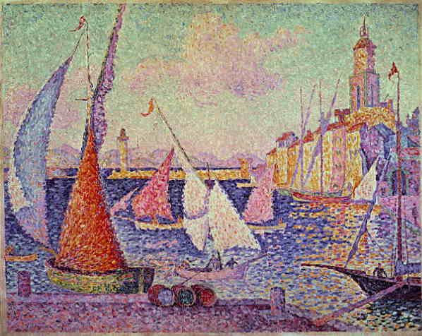
I had to think of how I would translate them to paint, how much I would embrace or deny the volume of their spherical blossoms. I worked through it as I went along, having a general feeling of what I was after but not knowing what it would look like in the end. I painted in extended and brief sessions, sometimes stealing moments in the evening to throw in a few more dots. The dots are drawn, as it is impossible for me to make a dab of the brush that would make a circle. Impressionists worked with dabs like the painting Port St. Tropez by Paul Signac.

Dabs, circles require diligence, labor is evident. It isn't drudgery, however. Each piece of paint is painted with joy, or at least the belief in joy. There is an insistence fulfilled through the repetition, a sense of certainty. It is an attitude to bring to the start of each day, hoping it will sparkle.

Sunday, September 05, 2010

Martha's Vineyard


20" x 16", oil on canvas, PRIVATE COLLECTION


A main focus, both structuring and informing the meaning of my work, is my interest in open spaces and, alternatively, woven/pixelated color. This can be seen in airy, luminous, large painted areas, Minimalist squares or dot paintings. There has to be an impetus, a spark to draw me to a particular visual situation often lending itself to big spaces or commingled color. Walking up the planked path leading to the ocean on Martha's Vineyard this summer gave me such a spark. The turn from the parking lot to the path brings an initial sun-filled view of the water and sky while the dunes wrap around one. The water is magnetic. I sought to capture this flash, immersion, dazzle and calm. Shapes are painted with enough subtle texture to leave as open areas. Open space is key here. I'm currently preferring this to woods, unlike earlier paintings in which I used the tangled density of trees and thickets.

A recent podcast on NPR concerned itself with a new book on etymology (wish I could remember/find the title) discussing the word "fathom" as coming from the ability of getting one's arms around something. [See The Online Etymology Dictionary definition below.]*. It also means "to get to the bottom of, to understand". These definitions imply the physical experience leading to knowledge. This is my point. I utilize a physical and perceptual experience while I paint and sometimes before I paint in order to create. This true for all artists, I would imagine. I'm just trying to articulate the process, the phenomenon. Many people share experiences but artists make them into art. Artists orchestrate experiences. Life is encapsulated in art. This is why art is valued. Perhaps it could be valued more.

*fathom (n.)
O.E. fæðm "length of the outstretched arm" (a measure of about six feet), also "arms, grasp," and, figuratively "power," from P.Gmc. *fathmaz "embrace" (cf. O.N. faðmr "embrace, bosom," O.S. fathmos "the outstretched arms," Du. vadem "a measure of six feet"), from PIE *pot-/*pet- denoting "stretching out" (cf. Gk. petalon "leaf," L. patere "to be open"). The verb meaning of "take soundings" is c.1600; its figurative sense of "get to the bottom of, understand" is 1620s. Related: Fathomed; fathoming.

Sunday, August 29, 2010

New iPad, Reflections on Artist Hitoshi Nakazato


iPad images, byNicole Maynard


**************************************************************************


Master printmaker Hitoshi Nakazato died July 17th from a head injury due to a fall in his studio. He was seventy-four. I had the opportunity to study printmaking with Hitoshi at the University of Pennsylvania where he showed me how to do etching, lithography, and silkscreen. "He called Philadelphia and the University of Pennsylvania the place of his intellectual awakening," said his wife, Sumiko Takeda Nakazato. Teaching from 1971 until the present and serving as chair in the mid-nineties, he had a strong commitment to the school. Always full of stories, he told us to appreciate relationships with our peers as we journeyed through graduate school at Penn.


His paintings and prints focused on the particular placement of simple geometric shapes: the circle, triangle, and square, vibrant in color and zen-like. The Machida City Museum of Graphic Arts in Tokyo exhibited more than 400 of his works this summer. He was a very kind man in addition to being an artist and teacher.


Sunday, August 22, 2010

Tree and Trees, My House (First Day of Summer)


Tree and Trees, 12" x 9", oil pastel


My House (First Day of Summer), 9" x 12", oil pastel

I recently went to The Whitney Museum of American Art in New York City to see the Charles Burchfield exhibition. The Whitney tweets about the show:

Burchfield only did 27 oil paintings but thousands of watercolors. Four of the oils are on view in this exhibition.

In the 1940s Burchfield began taking earlier works & expanding on them. If you get close enough you can see where the pieces of paper join.

Later in life Burchfield suffered many ailments but still got out in nature to paint, sometimes laying on the ground due to a bad back.

Peter Schjeldahl of the @newyorker on Charles Burchfield: http://bit.ly/aGjNW6. Lovely audio slideshow: http://bit.ly/a74zBZ

Whitney Museum
http://bit.ly/PWu4l

The tweets don't mention the scale of the later watercolors, epic at my guess of 4' x 3'. Rather than using a roll of watercolor paper like Arches makes (I'm not sure that was available at the time), the papers he tapes together are smaller than 8" x 10". The color and rhythmic patterns are stunning. The specific places and weather he directly observes spin into fantasy which is the difference compared with his earlier, grayish paintings of American buildings of the time. Permitting himself to let loose, he boldly puts forth an inner vision the general populace may not understand. This is the difficulty of being a visionary, waiting for people to catch up.

The exhibit has old copies of Life and Time magazines opened to feature stories on Burchfield celebrating his depiction of American of American life via common architecture. The paintings capture a gritty feeling of manufacturing at the time, working class environments rather than the monumental achievements of sky scrapers. People saw their lives in these pictures while his assertions of his dreams were less concrete in their minds. Of course, these later watercolors are the best and his place in art history would be be diminished without them. They sometimes focus on a central space like the altar of a cathedral, not unlike the spaces I'm after. Many artists say that art museums are like church to them and even more people say the same of nature. Burchfield's paintings evoke the celebration of the divine on both counts. This interest is an expression vastly differing from the ripples of the industrial revolution. A forward thinker, his work challenges us to stay true to ourselves and to trust our instincts, artists or not.

My pastels open the door to summer day dreaming, allowing you to float away with art as a springboard. Many artists can help get you there.

- Tofu-Powered Art-Chick

Sunday, August 15, 2010

Summer #7 Green Field and Sky


Summer #7 Green Field and Sky 6" x 12" oil on panel


I was attentive to using archival painting methods even as a student, dutifully gessoing canvases with four to six coats. I learned more about mold and water damage through a storage space flood in 1998. More recently, scratches, tears, and dents in large paintings in my January move are pointing me to taking out art conservation books from the library to aid me in their repair. I know it all will be dust someday but I would like a few people to see them first.


I'm reevaluating my choice of painting medium. Now I use either Windsor and Newton's Liquin or Gamblin's Galkyd Lite. I like them, no real complaints, and am unsure there is any real issue. I'm considering the argument that paint thinner does just that and perhaps weakens the archival integrity of a painting. Painter Ron Rizzi, for whom I worked as a studio assistant, thought so, at least back then. The substances used to suspend pigment for their application to a support is key in conservation. Mark Rothko's recipes are very problematic for conservators. The Rothko chapel in Houston underwent a $1.8 million renovation restoring the structure as well as the paintings which had problems due to light damage and the make up of the paint Rothko made himself.


"For the red, as well as for the plum of the seven monochromes, Rothko used pigment dissolved in warm rabbit-skin glue, which produces a thin, transparent wash of color. The rectangles, a velvety, matte black, turned out to be an egg-oil emulsion: a concoction of whole egg, oil paint, dammar resin and turpentine, made fresh each day without a recipe."


From the article, ARTS IN AMERICA; Restoring Rothko's Chapel and His Vision


In graduate school I made a few paintings using De Kooning's recipe of safflower oil and water as a medium for oil paint. Yellow One from 1995 is an example:


44" x 36", oil on canvas


I was working in an Abstract-Expressionist style, so the slippery paint maximized the fluidity of gestural brushstrokes. I don't fully remember why I stopped using it except that I wasn't completely satisfied. De Kooning liked it because it kept paint soft and fluid, requisite for his method of painting all day and scraping off the canvas at the end so as to have a clear surface the next morning.


I've started using the paint alone with a little stand oil when needed for fluidity. I've done this before but it might work better for me now that my work is smaller and I don't have to cover such large areas.


Taking care of art objects is often difficult and sometimes painstaking. It involves the sacrifices of money, space, and time. Conservation can take longer than it did to make the art (not that time is a good measure for evaluating the quality of a picture). If I had an unlimited budget I could provide secure transport, climate controlled storage, and the choicest supplies for my work. I take good care of things, but I am compromised. It is a burden (consider this before working large) and I am resigned to the inadequate means of preservation at my disposal and accept, with some pangs, the accompanying losses. This is what is on my mind as I unwrap paintings from my January move and assess damages. I am moving them from my garage into a new backyard shed (it's a lovely shed). We hope to get our cars to fit in the garage as we are told that the salt in the Rhode Island ocean air will corrode them. Hopefully the shed will also keep the salt at bay (bad pun, not that I have to tell you).


I don't mean to ignore Summer #7 Green Field and Sky. I don't think of conservation when I look at it. It's a reassuring image. It says, "Forget what you're worrying about and focus on what is important." It is something to dwell on.

Sunday, August 08, 2010

Summer #6 Sunrise & Summer #8 The Yellow House


Summer #6 Sunrise, 20" x 26", oil on canvas, 1998-2010

detail Summer #6 Sunrise


Summer #8 The Yellow House, 17" x 21", oil canvas, 2010


This week's post focuses on landscape painter Rackstraw Downes. He's very different from me but he's good. I became aware of his work in 1992. This month while watching my niece and nephews in Ridgefield, Connecticut, I was able to trade off with my husband to run to the Aldrich Museum of Art, conveniently located in the same town. An intimate exhibit of Downes' paintings, drawings, and sketchbooks in cases awaited. [Two other Rackstraw Downes' exhibits are concurrently on view at the Parrish Art Museum in Southampton, New York and at the Betty Cunningham Gallery in Chelsea.]


You must click on these links to see examples of his work to follow along.


The paintings are panoramic views of the underneath of the Westside Highway painted from direct observation in 2008-2009. Downes says he likes to be left alone to paint so if you see him, just keep walking. In a sketchbook, Downes writes that he gets annoyed with the changing weather. Light effects everything, after all. Downes isn't after an amplified, enveloping view like I do. He wants to see everything, to put it all into form. He wants to take it all in, process it, be present in it. In doing this he makes use of perspective: arcs and vectors structure the deep space, constructing the construction of the underpass. The horizon is stretched. I look to the left, straight, and right, seeing the other end in peripheral vision. There is a turn of the head in the gaze; the painting demands a slow scan (and then more of your attention). Bikers are painted as whole people, not shirts and pants painted separately. I couldn't care less about painting cars, but it matters to Downes and he makes me look. They aren't as dreamy as my visions, but they are still a dream as the picture is artifice. An angled stop sign becomes oval, striped like a buoy. Bike wheels function like the circles of barbed wire painted in another area. There is a glimpse of a building between trees, a poetic bit of painting; it's all poetry despite being concrete. In fact, he paints pictures of concrete.


Many painters ascribe to this kind of description, a factual world to ground us. What makes Rackstraw Downes more than amateurs who don't paint as well as they think they do? It has to do with the degree of perception, care, patience, skill in translating sight into paint, experience, and discipline.


I have some thoughts on what he does. Change of color temperature and light gives form and distinction to each piece. Orange, plastic construction fence is woven with the spaces in between its holes. The degree of thickness of paint is important - too thin, it would most likely be too dry, less personal, while too thick it would get clogged, loose a degree of legibility that is so much a part of his clear vision.


Treetops are made of small pieces like Vuillard but not as regular a pattern. They are fuller but sometimes fall flat, seemingly intentional. There is more space, more of a rustle, than in Vuillard. Again, as seen in Vuillard and positively delicious to painters, are shiny horizontal colored stripes with lines oily, like I like. There are also light, thin lines defining sections and what's between, simultaneously views and pieces of paint, many of which could be paintings on their own, if larger. I see the framing of spaces between sections of trees and leaves, made central in my hands, in my paintings.


As for the drawings, they are pinned to the walls, unframed. I've drifted away from frames and this is another professional example. Pieces of paper are taped together to make a longer drawing surface for the panoramas. Squiggly fibers in the paper remind one of the leaves in the paintings.


I couldn't stop looking; the pictures are full. My dots are here to fill you.