Showing posts with label chinese landscape painting. Show all posts

Sunday, November 28, 2010

Golden Tree


12" x 16", oil on panel


Big news at the MFA Boston!


Reframing “American” Art was the topic of the National Public Radio show, OnPoint, this past Tuesday. Hosted by Tom Ashbrook, the guests were Elliot Bostwick Davis, chair of the Art of America’s Department at the Museum of Fine Arts Boston and Andrew McClellan, dean of Academic Affairs for Arts & Sciences and Professor of Art History at Tufts University. The occasion was the opening of the MFA Boston's new "Arts of the Americas" wing. Five hundred million dollars in the making, it houses approximately fifteen thousand works of art.


Some of the discussion involved how the exhibit reflects the United States' changing demographics and global awareness. Juxtaposing art from the U.S. with our neighbors can inform our identity. What is similar or dissimilar in the art and how does that speak to who we are? It can broaden our self concept, not unlike a child going to preschool to be socialized. The child learns about others, finds his/her place in the group and goes home to bring the new knowledge to the family (sometimes for better sometimes for worse!). The Internet sends us all to a virtual "pre-school" experience, allowing us to learn from one another well beyond the one-room school house. Maybe computers can't do it all. I believe it is short-sighted that geography is rarely taught in American public schools anymore. Our lack of education about other cultures is compounded by the physical location of the U.S.; disconnected from the other continents. We began by separating from Britain and turning away from the layers of European history ever present in the architecture of those places. The pioneers had a clean slate, a wilderness they felt compelled to claim and tame. Out with the old, in with the new. The new wing and the curators way of presenting the art is an opportunity to poke our heads up and see what was going on while we worked so hard. If we begin to consider the art of others as equal, we can increase our understanding and value of the people behind it.


Many American artists were viewed as pioneers. The first landscape painters were out to show Europe that although we didn't have its cathedrals we had something better - God's unspoiled creation. Alfred Steiglitz's 291 Gallery bridged the gap, showcasing American and European artists. Jackson Pollock and the Abstract-Expressionists put New York City on the map as the art capital of the world, pushing Paris to the side. A lot has happened.


I worked as a security guard at the MFA in college and had a lot of time to think about the collection. My husband and I met at the West Wing Entrance where I was selling admission tickets (May 1992). He was a visitor, a total stranger. A lot has happened. I just had to call in.


I was on hold when Ashbrook asked if there is any point in looking for commonalities between the art. He took my call. I said that certainly each artwork is it's own thing but the impulse for art-making is human and connects us. I said that Joseph Campbell made his life's work be the study of mythology of all cultures throughout the world and throughout history, including how those myths are represented in art. He found reoccurring symbolism on many levels. The collection lends itself to this exciting approach. For example, what does a portrait of Paul Revere, a Jackson Pollock painting, and a teenage museum visitor have in common (I promise I'm not setting you up for a joke)? Rebellion. The passion to challenge the rules. The will to make one's mark and envision a different world. There is great strength, determination, and perhaps some necessary pig-headed-ness mixed in as well.


So there you go. I'm going with my old art school buddy and I'll take my husband and son. We can think about who we were and who we are as we look.

Sunday, September 19, 2010

Hill and Rectangle, The Page (Canvas)


Hill and Rectangle, 20" x 16", oil on canvas


The Page (Canvas), 13" x 10", oil on canvas


First I would like to draw your attention to the very fine exhibition by painter Barbara Grossman currently on view at Gross McCleaf Gallery in Philadelphia through October 6th. [127 S. 16th St., Gallery Hours: Tues. - Sat. 10-5]


Second, this post is regarding intellectualism. These two paintings, while pastoral, have a particularly intellectual bent. They have the color impact of Blue Hydrangea but also comment on the artistic process. The title The Page references the blank page of a writer and parenthetically, the blank canvas for the painter. Blankness is an infamous stumbling block. The page‘s physical geometry in Hill and Rectangle cuts through the landscape but also structures it. Sometimes I work on two pictures at once but inevitably I am continually faced with the problem of how to approach the next. Sketches can get me started but I think in color and the iPad art apps like Sketchbook Pro and Brushes are helping.


Hill and Rectangle celebrates the excitement of possibility and creativity. The rectangles in both pictures are confrontational, a standoff, and are large like heads, a face-to-face showdown. The white rectangle in The Page (Canvas) seems like a character. the space wraping around it, giving the sense of a standing figure, a three-dimensional albeit thin form. The gray squiggly line arching above it is like thought bubbles or curling smoke from a cigarette. I don't smoke but smoking and thinking have a history of connection like the painter Philip Guston painting himself smoking and tons of famous writers like Raymond Carver, Ayn Rand, F. Scott Fitzgerald, Jean-Paul Sartre, Jack Kerouac, and contemporary David Sedaris. I just like decaf coffee, less angsty and maybe I'll live to make more work.


The importance of intellectualism and society parallels that of intellectualism in art. Some artists embrace the idea, i.e. conceptual artists, while others are reactionaries such as the Dadaists (they think it’s all nonsense) and German Expressionists. Expressionists, both German and American Abstract, had sources in emotional catharsis and the subconscious. Art critics like Harold Rosenberg and Clement Greenberg wrote their interpretation of the Abstract Expressionists’ intellectual underpinnings.


Wikepedia provides a guideline for intellectualism:


"Intellectual’ can denote three types of persons:

  1. A person involved in, and with, abstract, erudite ideas and theories.
  2. A person whose profession (science, medicine, literature) solely involves the production and dissemination of ideas.[1]
  3. A person of notable cultural and artistic expertise whose knowledge grants him or her intellectual authority in public discourse."


I am particularly interested in number two with regard to spreading ideas as ideas can change people's perceptions. Intellectualism is currently Obama's problem with popularity. The general populous is feeling disconnected from him. It sees to many that he doesn't have strong feelings nor can understand their situations. This is despite his family's economic state while growing up, reflected by living in a two-bedroom apartment in Honolulu and his father's origins of a village in Kenya. His American mother, Ann Dunham, earned a Ph.D. in economic anthropology and rural development, relevant fields to the current economic state of America. She set a family standard for education. It is ironic to punish someone for living to their full potential, developing themselves, achieving graduation at Harvard and becoming president. Charisma can carry a long way toward relating with people, however, like the frequent statement that George Bush was someone the average person would like to have a beer with. The Right plays up this buddy-buddy attitude, an example is McCain's use of "Joe the Plumber" in his presidential campaign. I for one want a smart, articulate, lucid president who is going to carefully think through his actions. Obama not only sees the struggles of the American people but is working to lift them.


As far as painting goes, my job is to clarify my vision through the medium. I'm not going to solve any big problems but can impact people personally like poets and painters do. Thanks for taking the time to look.

Sunday, July 18, 2010

Tappan Zee Bridge and Sunset Blue and Pink


Tappan Zee Bridge, 6" x 12", oil on panel


Sunset Blue, Pink, Black, 6" x 12", oil on panel


Soap bubbles are floating over the Tappan Zee Bridge! Not exactly. It's fanciful but I'm not really depicting soap bubbles, just pieces of paint that feel like bouncing, drifting air.

There are few things more fanciful than the BMW art cars, a collection of various models painted (on) by famous artists. Alexander Calder was the first, others include Andy Warhol, David Hockney, Jenny Holzer, and Jeff Koons, to name a few. The cars were fresh out of the factory when the artists went to work. I really like them, especially the BMW 525i decorated by South African painter Esther Mahlangu. BMW called it "the first African Art Car". It is tradition in Mahlangu's community in northeastern South Africa for women to learn ancestral designs at puberty and then paint murals on their homes. Her car is a combination of this history and European consumer culture, epitomizing globalization. I would love to live in a house painted like that about as much as someone might covet her painted BMW.

The National Museum of African Art exhibited her work. The museum is part of the Smithsonian in Washington, D.C. I didn't know it exists or maybe I forgot. All these years of art school, reading about art, talking with other artists, and going to museums and it's not on my radar. Maybe it's stored somewhere in the back of my brain, but it's a little disconcerting it doesn't get much attention. I believe African art is under appreciated in the U.S. just as Africa doesn't seem to be on the forefront of the country's political landscape.

"My mother and grandmother taught me to paint when I was ten years old. When I am painting my heart is very wide, it reaches out. It makes me feel very, very happy." - Esther Mahlangu

Sunset Blue, Pink, Black retains dimension while also pressing against the picture plane. The blue and pink push against each other as they form one sky; the black trees keep their place. The landscape boldly stretches just as it draws you in. My heart is wide when I paint, too.

Sunday, July 11, 2010

iPad: Like Morris Louis, Green Blue Triangle Red, Cloud on Land


Like Morris Louis


Green Blue Triangle Red


Cloud on Land


Green Blue Triangle Red seems primordial. The red makes it seem like we are looking through a tepee: the door drawn back allowing the opening to be filled with the bright landscape of summer. Compositionally and coloristically (I don't think those are real words but we painters use them all the time) they relate to painter Morris Louis. Morris Louis , an Abstract Expressionist and a central figure in the development of Color Field Painting. He was inspired to experiment with paint applications of newly available acrylic paints after seeing Helen Frankenthaler's Mountain and Sea, the first "stain painting". [See Louis' 1961 Alpha-Theta] I was privileged to have Frankenthaler speak at my small departmental graduation ceremony for the MFA department at the University of Pennsylvania in 1996. Her speech was regrettably short (she seemed excited to get to her private showing of the Cezanne show up at the Philadelphia Museum of Art) but she got to the point which is what we often wish speech-givers would do. I will never forget her clear message, "Use your skills." She knew we were accomplished and understood how art can get pushed aside. She's now eighty-two and I am not alone in appreciating her contribution of luminous, energetic spaces. I haven't heard anything about her owning an ipad. I wonder what she would do.

******************************************************
[A most excellent website: http://www.theartstory.org

It's mission statement:

"The Art Story Foundation's official statement of purpose is to: "Educate, inform, and introduce people to modern art through speaker series, educational workshops, and online educational resources".

Nicole is all excited!]

Sunday, July 04, 2010

The Night Sky and other linocuts


The simplicity, pattern, line, and nature reference in these strike me as similar to Native American pottery. I particularly love the pots from Acoma, "Sky-City". My husband gave me one I saw there as a wedding present and it is one of my most treasured possessions because of what it is (I don't know its monetary value).

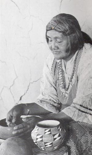
Lucy Lewis is the most famous Acoma potter (photo of her). I relate to her in because she took care of her family doing traditional chores (in a place that still doesn't have electricity or running water) while steadfastly creating her artwork without collaboration or assistance. She made art in obscurity, as she said that no one ever came to Acoma. She certainly wasn't alone, however, as she formed clay at the kitchen table surrounded by children and grandchildren. Born in 1902, the first competition she entered in 1950 brought a blue ribbon and further awards followed. Lewis' work is in art museums around the world. I had the opportunity to meet two of her nine children, Dolores and Andrew, who are both potters. They explained the origins of the materials for the ceramics are gathered from the area, the brushes from yucca plants, the color from a secret place. The symbolism of the designs is sacred and great effort is made to keep the meanings within the tribe.

These linoleum cut prints have a zoomed-out view of an open landscape. The Night Sky is an edition of ten. Each color is created by inking the plate, printing it, then carving out an area and printing it again on top. This is done for each color, layering the image. The three prints below are singular variations (hence monoprints) on The Night Sky, and are labeled "a" through "p". Most are printed on top of colored papers; some were old prints. The patterns and colors of the papers are fitted with the last pattern of the plate to make strong compositions differing in space and mood. I flipped the orientation of the plate for a few. Black ink is used as a unifying element, contrasting enough with the colored papers to clearly define form. I don't use yucca brushes but like Lewis I am at home in the studio and the kitchen. Maybe someday I'll be lucky enough to have the museum part in common too.

Sunday, May 09, 2010

Ipad Art, Brushes App, QuickTime Player


Farm 3, Brushes/ipad


Field, Brushes/ipad

Box, tablet computer, 2007


Untitled, iphone/idoodle, 2009

I am not anti-technology. A public confession: I think I'm addicted to clicking. I think I found a way to paint and have my clicking too. While nothing replaces painting, each artistic medium having it's own inherent strengths and limitations, Brushes for ipad is very exciting. Here's a
Brushes demo video by creator Stephen Sprang. It sells on iTunes for $7.99 and I think it will save a bit on paint as I am able to use it not only for digital art in and of itself but also for painting studies. I love the materiality of all traditional art media. The difference between an oil painting and a digital painting is corporeality, similar to a person in real life vs. a photograph of that person. Photography has a lot to say, or rather show, so much so that Native Americans thought being photographed might steal their souls. The photograph is far from soul-less, and so is the digital painting. My work is mostly seen via the computer (I wish it was seen more in person, oh well). Digital art is made for the computer. Scale isn't an issue. The images are light-filled. British painter David Hockney is totally on-board and says it is like painting with stained glass. I LOVE stained glass, always wanting to achieve colored light like it. Hockney is prolific, totally going to town on his ipad and emailing friends drawings of flowers daily. He started out using Brushes on the iphone and the pictures were exhibited at the Tate and Royal Academy in London. [Lawrence Weschler's Hockney article and Jordan Galloway's in The New York Press ]

The ipad isn't my first excursion into creating digital art. I've used a tablet computer and an iphone (see above). Ink Art was the software I used on the tablet. It's not that different from Brushes. Many people on customer reviews complain about having to use a finger to draw in Brushes rather than a stylus like on tablets. I am much happier skipping the stylus. It felt too removed for me and touch brings me that much closer to what I'm making. I think it's just a question of getting used to it, like a touch mouse. There are fans of drawing with pencils rather than painting in general because of the difference of control.

The ipad's big screen is the key to my excitement. I enjoyed making images on the go with the iphone, thinking of them more as studies. The ipad is large enough to do more. Jorge Colombo has made three covers for The New Yorker using the iphone, achieving a surprising amount of detail; I'm assuming by zooming in and out. I'm a little worried the paintings will pale in comparison to my new digital images when seen on-line. I also wonder how it sits with me that the digitals are more graphic in nature. I intend to make paintings from some of them, so it should be a rather fluid back-and-forth process. I can also take a picture of my painting and work on it further in Brushes. This can give direction to a work in progress or expand the idea for working in a series. Best yet, Brushes allows the actions/steps involved in making a picture to be played back as a QuickTime file. The subjects I'm painting lately are non-narrative yet I'm seeking to make them into moving images. Move over, Hockney.

The movie below is the making of Farm 3. I had a little technical trouble with Brushes Viewer and Steve Sprang himself replied to my query. Thanks, Steve!

Sunday, March 28, 2010

Winter Landscapes #15 (Smooth in Blue and White) and #17 (Hazy Sky and Snow)


Now that it's officially spring I have to get caught up on posting my winter paintings; these are the last this year.

Smooth in Blue and White reminds me a bit of Georgia O'Keefe and the paintings she did of adobe buildings in New Mexico with their soft, flowing, yet rectilinear forms. She is an example of an artist who painted both abstractly and representationally , like myself. She said, "I found I could say things with color and shapes that I couldn't say any other way - things I had no words for." Those "things" are why painters paint rather than choose a different medium. Arthur Dove, a contemporary (and another fave of mine) painted similar forms.

Hazy Sky and Snow has a sun smack in the middle and towards the top of my composition. The sky and land bisect the square. Light colors shimmer like winter light. The arrangement reminds me of the painter Adolph Gottlieb, famous for his abstract paintings often having the particular structure of a vertical format with a circle painted at the top half and a jagged shape on the bottom. The two forms set in opposition stimulate metaphors in the viewer. I especially love his Rolling, 1961, with its landscape format, nice and bold calligraphic black line at the bottom, and two large circles in colors I love together: red and blue. He makes use of the color of the canvas like Chinese landscape painters use the white of the paper, something I enjoy as well.

My spring series will continue shortly...