Sunday, May 11, 2008

Two Trees


18" x 24"
oil on panel

This week, a smattering:

My friend, Aaron Brooks, is having a solo show at the Bowery Gallery in New York City. It closes May 15th and the link is: http://www.bowerygallery.org/current.html His work often combines different styles in one painting and they have a metaphysical bent.

I am entering into the world of free-lancing and am available to do illustration and graphic design work, such as children's book illustrations, greeting cards, logos, website icons, etc. I am really enjoying using Adobe Illustrator. You can check out my profile with portfolio samples on Guru:

http://profile.guru.com/963970

One of my roommates from Mass. College of Art went with me and a group to do landscape painting in Tuscany for a month. She did a series of paintings and gave titles to them such as "It is What it is" or simply "What it is." The flippant, philosophical titles didn't match the traditional style of the landscapes, but they did convey the painter's problem with language. I am of the mindset this week to say the same about Two Trees: it is what it is.

Sunday, May 04, 2008

Spring Sublimation

18" x 24"

oil on panel


"Measured objectively, what a man can wrest from Truth by passionate striving is utterly infinitesimal. But the striving frees us from the bonds of the self and makes us comrades of those who are the best and the greatest. " - Albert Einstein

I'm always looking for motivators. I mean, I am self-motivated, but even so it is good to get external reinforcement that I'm not wasting my time trying when it sometimes seems futile. It's kind of like looking for the cups of water and orange slices from people when running a marathon.

I painted over another painting to make this one. It is a put-the-past-behind kind of thing which accompanied my spring cleaning and multiple trips to the Volunteers of America. Roberta Smith wrote an article in The New York Times recently about how there seems to be a new trend in painting of working small, as opposed to the large works of the Abstract-Expressionists. She suggests it relates to the economy. It is a kind of simplification, reduction. The short but brilliantly succinct film, The Story of Stuff shows the current state of world affairs better than anything I've come across. My nine-year-old was able to grasp the problems that elude much of society because of its straightforward and appeal graphics. I didn't want to watch it at first, but was glad I did. I think it definitely relates to my art and why I'm making it the way I am.

As far as this particular work, there is a lot of texture visible in this photo of it, but in person the center square seems to hover and seems to be able to go in front as well as behind the green. I'm obsessed with green. Plants are supposed to relax people. The expansive green fields and luminous blue skies of Western New York helped to inspire this picture.


Sunday, April 27, 2008

Pink Roses VII and VIII


20" x 16"
16" x 20"
oil on panel
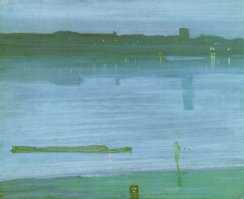
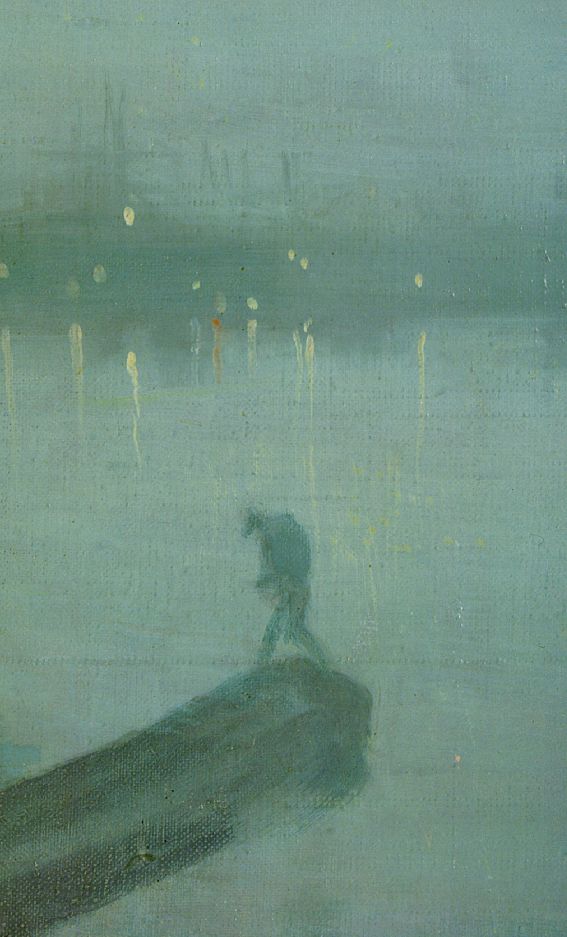
The obsession continues...here are two more from memory. Whistler always fascinates me for his sense of scale. Take the way he paints the figure in Nocturne in Gold: Old Battersea Bridge (click here for a close-up). It is not how you think a person might be painted, but in this context it completely works. That is how a lot of abstraction is; it seems wrong at first, but when well done, it can be right on the nose.
I decided to zoom out in number seven. I had tried doing it in number four, but I couldn't let go of the huge blossoms yet. I think I must have painted this little bouquet about fifty times over before arriving at the way it looks now, almost singular like one flower. It looks figurative to me, like a parachuting person. Someone thought it looked like flowers on an altar, with that gray rectangle behind it.
Number eight is very fluid, rhythmically winding the eye through the bouquet, stopping to note the particular change in light/color of each rose. Of course it is its own thing. Might remind you of Cy Twombly, mid-career Guston, or Terry Winters.
What next? Stay tuned...

Tuesday, April 22, 2008

Pink Roses From Carin


Pink Roses From Carin I - VI and Biscuit Smelling Roses (not sure my snapshot qualifies as art, but it is on topic)
oil on panel, 20" x 20" for the first and the rest are 16" x 20" or 20" x 16"

These almost didn't get painted. There are so many pictures of roses that it is hard to escape cliches. In addition, as soon as a painter picks up a brush, she has all of art history on her back. The problem of roses on top of that made it seem something I should side step. They came from my friend, Carin, in celebration of the first jazz aerobics class I taught (artists end up doing all kinds of things, although I don't think Cezanne did aerobics). I probably looked at them more than she thought I might, squeezing six paintings out of the bunch. My beagle, Biscuit, also took time to smell them. I got a little obsessed. Don't get all spoiled now, seeing six paintings up at once. I usually post one at a time so they can be looked at a little longer, but I think these are interesting to compare as a sequence.

From image to image the roses become less fragmented in their color, the pink is seen more as a whole, singular color experience (number V has some variation). The last two are done from memory; the roses wilted and gone, but still occupying my mind's eye. They range from sticky, cotton candy pink to gauzy.

The first painting is the only one showing the flowers from the side. It is the least romantic with some of Philip Guston's bluntness. The second is very intense, almost claustrophobic, pressing. The third is like O'Keefe in its composition and sensuality (she says she was just painting flowers, but everyone knows that was just her conscious intention), and the flowers are more a whole entity. The fourth is the only to include the vase. There is the basic problem of pink roses, green stems, vase, and the air around them all (background color, which is always more than a static background). Manet painted all the bouquets he received from friends while on his death bed. I saw a show of them and read the wonderful book by Andrew Forge. They are something, as he was so involved with life as he painted them, knowing he was going to have to let it all go. The fifth painting reminds me a bit of Soutine (he did several paintings of the same subject such as gladioli)with how the edges are handled, as well as the intensity and winding way the eye travels through it. The last painting is rather fresh. I have painted writing in pictures before, and this text comes from the song by Seal, Amazing. Friendships are wonderful for the companionship in celebrating each other's accomplishments as well as supporting each other through difficult times and gray areas when we don't always feel amazing.

Although I can reference other artists when I look at my work, I didn't set out to paint in anyone's style. Like jazz musicians playing off of each other, creating and creating, I kept wanting to do it again, but differently. I think I am in each one and whatever a "Maynard" is, maybe the word "intense" and "eclectic" could be attached.

Monday, April 14, 2008

Thaw

18" x 24"

oil on panel


Here in Western New York, it is very exciting to see the first bit of ground showing through melting snow (I painted this two weeks ago; I confess). It is on par with the robin and the crocus, and Thaw is a celebration of that moment. The bottom is heavily textured in contrast to the light top; the short, varying brushstrokes owing something to Van Gogh (that link is to a very nice website on Van Gogh, by the way).
The beginning of spring is interesting for the change of substances: snow to water, frozen ground to mud. It calls to attention the alchemist in me. At MassArt, painter Marcia Lloyd took a few students to the Museum of Fine Arts, Boston, and pulled me aside to look at a painting of an An Artist in His Studio by John Singer Sargent. She told me that I am a "Sensualist", meaning that I paint in a way that transforms or translates not just the texture but the essence of material into paint. In the example, Sargent made paint become light reflecting off the artist's bald head, the flesh of ear, blankets, wood, ceramic, the paint on a palette and the paint in a painting. It involves using more senses that pure sight while making art. That is as metaphysical as Art Weekly is going to get.
One other thing I found interesting when looking up "sensualist" is the connection mentioned between indulging in the senses as a means to happiness. It makes one think of the opposite: the way studies have shown that sensory deprivation leads to depression. Relaxation methods often try to awaken senses through fragrance, touch, sound (lotion, massage, candles, music, etc.). Thaw is also about being able to spend more time outdoors (and thus have more sensory experiences = increase in happiness?).
Webster's Revised Unabridged Dictionary - Cite This Source - Share This
SensualistSen"su*al*ist\, n. [CF. F. sensualiste.]
1. One who is sensual; one given to the indulgence of the appetites or senses as the means of happiness.
2. One who holds to the doctrine of sensualism.
Webster's Revised Unabridged Dictionary, © 1996, 1998 MICRA, Inc.
Bibliography:
American Psychological Association (APA):
sensualist. (n.d.). Webster's Revised Unabridged Dictionary. Retrieved April 14, 2008, from Dictionary.com website: http://dictionary.reference.com/browse/sensualist
Chicago Manual Style (CMS):
sensualist. Dictionary.com. Webster's Revised Unabridged Dictionary. MICRA, Inc. http://dictionary.reference.com/browse/sensualist (accessed: April 14, 2008).
Modern Language Association (MLA):
"sensualist." Webster's Revised Unabridged Dictionary. MICRA, Inc. 14 Apr. 2008. http://dictionary.reference.com/browse/sensualist>.
var tcdacmd="sa=e;sz=3;ad;dt";

Monday, April 07, 2008

Field I


18" x 24"


oil on panel


I am always enthralled by aerial views; a teacher from art school always pushed us to vie for the window seat. I am particularly into rural landscape and its design of rectangular, patchwork pieces. Field I is rather singular in its central, brown area. The earth color has many variations and is crossed by undulating, thin, green lines, like a musical staff. While in graduate school I painted a series based on Beethoven's Symphony Number 6, know as the Pastoral Symphony. Nature and art are both rhythmic (design elements in art can bounce your eye around a piece in a tempo which contributes to your interpretation). I recently listened to Johnny Cash's song, Get Rhythm. To quote Wikipedia,"The song is about optimism, centering on a shoeshine boy who "gets rhythm" to cope with the tedious nature of his job." Rhythm and optimism can go hand-in-hand, and I think of the reassurance many people say they feel from the certainty and natural order in math. I think musicians feel it when notes are hit at the right time, dancers when movements are in sync to music, a batter when the bat hits the ball. The painting's subject, a field, is emblematic of growth as well as the labor that goes into cultivating change. Jasper Johns painted the American Flag. He took a symbol that was loaded with content and worked on its surface as a painting, which is different than taking a subject like a field, and painting it into a flag/emblem. Still, Johns made his painting iconic of American Painting and his picture goes beyond being a picture of something to being inseparable from the object that is depicted. In any case, with all the green around it, Field I is my own flag of optimism.

Tuesday, April 01, 2008

Sky and Grass


18" x 24"
oil on panel

I've always liked the Claritin ads for their blue skies and green grass. I like the still quality of paintings especially because they have their own sense of time. They ask the viewer to wait a minute (or much longer) to look and maybe come back again another time and look some more. Some people say they would like to live with a picture that is like Where's Waldo so that they could always find something new in it. I want to see paintings that don't have a lot of things in them and still have my awareness challenged, heightened, awakened again and again. Painter and professor Susana Jacobson once gave me the advice to "paint the paintings you want to see." I always try to paint as though it is imperative; if I could only paint one last thing, what would it be? It's not always easy to sharpen one's focus. Art is funny because it can seem like nothing until someone says its not, easily dismissible without words to defend itself. In a recent interview with Terri Gross, David Grohl from the Foo Fighters told about Australian miners who got trapped in a collapse. There was a small opening drilled down to them and one asked for an ipod to be sent down with Foo Fighters music. They got out in the end, at least the one who asked for the music, and Grohl arranged for tickets and a flight to his next concert. You just never know how your art, or anything you do, for that matter, may effect someone. If I was trapped in a mine, I would really like to see this blue sky and green grass.


Tuesday, March 25, 2008

Winter Landscape I, II, & III


18" x 24" each

oil on panel


Even though it is after Easter there is still some snow out here near Rochester. I enjoy the changes in light, air, and temperature (well sometimes the change in temperature) that make for stunning qualities in color. The texture of the landscape seems to change as well, as trees have buds and snow melts and refreezes.

The first winter landscape painting up top seemed to paint itself. It's one of those breakthrough paintings that happen once in a while and can never be made the same way a second time. *@$!# sigh. It totally has to do with frame of mind and maybe even the alignment of the planets. Painters are pluggers just like writers, so the only thing to do is to keep sliding around in the mud until something materializes. Gladly, none of these paintings are mud. The first one captures the coldness of winter and the crystalline air. It also suggests woods on either side and the format of a stage. I have been thinking about how the woods have so much plant and animal life in them that we don't always think about as we get through our "to do lists".

The second painting is involved with the three layers of sky, woods, and snow. The woods are a layered tangle of compression of form and space. The paint handling is rhythmic in its bends; lines travel between the varying density of trees.

The third winter landscape also addresses the problem of sky, woods, and snow. This time the woods are not set in gray, but almost seem encapsulated in blue ice. Obviously staying true to nature is not my priority. I enjoy the different kinds of blue here, the space between the trees, the drawing of the trees (mini-portraits) and the interplay between the layers.

As much as I go on about spring, winter has its moments.


Tuesday, March 18, 2008

Cream, White Circle, Blue


12" x 18"

oil on panel

This is a fairly straightforward landscape color field type painting. The directness of it comes from its basic composition of a horizontal rectangle halved with a circle in the top part. A friend was recently sick on an airplane with me and it increased my appreciation of the fundamental importance of being able to see the horizon. I think that line of earth meeting sky is hardwired into us and is a good place to start when making a peaceful image. Such a simple line and areas above and below can be quite compelling in real life as well as in art.

I just saw the Courbet show at the Metropolitan Museum of Art in New York where the painting, The Wave, is on view. It is as encompassing as a Rothko and I was thrilled to have Cezanne's words in my mind as I took my turn before it. From the Met website "Cézanne later recalled his impressions of this painting: 'The one in Berlin is marvelous, one of the important creations of the century. ... It hits you right in the stomach. You have to step back. The entire room feels the spray.' " The Wave is a churning subject painted in a way that amplifies that sensation. Courbet's The Desperate Man is a depiction of himself in a state of angst. It is the cover image for the show's brochure and to me it has parallel emotional content to The Wave. The Desperate Man is an amazing painting for its innovative expressivity combined with its technical virtuosity. It captures the topsy-turviness that many people feel in their early twenties (Courbet was twenty-five when he painted it) and it shows that Courbet was an edgy painter, approached painting with a freshness that matched his reputation as a rebel in his time.

No longer painting churning landscape abstractions as I did in my twenties, Cream, White Circle, Blue goes more in the direction of Agnes Martin.


Tuesday, March 11, 2008

Sky and Snow


12" x 16"
oil on panel
After making this painting I discovered a poem about winter that I like very much. It is called
Twenty Below by Paul Engle. It talks about the hardness of winter wind, loneliness, and the way "cabin fever" can bring about intimacy. It has been very cold and snowy here in Western New York, but my painting doesn't focus on the same things as Engle's poem. Sky and Snow is lyrical despite its lack of Matisse-like arabesques. The blue and the white shimmer radiantly; the air feels crisp. The line of snow meeting sky softly undulates, human, not stark. The space is inviting for all its apparent emptiness, calm and open, no trace of a cabin. It is a friendly place, not unlike an illustration from one of my favorite picture books, Caldecott winner A Snowy Day by Ezra Jack Keats. His book is described on his website as "sparkling with atmosphere." I remember being enchanted by it as a child, and again as an adult reading to my son. I think my painting has some of that sense of wonder, but the narrative is removed and it is very still.

Tuesday, March 04, 2008

Light Blue Rectangle, Blue Square


24" x 24"
oil on panel

Don't dismiss it yet. It's not nothing. There is a square and a vertical, smaller rectangle. The latter hangs in space, glowing. It is like a mirror without a reflection. Peaceful, it seems impenetrable at first, but closer inspection reveals fracturing in its facture, hints of atmosphere. Maybe it is a looking glass to pass through. The light blue rectangle has the singularity and scale (hard to tell in a reproduction) of a head; that when the viewer approaches it stands in opposition, ready to greet or be met.


There is a hint of alchemy, of substances, colors mixed, subtly woven into the two opposing blues. Their overall contrast makes me think of the sky-blue atmosphere of earth and the universe beyond. Although we can't see outer space with our naked eyes, it is very real all the same. So the picture is about mystery and human limitations. It is about conception and reality, the flat world and the round, the search for clarity and the frontier. It is also a light blue rectangle and a blue square.

While in the MFA program at the University of Pennsylvania I had the opportunity to study with Robert Slutzky and later be his TA for Drawing I. Bob died in 2005 and I remember him as a caring, extremely intelligent teacher known for his expertise in both architecture and painting. He studied with Joseph Albers at Yale, taught art and architecture at Cooper Union, worked with architects John Hejduk, Peter Eisenman, and Richard Meier. Then he came to Penn and was always a central figure in critiques for architecture, painting, and sculpture students. His geometric paintings are filled with light, color, and transparency; stunning, please click here.

It is funny to see one's own work next to a mentor's. Bob's work dazzles me but the thinking of space, placement, color, makes the work so strong, far beyond eye candy. The work of mine that I am posting is not more about opacity, atmosphere, singularity, something somber. I would so have liked to have had more conversations with Bob because he always made me feel that painting is important and my painting is important.


Tuesday, February 26, 2008

Boom! Ft. Lauderdale


24" x 18"


oil on panel


I went to Ft. Lauderdale with two friends recently to celebrate my birthday. I visited my very cool brother there and we all went out to Boom! In fact, we went to Boom! two nights in a row and had a great time. A gay dance club and bar, it is very popular and shares a spot in a strip mall with several other gay owned stores including "GayMart", "Bottoms and Tops", and "Georgie's Alibi". The text in the painting, "I like you just the way you are" comes from the Timbaland song, "The Way I Are." It also is a reference to my song with my husband, the oldie-but-goodie, "Just the Way You are" by Billy Joel. The club has an atmosphere where anyone is welcome. I am sure that club-goers have their own list of preferences, and nothing is completely simple, but overall it is a place where anyone can come as they are. My husband couldn't make it but was happily in support of my fun.

The main negative about Boom! and other clubs in Ft. Lauderdale is that smoking is permitted (note the haziness in the painting). Between the smoke machines for the ambiance and the overcrowded room filled with lit cigarettes, I returned home to have the worst asthma episode of my life, lasting over a week and a half. I'll spare you the details except to say that I had the energy of an eighty year old. I didn't drink a thing all weekend, so all the bad feeling was from smoke alone. Sadly, I can't return to Boom!. We did duck out periodically to Georgie's Alibi next door which is non-smoking. We caught our breath to music videos while sitting in the lounge, enjoying the music better than the sometimes too techno Boom!.


There is a great club in Rochester where it is non-smoking (although they do feel the need to use the smoke machine). Tilt is less of a meat market with more eye-candy. It offers straight and gay nights and has a reputation for great drag shows. The fun is not over.


Painting notes:

The figures in the painting are similar to those by artist Marsden Hartley, who incidentally was gay.
Wikipedia entry here.


Tuesday, February 19, 2008

Butterfly Self-Portrait


24" x 18"
oil on panel

It's a little goofy looking, I know, but that's me. Bright-eyed and smiling, my intense gaze is optimistic. What I am looking at is unseeable to the viewer and perhaps to me as well; I think I am looking towards what lay ahead. Butterflies frame my gaze, fly out of my head, and seem to be with me inside and out.

Butterflies are associated with nervousness and the body - butterflies in the stomach - as well as transformation. The movement they make, all that fluttering and quivering, makes them such a perfect metaphor for tremulous feelings. When I want to do something that is good for me but it involves stepping outside of my comfort zone, I try to make myself do it even if I am afraid. At the same time, I am careful not to take on too much in order to avoid being overwhelmed. In looking for internet sites relating to learning something new everyday, I found some fun things. Learning is related to total wellness and I think the balance of mind, body, and soul is very important for happiness.

Stylistically, Butterfly Self-Portrait, is related to the work of Abstract Expressionist Willem DeKooning. DeKooning's paintings of women took off from the cubist portraits of women Picasso did, but added supreme fluidity, and guts to a planar framework. They are tough and often ugly. Virtuosic, visceral, honest, and a "to hell with what anyone thinks" attitude make them favorites of many. There are also a lot of people who are put off by their aggressiveness. The attitude of stupidity the degree of fragmentation of the women raised the question of misogeny (many of Picasso's portraits of women seem to mock them, like the portrait of Dora Maar, Weeping Woman). I have also heard it said that DeKooning may have been painting about a difficult relationship with his mother.

In my painting, I kept the almost charicaturesque quality of these other paintings (it's a willingness to laugh at myself), but backed it with my sincere positive outlook. The painting is fluid and airy for those butterflies. I am not decked out in fancy clothes (or any for that matter) as it is all about taking a look at myself to see the essence of what makes me go. My fortune cookie this week read, "Accept yourself as you are." I do, but I don't like being bored, so...

Learn something new every day:


Braingle.com "Brain Teasers, Riddles, Trivia, Brain Exercises, Games, Forums and more..."


Tuesday, February 12, 2008

Clouds and Stones


12" x 16"

oil on panel

We have a lot of rocks in our yard. We're not very good gardeners and my husband has become preoccupied with getting the rocks out of the way of the lawn mower and starting a stone wall. He has a particular fascination with ones without mortar. My grandfather, a construction worker, also loved stone walls. He admired the craftsmanship and the combination of natural beauty and the work of the hands. Their is a human scale to such walls, as well as evidence of care, time, and planning, like embroidery.


In this painting, the clouds take the form of a series of rings. Their unity as a line and forms of individual units echo the stones. One reading of the foreground can be water surrounding the rocks, but waves don't lap at their edges. More likely from the information painted they are strung in the air, like weighty party decorations. Clouds and stones are elevated to the celestial, common, belonging, important. The clouds seem like white halos to the stones.


Wednesday, February 06, 2008

Green and White-Blue


12" x 16"

oil on panel


Imagine you are on a plane. You see rectangular fields of green; the plane tilts and you see clouds, atmosphere, a bit of blue, all framed through the plane window. I am not literally describing this scene in Green and White-Blue, but this kind of experience informed it. I enjoy the intensity of the tangible green, the luminosity of the white, and the appearance of the edge of blue. An odd thing is that it seems taller than its 12". It is both lively and peaceful, expansive, hopeful. Even though it is geometric in design, the edges are all about substances interacting and it is connected to the landscape tradition that celebrates nature as majestic and larger than ourselves. One such nineteeth century American painter is Frederic Church who painted this color centric picture of Niagara Falls.


Here is a painting by Brice Marden, which seems to be a contemporary relative of mine.
I mentioned an article by Mark Bittman from The New York Times last week. He has just begun his own blog through the paper which can be found here. It looks really good; he's posting a daily recipe and there is going to be some discussion of food politics. Don't be scared about the politics; it doesn't seem to cut-throat as one of the recipes up is for fried chicken. Excuse the vegetarian pun; I get it from my husband.
Another note on my last post, my friend, Sharon, recommends the book Food Politics by Marion Nestle, "She has a great discussion about the formation of the Government’s food pyramid and how the dairy and meat industries lobbied heavily to inflate those daily requirement, with little or no medical research to back it up. It’s a fascinating read, if a little dry- if your local library has it I’d recommend picking it up."


Wednesday, January 30, 2008

Butterfly Lungs (Aztec Skipper)


16" x 12"
oil on panel


I like the symmetry and duality of the butterfly form and the human form. Some oppositions they evoke are: halves and a core, internal and external, fragility and strength, function and beauty. I like the juxtaposition of implied movement: the breathing lungs and the pumping wings. The brown, black, and purple are striking in their richness, but can also seem unpleasant, the way anatomy is simultaneously amazing and repulsive. It ties our bodies to nature, a connection environmentalists are trying to re-establish. I think the main feeling behind this strange image is that of purpose and potential futility. There is no guarantee that all the effort will result in meeting some tangible goal. There is the belief that the striving is important. It is in opposition to apathy.

It is the icon of my daily life, rinsing out jelly jars and putting clothing tags in the paper recycling bin. It is eating Tofurky (very good in a sandwich with cranberry sauce). I was glad to see a recent article* in the New York Times by Mark Bittman address the environmental impact of eating meat. He suggests the federal government's daily recommendation for protein intake is inflated. Gee, could meat lobbyists be involved?! It's not just "Big Tobacco" out there, it's "Big Meat".

A striking analogy from the article is this quote:

"To put the energy-using demand of meat production into easy-to-understand terms, Gidon Eshel, a geophysicist at the Bard Center, and Pamela A. Martin, an assistant professor of geophysics at the University of Chicago, calculated that if Americans were to reduce meat consumption by just 20 percent it would be as if we all switched from a standard sedan — a Camry, say — to the ultra-efficient Prius."
I do drive a Prius, but I confess to the world that I eat bananas. They travel far to reach me and I sympathise with all the carnivores out there, because it is hard to give things up. I eat Tofurky; I don't know if I can give up bananas.

*used with permission


Wednesday, January 23, 2008

Orange Self-Portrait With Butterflies


12" x 16"

oil on panel

I think the painting is peaceful in mood, created in part by economy of design elements. Atmospheric perspective allows for lines and butterflies to come in and out of focus. The gray-white air moves forward and back, now figure, now space. The orange changes saturation and moves towards pink while a right angle near my shoulder suggests a chair or perhaps a the corner of a painting, maybe one of butterflies. A large butterfly is connected to my head, popping out of my brain, a live thought bubble. Butterflies are creatures of dreams, of hope and potential. My painted self is my real self.


Wednesday, January 16, 2008

Glass Box, Hand

36" x 24"
oil on panel

The black squares in some of my paintings take on three dimensions in the form of this glass cube. The setting is some kind of existential wasteland, a non-descript place of change, as indicated by the loose brushwork. It seems as if a wind is blowing, the only thing to ground you is the brown bit of horizon. The hand seems ghost-like, as transparent as the box, defined only by a few lines. The glass cube seems to make the hand a bit more substantial. It is an offering, resting on the outstretched hand, a precious bit of color in a vacuous space, water in a desert.

This could be a metaphor for a few different things. It is a picture about strength and vulnerability. It is about gift-giving. A gift has a part of the giver in it, in the thought required to select it and present it. There is the hope that the receiver will receive it well. I did not always know how to accept a gift graciously. It is easy to slip into practical thinking or to be too much of a connoisseur when looking on a new object coming into one's house. It's better to think about the giver instead of the thing or that the thing is a piece of the giver. Britney Spears, whatever her situation, has it right in her new song, Piece of Me. A performer does put a piece of themselves out there, no matter how private they may or may not want to be.

The painting is not only about giving, but is about extending oneself. It is about taking a risk, going into unfamiliar territory, potentially bruising one's ego (the glass box). The path is not fully illuminated but may be worth exploring.


Wednesday, January 09, 2008

Hand, Butterfly (Ipidecla miadora)


36" x 24", oil on panel

I bet you missed the butterflies. They're not gone; I've got a few fish frying.


There aren't many details in this painting. It makes you focus on the way the sections of the muscles of the hand are similar to the sections in the butterfly's wings. The painting is not mamal vs. insect but rather living thing and living thing. The butterfly is depicted fully, while the human is only represented by the hand and forearm. The butterfly is more of a character, in a way, than the person is, more of an individual; it has a face. Maybe the hand could be the Hand of God with a radiant, holy gold color. It has a monumental feel. The background has a leaf-like shape to it, echoing the form of the butterfly's wings. The subject's large scale, bold color, and focus on nature relates to O'Keefe.

I'm getting more studio time now that the holidays are over. Back to frying fish (no more cookies, thank goodness).


Wednesday, January 02, 2008

Green Circle, Blue Square


24" x 24", oil on panel


No, your eyes are not deceiving you; the circle in the center of this blue expanse is green, not yellow like the sun. It relates to my previous post in that it has an unexpected twist with nature references present but skewed. The blue subtley shifts and is not painted flatly like a wall or a sign. I like the clarity in the piece, its serenity and confidance. It has a good vibe for the New Year. It is a focal point like the Target logo, but less wired. Enjoy, and if you have holiday returns to make, stay and look a little longer. Happy New Year!