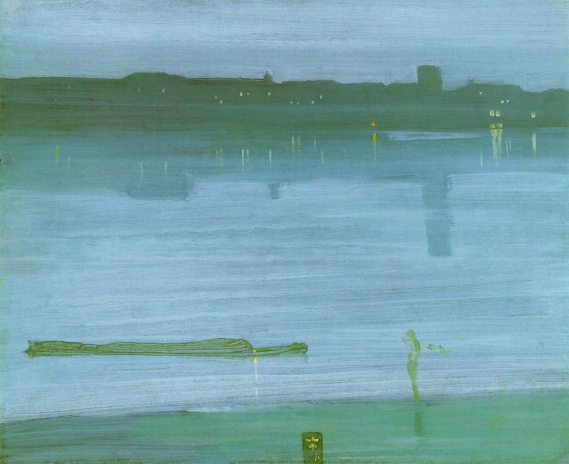
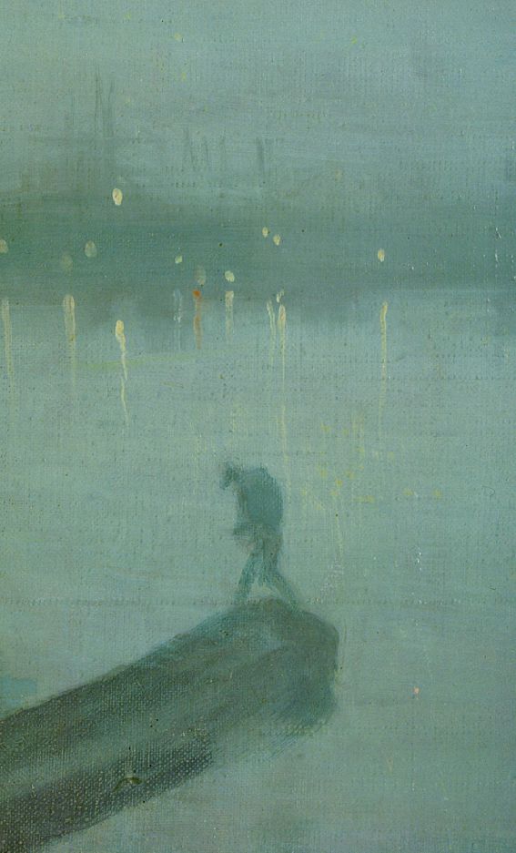
After the opening I went to the cd release party for my cool brother-in-law, musician Andreas Sahar. I love his new cd, Crossing Over, & he is so passionate that to me he seems like a musical Van Gogh. He's in ITunes if you'd like to look him up.

My friend, the writer Rob Staeger, had some observations of the show. Of particular interest to me is how he notes the difference between my work and landscapes done on site.
http://robstaeger.blogspot.com/2008/11/oasis.html
Barbara Grossman, a painter, friend, and former professor of mine had this to say, "I love the way you have found strength in the summarizing of your view. They are not plein air paintings in the traditional sense but you take us there." To me it parallels what Rob said.
Once while in grad school at Penn, Barbara saw what I was working on and said, "Don't do that again!" among other constructive things. Uncompromising and visually brilliant, I can always count on her to tell me the truth and bring insight as well. She is a great teacher.


This painting follows the basic schema used in Winter Landscape I in which the opposing verticals can be read as trees or curtains (domestic at a window sill or those for a stage). When I explained this reading to my mother-in-law, she had the correct observation that one gets the feeling of the first moment the stage curtains are drawn back to reveal the scenery. That moment is full of freshness, excitement, and anticipation. Perhaps, if I am lucky, I am able to show the long familiar subject of landscape anew. The pictures are unveiled and are about clarity. In Landscape in Grays, the crystalline, pale blue sky is captivating as it encapsulates the gray and stretches over the next layer of gray-green. Painting students learn to see the rainbow in whites and the dingiest institutional gray floors and surroundings. This painting makes use of a limited palette (a pared-down selection of colors), but still achieves luminosity. The proportion of the verticals is different than my other paintings and it gives the feeling of collosal scale like the columns of the Acropolis.


oil on panel


I'm painting over some old paintings. No one should ever bother to x-ray them in hopes that there is a hidden masterpiece underneath. I have pretty good judgement about these things and usually don't miss what was. It is an interesting process, a dialogue with a past self. Hindsight lends a hand. I stand by the majority of my older work. I am unable nor desire to repeat the past. The old paintings are springboards for new ideas; either by keeping some of what is there or by having the reaction to negate everything in favor of a new direction. George Lucas has been critizied for wanting re-do parts of the Star Wars trilogy. I understand both the desire to keep tweeking a work and to let it stand, marked by the context of its time of creation. Artist Pierre Bonnard was said to have retouched one of his paintings after it was hanging in a museum. There is always the danger of over-working a piece, to be so compelled to keep going that the piece is taken past freshness. Giacommetti's brother, Diego, often pulled sculptures and paintings away from the artist in an effort to curb this tendency. He was so brilliant, hard-working, and prolific that the compulsion probably served him more than hindered.
Purple Veil is a fresh panel, nothing to paint over, although a few sessions on it has left it pretty bumpy. The light rectangle is like a time dimension, unpenetrable to our gaze. It reminds me of the veil in Harry Potter and the Order of the Phoenix that Sirius falls into when he dies; Harry is unable to follow. This is similar with the pale blue rectangle of Ten Years Later, which, although also a portal, is made of thinner air. The title came from painting over the image underneath, which was done in 1998. I don't have the tendency to overwork things. With Chinese painting and caligraphy in mind, I try to be alert for the moment when the image clicks. The tricky thing is to be open to unusual outcomes, but that is the exciting part.
14" x 14"
A stone foundation provides the square framework I enjoy. The landscape can seem like a direct downward view, or a frontal angle with the stone tipped up like a frame to look through. I recently heard a podcast through MOMA NYC, I believe, about Sean Scully (very good article I've linked, by the way). I never gravitate to his work but now I have a new appreciation as he described the rectangles in his paintings as "bricks" and the significance of the brick in history/culture. Now I am all over them.
Foundation is about the architecture AND the landscape, however. There is a sense of mapping through the linear element in the work. The bricks are a bit quirky, beautiful and unique like people. The Williams Visual Arts Building at Lafayette College, where I once taught, is a wonderful building whose bricks were individually hit as they were made to purposefully bend them into irregular shapes. They protrude from the walls and curve in an aesthetically stimulating manner. Back to the painting - the yellows and greens bring new life to the bricks. A new foundation or old, we can not tell; it speaks to the past as well as to the future.


This is like an agrarian Broadway Boogie Woogie. It is fun, like Mondrian's. As a rule, I'm not so interested in the perfectly square (you should see me trying to mat things), primarily because I like the slightly imperfect. At the same time, the color is orchestrated in perfect pitch. The rectangles aren't static; the color induces ocular somersaults. Radiant, it seems to give off heat.

This strange shape for sky and clouds looks almost like a giant eye and reminds me of the eye sockets of skulls held up to the sky by O'Keefe. Perhaps the white on the sides is also like white curtains being drawn back, theatrical. The shadow in the foreground adds depth as does the reflected light on the hills. The blue seems to press forward as well as to recede. It is one of my more harmonious paintings. The brief commentary this week matches the reduction in the painting.
I went to NYC this week and saw the Whitney Biennial. Painting was barely represented and it was difficult to take in the numerous pieces of art in various media. I wasn't so excited about the work overall, but I did like this piece by Carol Bove.
I especially enjoyed the Guston drawing show at the Morgan Library (I'm off to draw next, very motivating!). Another highlight was the show of Natalie Charkow reliefs and Ruth Miller paintings at the Lohin Geduld Gallery. The reproductions don't do justice to the caring marriage of hand and eye in both these artists' work. They are two women who have made art their lives and have persisted in their own visions regardless of trends.

18" x 24"I'm always looking for motivators. I mean, I am self-motivated, but even so it is good to get external reinforcement that I'm not wasting my time trying when it sometimes seems futile. It's kind of like looking for the cups of water and orange slices from people when running a marathon.
I painted over another painting to make this one. It is a put-the-past-behind kind of thing which accompanied my spring cleaning and multiple trips to the Volunteers of America. Roberta Smith wrote an article in The New York Times recently about how there seems to be a new trend in painting of working small, as opposed to the large works of the Abstract-Expressionists. She suggests it relates to the economy. It is a kind of simplification, reduction. The short but brilliantly succinct film, The Story of Stuff shows the current state of world affairs better than anything I've come across. My nine-year-old was able to grasp the problems that elude much of society because of its straightforward and appeal graphics. I didn't want to watch it at first, but was glad I did. I think it definitely relates to my art and why I'm making it the way I am.
As far as this particular work, there is a lot of texture visible in this photo of it, but in person the center square seems to hover and seems to be able to go in front as well as behind the green. I'm obsessed with green. Plants are supposed to relax people. The expansive green fields and luminous blue skies of Western New York helped to inspire this picture.