Sunday, May 30, 2010

Spring Landscapes #22, #23, #24 Farms & Windmill


Spring Landscape #22 Windmill, 24" x 18", oil on panel


Spring Landscape #23 Farm, 18" x 24", oil on panel


Spring Landscape #24 Land, Cloud, Trees, 18" x 24" oil on panel


The top three images are done on an iPad with the Brushes application. I consider them art but also wanted to do the ideas in oil, which is different. The color in Spring Landscape #24 Land, Cloud, Trees isn't right but it was the best I could capture and rework in iphoto; don't know why. The bottom half should be more luminous and the top half less bright. The iPad pictures translate perfectly, as is the nature of the beast, in this case the screen. The iPad pics were done in the car while passing these views. Sketchbooks are getting very sophisticated. I find the digital images are subtly changing my painting sensibility. The iPad work is less dense, not being bound to a material form in the same way as a painting. It's color and light differs from the observable world and as well as the painted one. Some people may prefer it. I don't but I confess that I like it just as much. [audible gasp from a good percentage of painters] I feel the need to say over and over that there is nothing like painting but I really LIKE this. Maybe because it is also painting just as making marks in the sand with a stick is drawing; no artist would argue that it isn't. Look at how artist Andy Goldsworthy draws. [Looking at his stick sculpture on site with a circular opening framing the landscape I think that maybe he's better at doing what I'm trying to express. Maybe we're just on the same wavelength and he has his methods and I have mine. See similarities in last week's post.] If drawing can happen with any material then digital drawing shouldn't be inferior. The material doesn't make for greatness, however, as a stick of charcoal makes drawings in a wide range of quality depending on the person holding it.

Onto a discussion about the work. It is too much for me to talk about all three images because I need to spend more time in the studio than on this blog. I enjoy the scale and pattern and exuberance in these. I'd like to focus on Spring Landscape #22 Windmill. The hill looks like the earth/globe. The painting is a positive picture of renewable energy. The depiction shows wind energy is far-reaching, energizing the atmosphere as well as the surrounding air. A thin cloud acts as an extension of on of the windmill's blades. Space is arching. The analogous color scheme of blue/green/yellow and flowing lines help to create a feeling of harmony. Windmills aren't a source of harmonic discussion, however. A wind farm proposal for perhaps what would be the largest in the world, is on the table for Cape Cod, close to where I live in Rhode Island. The controversy involves the trade offs for clean, renewable energy including concerns for wildlife, marine life, land rights, decreased property values, and of particular interest to me, aesthetics. I LOVE how these turbines look. They are sleek and elegant like Brancusi's polished brass Bird in Space. Van Gogh loved windmills as did Rembrandt before him. They not only accepted this "modern" addition to the landscape but found poetry in its structure. Maybe people see them as vertical obstructions in a horizontal ocean view or a sign of contemporary life encroaching on nature. Nature is at stake and while I'm not qualified to lecture on the negative effects of windmills to the immediate surrounding area vs. their benefit to our environment globally, (a great site for this is the American Wind Energy Association) I have looked at both sides of the argument and firmly believe they are for the greater good. If you are on the fence and the main issue for you is aesthetics, this art chick says to get over it.

Sunday, May 23, 2010

Spring Landscapes #19, #20, #21


Spring Landscape #19 Sky 12" x 12", oil on canvas


Spring Landscape #20 Buds 12" x 12", oil on panel


Spring Landscape #21 Green and Pink Trees 12" x 12", oil on panel


On June 1st, 2010, The Guggenheim Museum of Art, New York City, will announce the winners of its competition, Contemplating The Void.

Competition Description:
To celebrate the close of the Guggenheim’s 50
th Anniversary year, we invite you to create your own dream intervention of the Guggenheim Museum. Now you can take on the same challenge that 200 artists, designers, and architects took on for the exhibition Contemplating the Void: Interventions in the Guggenheim Museum.

Contestants were asked to:


"• Design your own intervention of the Guggenheim’s iconic rotunda.

• Your submission can be a hand sketch, a computer rendering, a watercolor, a painting, a photo collage—in other words, any 2-D format that helps communicate your ideas. "


These ideas were then uploaded to flickr, where they are still on view.


I saw in person the actual exhibit at the museum which was the spring board for the on-line contest. It was like seeing professionals doing an art school assignment,, creative people stretching their imaginations to solve the same problem uniquely. Some filled the center of the museum with trees, chocolate, a butterfly garden, gay pride stripes, laundry on a clothesline, glitter, and an inverted spiral. It epitomized the brainstorming necessary in any creative endeavor.


My creative endeavors this week include the use of the center spatially, though not in any way involving the Guggenheim or its architect, Frank Lloyd Wright. #19 and #21 are squares with circular compositions. #19 is about the sky filling the void, the space framed by a circlet of trees and leaves. The green dots get smaller towards the center, pulling you up, while the blue central dots are somewhere in between, ambiguously falling or rising. The sky is a solid but thinner. It holds promise.


#21 appears to people differently. My husband thinks it looks like a pink moon through the trees. My son says it is like looking up through a tunnel at the them, "Cool!". I made it by looking through my hand like it was a telescope at the trees across the street, one of which is a pink magnolia. Pink, a type of red, complements the green and is echoed by the red-brown, large dots in the foreground. The dots are like the tiles of a mosaic or the sections of glass in a rose window. The paint is velvety, something the those media are not. It is like a kaleidoscopic mandala, having motion while mandalas are still. Similar to a mandala, however, I think the image invites meditation, daydreaming and glazing over. A friend suggested they look like the images used to check color blindness. They do resemble them in their construction, their elements, but the paintings are obviously much more.


#20 is left out of this conversation. It sits vertically, angular, with dots rebelling, buoyantly asserting their individuality. I like that.

Sunday, May 16, 2010

Spring Landscapes #16, #17, #18


Spring Landscape #16 April, 12" x 6" oil on panel


Spring Landscape #17 Magnolia Trees, 12" x 12" oil on panel


Spring Landscape #18 Three Clouds, 24" x 18", oil on panel

Did you know that the whopping majority of painters are insulted if you call their work "pretty"? You don't have to tell me that's what these are. It is a sort of trouble to me.
"Beautiful" is much more acceptable. The difference? The dictionary defines "pretty" as "attractive to the eye" and the noun, "pretties" refers to the ornamental. Even more so, painters HATE their work considered ornamental, decorative, the insinuation being that the work has little substance beyond looking good. It's the equivalent of a trophy wife. Beauty is also defined as being delightful to see, but under synonyms the dictionary says this:

A person or thing that is beautiful has perfection of form, color, etc., or noble and spiritual qualities: a beautiful landscape, a beautiful woman. Handsomeoften implies stateliness or pleasing proportion and symmetry: a handsome man. Pretty implies a moderate but noticeable beauty, esp. in that which is small or of minor importance: a pretty child.

Beauty refers to a "perfection of form", i.e. a Platonic ideal and something that may have spiritual qualities. This is much better. Pretty is diminutive "that which is small or of minor importance."

I know my recent work, especially these paintings, is pleasing to the eye but it falls more within "beautiful" as it strives to reflect the spiritual (interconnectedness of all things esp. through nature, the lift of happiness in a sunny day and in color). The harmony and balance achieved through design sense is a kind of ideal.

Even the sunniest day might bring physical discomfort regarding temperature, a bird could poop on you, or sand might blow in your eyes. The paintings are landscapes viewed from a little distance, like photographs of sentimental moments. There is a preciousness about them. Beauty is transitory; we attempt to retain our youthful appearance but the paintings freeze it. Ideals, they show a benchmark like a Best in Show beagle. The paintings aren't just superficial beauty (I'm sure you're getting this by now) but also are about an essence of truth, of meaning made tangible. But I want them to delight, dazzle. I want them to elevate mood, elevate hope, confirm good in life like someone saying "Good morning" in contrast to a car bombing. Small things matter, a piece of paint, a speck. A friend, a wife of a pastor, recently gave a guest sermon in which she spoke about the anonymous people involved in building a cathedral. She compared the labor, the small acts of individuals as metaphors for the unseen good we do daily to support one another. These paintings are for you in the trenches.

Sunday, May 09, 2010

Ipad Art, Brushes App, QuickTime Player


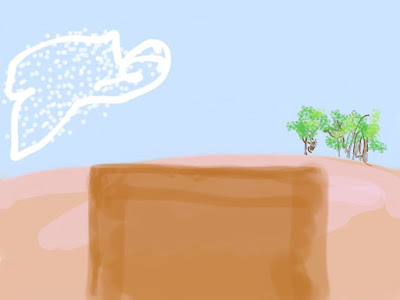
Farm 3, Brushes/ipad


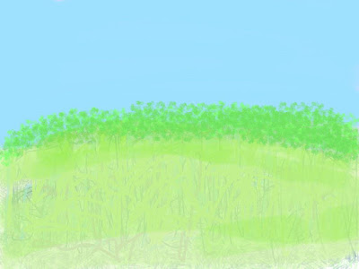
Field, Brushes/ipad

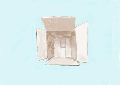
Box, tablet computer, 2007


Untitled, iphone/idoodle, 2009

I am not anti-technology. A public confession: I think I'm addicted to clicking. I think I found a way to paint and have my clicking too. While nothing replaces painting, each artistic medium having it's own inherent strengths and limitations, Brushes for ipad is very exciting. Here's a
Brushes demo video by creator Stephen Sprang. It sells on iTunes for $7.99 and I think it will save a bit on paint as I am able to use it not only for digital art in and of itself but also for painting studies. I love the materiality of all traditional art media. The difference between an oil painting and a digital painting is corporeality, similar to a person in real life vs. a photograph of that person. Photography has a lot to say, or rather show, so much so that Native Americans thought being photographed might steal their souls. The photograph is far from soul-less, and so is the digital painting. My work is mostly seen via the computer (I wish it was seen more in person, oh well). Digital art is made for the computer. Scale isn't an issue. The images are light-filled. British painter David Hockney is totally on-board and says it is like painting with stained glass. I LOVE stained glass, always wanting to achieve colored light like it. Hockney is prolific, totally going to town on his ipad and emailing friends drawings of flowers daily. He started out using Brushes on the iphone and the pictures were exhibited at the Tate and Royal Academy in London. [Lawrence Weschler's Hockney article and Jordan Galloway's in The New York Press ]

The ipad isn't my first excursion into creating digital art. I've used a tablet computer and an iphone (see above). Ink Art was the software I used on the tablet. It's not that different from Brushes. Many people on customer reviews complain about having to use a finger to draw in Brushes rather than a stylus like on tablets. I am much happier skipping the stylus. It felt too removed for me and touch brings me that much closer to what I'm making. I think it's just a question of getting used to it, like a touch mouse. There are fans of drawing with pencils rather than painting in general because of the difference of control.

The ipad's big screen is the key to my excitement. I enjoyed making images on the go with the iphone, thinking of them more as studies. The ipad is large enough to do more. Jorge Colombo has made three covers for The New Yorker using the iphone, achieving a surprising amount of detail; I'm assuming by zooming in and out. I'm a little worried the paintings will pale in comparison to my new digital images when seen on-line. I also wonder how it sits with me that the digitals are more graphic in nature. I intend to make paintings from some of them, so it should be a rather fluid back-and-forth process. I can also take a picture of my painting and work on it further in Brushes. This can give direction to a work in progress or expand the idea for working in a series. Best yet, Brushes allows the actions/steps involved in making a picture to be played back as a QuickTime file. The subjects I'm painting lately are non-narrative yet I'm seeking to make them into moving images. Move over, Hockney.

The movie below is the making of Farm 3. I had a little technical trouble with Brushes Viewer and Steve Sprang himself replied to my query. Thanks, Steve!