Wednesday, June 27, 2007

Square Prints

Print #1

Print #2
Print #3
Print #4


Print #5

drypoint, chine colle


In these prints, the square is a form and a void in space. It is organic, like the irregular weave of something handwoven, a plane not usually parallel to the picture plane. It has varying degrees of density from image to image. In the first print, the butterfly is entering or exiting the dark square while in the second butterfly print, the butterfly inhabits it. Which world is unknowable, the dark or the light?


Colored prints number three and four are landscapes, atmospheric, and created out of color. Number three is constructed out of slabs of paper giving the sense of monumental scale of Stonehenge and just as bucolic. The fourth print is all about sky and reflections; a white square fades in and out of focus. Its subtle and peaceful qualities are in the vein of Agnes Martin, revered for her simplicity and achievement of sensations of tranquility. She is one painter who knew that less is sometimes more.


Print number five is like Daffodils, Loss, but without the flowers. It is stark but soft, full of contradictions. When I was a teenager, I painted a mural in my bedroom of a split face, one side in color and the other in black/white/grays with the word "paradox" painted above it. It was pretty much the theater comedy and tragedy masks rolled into one. Something of the theme remains in my work despite having left adolescence behind long ago, LONG ago. I would never have been able to make these prints as a teenager. It is not a technical issue but a conceptual one. My work hinges on the idea in combination with materials, process, touch, and perception. There is change, but there is also a strong, yet flexible philosophical undercurrent buoying it all along.

Tuesday, June 19, 2007

Washington Art Association


16" x 16", oil on canvas, 2006


Butterfly Pelvis/Wild Indigo Dusty Wing


I am having a show at the Washington Art Association in Washington Depot, CT, from June 23-July 22, 2007. The opening reception is Saturday, June 23rd from 4-6pm. The gallery's website is http://www.washingtonart.org/ I expect to hang between fifteen and twenty paintings as well as a few prints. The art association has three galleries and there will be one artist for each space. The other two artists I am showing with are the painter, Kathy Black, and the sculptor, Bob Rivera. The image above will be included in the show and is featured on the announcement. It is rather like Georgia O'Keefe both in symbolism, scale, and paint handling. The pelvis is symbolic of birth as well as death (bone) and the butterfly of life cycles and renewal. The forms fit together in a dynamic way and it was important to me that one did not dominate over the other.
The tension between the green and purple echos the sharp contrast of black and white in the picture.

Friday, June 15, 2007

Ring, Green


oil on panel, 24" x 24"

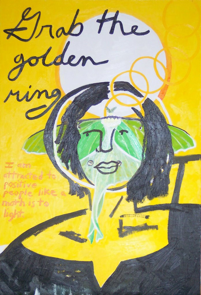
I am enjoying taking a break from narrative, although the narrative isn't totally gone, just distilled. A gold ring in the center square is like those used in some of my other paintings (see Mass Grave, and Lunar Moth Self-Portrait). I like the contrast between the formal rigidity of the square and the loose, atmospheric brushwork. The inside square is not truly "square", however. It coexists with the surrounding space, push-pull dynamic like a house being weathered by nature while simultaneously using resources to maintain itself. The golden ring is not a perfect ellipse, looking as though it has had a few hard knocks. It retains its structural integrity and is not eclipsed by the shadows of the void it inhabits. The black square and ring make a painting within a painting.
I am in the process of pursuing this idea of the square, the void, and filling it. I think of Jasper Johns' Target with Four Faces from 1955 and his lithograph, Target from 1960. I am also obsessed with packing my son's lunch in the bento box style lunchbox used by the lady at the Vegan Lunch Box blog: http://veganlunchbox.blogspot.com/ ! I am sure no serious artist would ever admit this; besides, how many serious artists are moms who would actually take pleasure in the mundane drudgery of packing lunch? This activity of filling squares with precious things also reminds me of the rituals of saving locks from the first haircut, placing photographs in albums, organizing collectibles like stamps, as well as jewelry in boxes. The paintings also remind me of washing window panes (stroking the surface of the window while seeing the yard through it), as well as the more recent and less pastoral association of the computer screen and Windows programs.

With all the activity of film, video, digital media, something still like a painting can be refreshing. It can also be perplexing, as the viewer is being led in a different way than other media. While I am hopeful that viewers can get something out of my work, it bothers me less that my audience is small. We don't always catch every sunrise, glimpse every bird, or marvel at each other. Spiritual experiences can't be forced in nature or art. Being constantly engaged would be exhausting as well as impossible, ask anyone who has ever made the mistake of trying to see an entire art museum in a day. My work is available to be experienced, but it will most often go unseen, perhaps even by people who are looking directly at it.


Thursday, June 07, 2007

Swordtails and Boxes


line etching, 4" x 3" image size

In addition to squares, I have been thinking about boxes. The squares in my work are rarely completely two-dimensional, since they have spatial references.

This image comes from a painting in an earlier post, Butterfly Box. With the figure removed, the subject is the relationship of the butterfly, something wild and free, and the box, a container. I turned the etching plate up-side-down and printed it a second time, inverted, further amplifying this duality through the mirroring asymmetry. It didn't look right printed in one pass. The overlaying forms are transparent enough to maintain their separate identities but to also fuse into one form, suggestive of fluttering. The butterfly has a geometric structure like the box even though its movement is unpredictable compared with the box's stasis. Turning the box on its head makes it airborne like the butterfly and further complicates this relationship.

To me, the image is metaphoric of the balance between responsibility and freedom in politics, ecology, and personal daily life.


Swordtail Butterflies


This one is for the Butterfly Book.

A response regarding Rob Moore


A painting by Rob Moore:
Untitled, 9.75" x 17", oil on masonite, 1984

Nicole,


Thanks for your writing about Rob Moore. I was a student of his at Mass Art from 1974 - 1978. he was the most influential instructor of my life. Being from New England and not used to southern accents, i will alway remember him in front of the class that first day when he was discussing \"Form in Spice\".


Other than a reference to \"The Package Deal\" poster (from his work with the Graphic Workshop) being in the collection at the Smithsonian American Art museum (http://americanart.si.edu/search/search_artworks1.cfm?StartRow=1&ConID=7337&format=short) - a poster that I do have a copy of and helped print - and the website you mentioned there is little on him. I\'d love to see a website with images of his work.


Thanks! Rick

Thursday, May 31, 2007

Lilies of the Valley, Crow's Feather


24" x 18", oil on panel


My friend, Brenda, often brings me flowers from her garden in generous, bug bunches. This time she brought these lilies of the valley and put a crow's feather in the middle that she found on her run. It struck me as just the right metaphor. It is very much like the daffodils with the black square in the upper center. Color and form are especially important in this painting. I really like the form of the leaves with the vertical of the feather, its split, curling top and wavy edges. The flowers were tricky to paint, as it is easy to get too fussy with frilly details. I decided not to include a table and to increase the amount of reflection in the glass so as to make the image more airy and give emphasis to the flowers and feather. It has been awhile since I have done a straight forward still life and I'm not sure how it stands next to the latest minimalist things I have done.


Some flower painters I like:


John La Farge (known for his stained glass work, but he painted as well)


Van Gogh, Irises nice close-up (of a different Iris painting)


I found a neat BBC site about a program they had, "Painting Flowers" with many examples of specific kinds like lilies, sunflowers, tulips, and roses. Check out the Sargent I adore, Carnation, Lily, Lily, Rose.


Friday, May 25, 2007

Hope, Loss


36" x 24", oil on panel
4" x 3", dry point, chine colle


This is the most minimal work I have done to date. The general theme is evoked by color, green for hope and black for loss. Emotions and color have in common that they are complex beyond words with many subtleties for which there are no names.

The green in the print looks flat compared with the juicy oil painting, but in real life it is sensous, reminding one of dewy grass.

Artists working as color field painters:

As I looked on-line for a link to put with color field painter Robert Moore, I became increasingly disheartened. I was a junior at Massachusetts College of Art, looking forward to taking his color theory class because of the high regard students had for him, when he became ill and shortly after died. This painting I am doing now reminds me of him. Artists always have other artists as role models, but my favorites are those who are amazing, caring people in addition to being great artists. Rob Moore was that kind, reputed to paint an unbelievable number of hours on top of his teaching schedule. There must be lots of paintings out there by him, but there are so few links on the web. He died in 1993, before being on the Internet became almost necessary as proof of existence. It shouldn't be so shocking, I suppose, that artists leave behind their art and become anonymous; archaeology provides countless examples. It just seems so soon for that to happen and rather unjust when there is so much art that is promoted unworthily. If I had money to collect art, I would seek out his. I saw some in person once at a Boston gallery and they were like small miracles. One would expect paintings so small and with so few elements to be arbitrary, like how students often feel at their first glance at a Morandi. Instead, they are vibrant, joyous, meaningful visual poems. I remember one that was the color of a raw cracked egg: glistening yellows, whites, made of a substance that seemed to go beyond paint. One of the things I found through Google was a short bit of writing about Rob by a former student, which was very moving and seemed to describe the qualities of the man that he also squeezed into his paintings.
I guess I am looking back so much because I need to be refreshed and re inspired as I continue to put paint on a surface. There are so many other practical things to do with time, many of which are a lot easier! I am dust if I make paintings and dust if I don't, and the paintings are dust, too. It is a meaningful process for me like no other, so I make them.


Friday, May 18, 2007

Daffodils, Loss


36" x 24"
oil on panel, PRIVATE COLLECTION
Now I just know that someone somewhere will see this and say, "I love those daffodils; I just wish she didn't stick that black square in there, otherwise I would buy it!" I like to do this in a falsetto voice to amuse friends. C'est la vie.
It's spring and there is plenty to be jubilant about, but sometimes there is loss, even in spring. The black square is that gaping hole, the void, the pit of one's stomach. The vertical picture relates to the body, a torso, if you will, and the square is like one's gut. But, you know, it also looks like a square of dirt, which could make one think of a grave with flowers around it, or of ordering nature. Let's go with gardening. It could be that bald spot in your lawn that you need to patch or a new flower bed to be planted. The negative is not always negative but unused potential waiting for seeds.

Friday, May 11, 2007

Butterfly-Hands (One Strong Butterfly)


24" x 24", oil on panel


This form makes me think of the way you can use your hands to make a bird flying.


As always, words aren't going to cut it, but I'll say a few. The form is very sculptural, central in the picture, situated in space, while the forearms are like a pillar that can also be read as space. In that way, they do not compete with the form of the butterfly, which would serve to ground it. This butterfly is flying with vigor, all muscle, even though the black lines are so solid (like the lead around stained glass). I revisited the medieval stained glass at the Metropolitan Museum of Art in NYC this weekend and there's something about them that seems as hard as nails. Image, form, and belief are inseparable. I would say there's also some of the raw toughness of Soutine's sides of beef in my picture.


Friday, May 04, 2007

Woman, Bird, Skeleton


Woman, Bird, Butterfly, etching, watercolor, 2006-2007
Woman and Bird (Spring), etching, watercolor, 2006-2007
If these seem strange, then you probably haven't come to terms with Joseph Beuys. I have long admired his work and, being a painter, find his drawings and watercolors particularly fascinating. They are succinct, draw on pre-verbal conceptions, and are the result of a search for meaning rather than people-pleasing. In comparison, mine are much more digestible, and I'm not sure that that is a good thing. While I will continue to try to dig deeper, I seem to go towards a certain amount of description in my work. It's something for me to consider and the type of problem an artist has to wrestle with.
These aren't going in The Butterfly Book, unless I decide to make new plates based on the images, because they are larger plates that I printed at another time for another edition. Painting on leftover prints (proofs - prints that aren't uniform enough to be included in the edition) is wonderful. It is a theme and variations game where the artist can experiment in taking the same basic idea in different directions. Drawing on a tablet computer is amazing for the same reason. Makes me want to go make some work...

Friday, April 27, 2007

Letting the Butterflies Go, painting


oil on panel
20" x 16"
One word to describe much of my work, especially this one, is "visceral". The palette and brushwork contribute to the feeling as well as the imagery of the butterflies making their way out of the gut. The emerging pale blue-violet butterfly contrasts with all the heat, giving the picture a bite like strong blue cheese. The picture is about the process of letting go, which is sometimes painful. The other versions of this image (done as a digital image and as an etching) are more about letting worries go, whereas this painting is about letting go of people, things, or ideas that have enough personal meaning that they feel a part of you. The butterflies in the background are like ghosts.

Friday, April 20, 2007

Loaves and Fishes (version 4)

digital image

My pastor asked if my image of the Loaves and Fishes could be used for the cover of our church bulletin this Sunday as it matched the gospel reading. I couldn't find a jpeg handy, so did this digital version anew on my tablet. I have two versions of the image done in oil and one in woodcut that was used for a church fundraiser. The digital will reproduce easily.
The painted versions of The Loaves and Fishes show more clearly that the two hands of Jesus rising from the ocean are of different races. Also the round, golden pita loaves double as halos. I like the simplified iconography, "x" composition, and strong forms emerging out of agitated, rhythmic water. Artists often return to the same subject and hands are one of my favorites.

Friday, April 13, 2007

Three New Prints for the Butterfly Book


etching and watercolor, 4" x 3" (Passing the Butterfly has oil pastel as well as chine colle - pasted paper that's then printed on)
Self-Portrait, Tailed Copper - The butterfly wing is simultaneously muscle and veil. It is tough, sinewy construction while lacy like a doily or garter. The butterfly's body is a stand-in for the figure's. The picture is both colorless and colorful. The background is atmospheric, a demure, hazy setting that does little to reveal the underpinnings of the figure. It is about dichotomies and the subtleties involved in gender and identity.
Passing the Butterfly - Two hands meet while the butterfly rests between. The limited vocabulary of shapes and lines in the hands and butterfly play off each other. The oil pastel gives a powdery feeling appropriate to a butterfly's wings. The crushed color reminds me of the chalk pastels of Odilon Redon. The wings are jewel-like while the surrounding space evokes wet grass, dim light, and rain.
Self-Portrait, Spring Azure is a metaphor for the interconnectedness of all things. This is shown by the cubist fractured space and figure and the golden chain of interlocking rings. The butterfly wing is a lens to see the world, instead of rose-colored glasses. The butterfly's symbol of renewal, doubly reinforced by the word "Spring" in its name, lends the viewer faith.

Friday, April 06, 2007

Butterfly Book


These two images are a part of my new project - the series of butterfly related prints that will be collected into a folio (with a total edition of 10 folios). So far I think I'm going to stick to etching as the medium. It is very versatile and I like the idea of the uniformity of the small rectangles.
The top image is another version of Intellect and Optimism Create Butterflies (after Goya) [see previous post]. I used two plates. The first plate was an aquatint printed in yellow. After it dried, I printed the second plate, a drypoint, to create the black lines on top of the yellow. Lastly, I hand-painted areas light yellow and white-yellow. I really like painting on prints, which is something that an artist who is strictly a printmaker and not a painter might not do. I think of all those manuscript illuminations from the Middle Ages and engravings that were hand-colored. It is more like planting flowers as opposed to oil painting, which is more like turning soil for me. The image makes me think of Paul Klee in its playfulness and handling of shape, line, and space.
The bottom image, Butterfly/Hands, is a drypoint. The visual vocabulary is pared down as the mass of the fingers relate to the area of the butterfly wings. Fingernails play off the markings on the butterfly. They also look like the wholes cut out of paper to make a snowflake. The combination of nature and feminine form relate to O'Keefe.
The National Gallery has great virtual tours of art, by the way.

Saturday, March 31, 2007

Spring! [Intellect and Optimism Create Butterflies (after Goya)]


I am thinking a lot of Goya's The Sleep of Reason Produces Monsters from Los Caprichos. The title implies that losing touch with reality is a scary place. The figure is slumped over a desk, his garments making him into a winged form like the bat/owl creatures behind him. I thought to redo the picture, changing it to mean the opposite. I think it is important to change the word "produce" from the Goya to "create" as a more postive action rather than cause and effect. The mood of my painting is optimistic, celebratory for spring and rebirth, while Goya's monsters press on him in a nightmare. The figure in my painting is female and is vertical, active, lyrical in her pose. The form of her head surrounded by her arms is echoed by the center of the yellow flower surrounded by petals. The monsters are replaced by butterflies. The expressionist paint handling is energetic and relaxed while clear. The fluidity of the forms and their environment suggest harmony. Of course the painting is indebted to DeKooning.

Saturday, March 24, 2007

Sunset in Western NY (Rusty)


This painting came from taking out the garbage when the sun was setting and the moon was out. The turbulent landscape is in contrast to the monumental scale of my dog, Rusty, a Vizsla. I think of Egyptian sculpture and cat worshiping. No matter what adventures take me from home (beyond the exciting trash, that is), my dog is waiting.
Examples of good dog art:

Saturday, March 17, 2007

Self-Portrait Banded-Peacock Butterfly


etching, watercolor, 4" x 3" image size
Portraits often show people dressed in their best clothes. People from around the world identify themselves with particular animals. Here my butterfly obsession combines these two ideas as the butterfly operates as finery and a symbol for change and renewal. The particular butterfly this is based on, the Banded-Peacock, also alludes to the way a peacock takes pride in its ornamentation, which although decorative, is also part of its structure. The butterfly in my picture has been fused with my form, elongated in the process, making an elegant collar. The top part of the butterfly functions as a kind of headdress, making sense only in this printed world. I could make fun and say that these two forms can be compared with Princess Leia's hair buns or Mickey Mouse ears. Both comparisons are relevant in that the hairstyle and the mouse ears are adornment necessary to particular characters.
I am also very interested in Goya and his Los Caprichos. This print is going to be used as the introductory image in a series of butterfly themed prints that will be assembled as a folio in a small edition of ten. I am not sure how many images I will make for this project, but at least ten. Goya made eighty prints in each edition of Los Caprichos, which were sold at the time for what was the equivalent value of thirty-five dollars a set. The six sets he made for friends were of a higher quality than the ones for sale to the general public.

Monday, March 12, 2007

Grace


oil on panel, 20" x 20"
The position of the hands in this painting is sign language for "grace". The landscape is war-torn, contrasting with the title. One hand seems to have white feathers, like a dove (christian symbol for the holy spirit) descending on a bald head, perhaps a monk or a soldier. The bird-hand is semi-transparent, ephemeral, suited for the spiritual. Its touch has a rippling effect. The vertical hand seems to struggle with mortality, entropy. It feels like it is sinking, but it is resistant, elegant but raw.
In terms of composition, the square is essentially divided by an "x". The hand is in the upper left, while the head the lower right, forming one diagonal, while the winged hand makes the other.

Saturday, March 03, 2007

Passing the Butterfly


oil on panel, 24" x 18"
I'm sneaking another post in this week.

This candy colored painting started by covering the surface with dots. I was mindful of the delivery of each dot, like a violinist plucking individual strings. I also thought of Andrew Forge, whom I was fortunate to have critique my work in graduate school at U. Penn. I thought of him because of the picture's pointillist beginning and because of its meaning. "Passing the butterfly" is like passing the torch or the bar in a relay race. It is about inspiring one another and striving. Andrew Forge was a painter, art historian, and head of the MFA program at Yale for many years. He had a combination of brilliance, integrity, and humility that made every word he said precious. Even though I have only spent a handful of hours in his company, his life and work exemplified what an artist, a person can be when they live to their full potential.
There are many people who have helped me, and as I get older I am more willing to accept help. The butterfly is precious, unique, and vulnerable in its fragility, as are we as we extend ourselves and accept a hand from others. The lyrical colors reflect the content. The surrounding space shifts in this precarious transaction.

Friday, March 02, 2007

Home


digital image


This is a double self-portrait (figure in blue, larger figure sketched on left) along with my husband, son, and dog. The house is a part of my husband's torso, his head its apex, like a cross on a steeple. He is the symbol of home for me. One of my legs is an arm and hand. It touches the ground, showing that I am on sure footing at home, "walking on solid ground," so to speak. I like the change in scale between the interior and exterior figures as well as the flailing arms in exuberant greeting. This is as close to Hallmark as I get.


The style is somewhat Cubist. Two of Picasso's portraits of family were stolen this week from his granddaughter's home. http://www.nytimes.com/2007/03/01/arts/design/01pica.html?_r=1&hp&oref=slogin Their combined value of $66 million is hard to wrap one's head around.