Wednesday, December 26, 2007
Blue Circle, Thick, Dark Green

Thursday, December 20, 2007
Nativity

Finished in time for Christmas...
[Well, I finished an oil on panel, 24" x 24" version after doing this Inkart piece. I couldn't get a good shot without a glare, so I'm going with posting the digital.]
The square format, attention to geometry, and cobalt blue reflect my admiration for Giotto. The picture is divided into quadrants by a god's eye type of form. The black pupil is the center of the painting. The star in the upper left echos the structure as does the flattened legs of the wooden trough. They stick out at that odd angle as a reference to the crucifixion. The star and the crucifixion are symbols of hope. The figures are eliminated except for the baby Jesus. Joseph and Mary are signified by two interlocking halos, like wedding bands. The lower left corner has three purple/blue cubes symbolizing the gifts from the three magi. The animals are reduced to one big ox or bull, which I have explored as a motif in other paintings. The bull is not a tame animal, so I think its place in the scene is to say that while the night is peaceful, there is danger in the future. God's eye sees all and life is vibrant nonetheless.
Thursday, December 13, 2007
White Square, Green

24" x 24"
oil on panel
I'm on a green kick: spring, fresh starts, optimism, positive thinking, hope, renewal, all those things. The white square in the center echoes those ideas, evoking the potential of the blank page. It feels full rather than empty, alive in its organic, wavy edges. It is like a white sheet hanging on the line in May. The different greens are close in value (lightness/darkness) and so shimmer. The paint is applied so that the greens interact but one does not seem to dominate. The pieces feel like the closely-knit greens of moss.
It is rather the opposite of a department store experience, so if you are taking a break from your holiday preparations to check out this blog, soak it up. As for me, my cookies are in the oven, I'm studying for a quiz on HTML, I just packed my son's lunch, did laundry, put paintbrushes into soak, planned a play date, boxed a painting to be shipped to New Orleans, re-arranged carpooling, did the dishes, and let the dogs in and out and in and out. That is why the painting is necessary. It is pointless in helping me with all those things, except that making it and looking at it brings me back to center so I can keep going.
Another place to refresh is The Poetry Foundation; check it out.
Wednesday, December 05, 2007
Yellow Square, Blue, White
Thursday, November 29, 2007
Photos


digital photos
Colored light and shape are what interest me most in these shots. I think they inform my paintings with the way they are focused on simplicity. The triangle is a singular shape appearing to hang in space, although it is light on a wall. My paintings of circles and squares are the same kind of idea. There is a relationship between positive and negative as well. James Turell is a master of the materiality of light. My photos are sketches compared with his symphonies. The first photo is Self-Portrait with Biscuit depicting my beagle puppy. I like the way my shadow snuck in there. In fact, it is much like the shadow of a head my friend observed in Square-spotted Yellow Mark. It reminds me of the domesticity and colored light of Bonnard as well as Bonnard's dashund.
Wednesday, November 21, 2007
Two Paintings: Green with Yellow Marks, and Ochre and Brown


Ochre and Brown is a strange painting for me because it is both subtle and straightforward. It is earthy and feels like a golden, burnt field of Millet and has the brown of a discolored varnished oil from the nineteenth century. The land and sky have an interesting relationship as pieces of ground seem to lose their density and become clouds. It is strange too for its mixture of modernity and history, organic and synthetic.
Wednesday, November 14, 2007
Square-Spotted Yellow Mark

24" x 24", oil on panel
This painting is a link between my minimalist pieces with squares and circles and the butterfly work. The butterfly is coming out of the void into the green. It is equivalent to coming out from under a rock, as the saying goes. Light and texture play important roles in this one.
Thursday, November 08, 2007
A Butterfly in the Hands, Red-bordered Pixie
Wednesday, October 31, 2007
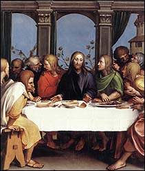
The Last Supper
Thursday, October 25, 2007
Passing the Butterfly II, White Peacock

16" x 12"
2007
Oil on panel
This painting is addressing the same theme as Passing the Butterfly (Homage to Andrew Forge). The analogous palette is limited to green, yellow-green, yellow, white, black, and gray. I reached a point in painting it where I thought it was done. It looked good close-up, but at a distance it seemed illustrational and tight. Illustration can be Art with a capital “A”. The problem that keeps illustration from being fine art in many cases is that it is in service to getting a clear message across in a very concrete way. That being the goal, it is not often at liberty to pursue the mysterious and push metaphors to the limit. These things add complexity to art and offer the multiplicity of interpretation and rich symbolism that makes art vital and timeless.
So how did my painting get stuck being so literal? Sometimes I like to adhere to a likeness and I was being fairly loyal to the particular butterfly, the White Peacock. Maybe I was feeling cautious. I let it sit several weeks, like putting writing away in a drawer, and then felt ready to dig into it again. It required a bold mindset, as one might imagine Sargent feeling when he painted brushstrokes with bravura. He was never fussy. I made the three forms relate more to each other by bringing colors back and forth amongst them. I like the way the black separation (space) between the fingers of the upper hand visually blends into the body of the butterfly (form), like a crevice. It is a split in half that is echoed in the bottom hand through the yellow vertical line and the division in light and shadow. It isn’t obvious which hand is giving and which is taking. Often the act of giving fills oneself, as the clichĂ© “It is better to give than to receive” extols.
Wednesday, October 17, 2007
Yellow-rimmed Eighty-eight, Michelle's Colors

36” x 24”
Oil on panel
2007
The palette of violets, blues, reds, and black is one which appeals to my painter-friend, Michelle Albert. We met at Massachusetts College of Art where we were in the same painting section. One of the exciting things about going to art school is the process of learning from ones peers. It is like a laboratory of people experimenting and searching. Observing the process of others is stimulating and contributes to one’s own creativity and learning process. Lasting influences are forged as ideas are embraced or rejected, often unconsciously.
I like the light in this piece, its dim, rich vibrancy, like that of stained glass, reinforced by and the black lines like lead. I want the image to dazzle, as do the Tiffany windows in my church.
Thursday, October 11, 2007
Butterfly Release

30 in. x 24 in.
A joyous painting, it depicts butterflies set free from a box. The action is important here, so details are mostly absent and forms overlap, suggesting the chaotic fluttering of a moment. It is impressionistic in that respect. The cream colored butterfly in the upper right is the most in focus; thickly painted outlines also offer tangibility during an emphemeral event. I think that I would like to explore this idea further. Like Van Gogh's sunflowers, yellow carries an uplifting mood easily; high notes on a keyboard.
Thursday, October 04, 2007
Butterfly Pinned
The butterfly appears to be mounted for display, but that was not my conscious intention. The space is suggestive of a box, the white plane behind the butterfly is like a flap. It is not the first time that I have pictured a butterfly as a crucifixion (the symbology is resurrection in Christianity). The grays, black and white allow what color there is (variations on the complements green and red) in the insect to carry more weight. The dynamic, linear veins defining the segments are rhythmic and strong, electrified currents in a clinical atmosphere.
Strangely enough, the thought of a Russian dancer from Tchaikovsky's Nutcracker comes to mind. The drama of the dancer's outstreched arms and the struggle of the kicks while squatting, and the boldness of it all seems in sync with this creature. It seems ready to spring to life like one of the toy soldiers coming out of a box in the ballet. The dance is called the Trepak, and I found something similar in Russian Dance Ensemble Barynya's video clip:
http://www.barynya.com/video/nedorostok.mpg
Thursday, September 27, 2007
White Circle, Blue, Black

Despite the reduction, this image recalls Romantic landscapes, which has led me to the word "sublime". A Wikipedia entry regarding the sublime in art has expressed my intentions rather succinctly (I have cut and pasted parts of it below).
An artistic reference to this piece is Arthur Dove, a painter who embraced the sublime.
Victor Hugo touched on aspects of the sublime in both nature and man in many of his poems (Poems of Victor Hugo). In his preface to Cromwell (play) he defined the sublime as a combination of the grotesque and beautiful as opposed to the classical ideal of perfection.
The sublime, as a theme in aesthetics, was the founding move of the Modernist period. Attempting to replace the beautiful with the release of the perceiver from the constraints of the human condition, these ideas were amplified in critical theory through the work of Jean-François Lyotard[16]. For Lyotard, the sublime's significance is in the way it points to an aporia in human reason; it expresses the edge of our conceptual powers and reveals the multiplicity and instability of the postmodern world.
Thursday, September 20, 2007
Moving Cloud

Drifting clouds are fleeting and paintings are fixed. The cloud is off-center, pushing towards the right. It is framed in a blue rectangle inside a white square, drawing attention to its placement and the artist's awareness that it is artifice and a slice of a larger thing, a moment of sky. Clouds are all about change, while squares are of stasis. Like photographs, the rectangle contains time. It is a window to get distance to look closer, if that paradox makes sense. The painting is monochromatic. The whites offer tranquility and the blue brilliance in motion. The cloud is passionately peaceful in its solitary direction.
Tuesday, September 11, 2007
September Eleventh

digital image
I have been making art in response to 9/11 since it happened and then a piece or two at each anniversary as a way to personally set aside time to think about it and as a kind of memorial. It is too big for art to fully encompass, and too world changing to ignore. The New York Times asked five artists to draw and write about the event and has their work on-line today: http://www.nytimes.com/slideshow/2007/09/10/opinion/20070911_OPART_SLIDESHOW_index.html
They artists they chose work in a traditional, representational manner. While I like the work, I think it was a conservative move so as to take no risk of offense.
I think I am going to paint the digital version. The bright blue is the blue sky of that clear day, the black forms are the towers, Pentagon, and plane that crashed in Stonycreek Township (surrounded by green for the field). The black is for negation, voids. The white plane is also cloud-like. The figure is in a crucified position and is representative of all human loss and suffering surrounding that day. The hands and arms are drawn loosely, in order to be more like wings and feathers, echoing the wings of the plane and suggestive of resurrection.
Friday, September 07, 2007
Black Cloud, White Cloud

They are really impressive in their intensity, especially the last one. I think clouds' amorphousness gave this 18th/19th century painter the opportunity to use vigourous brushwork with emotional vigor not unlike what the Abstract Expressionists did later.
Sunday, September 02, 2007
Butterfly Breathing

Tuesday, August 21, 2007
Butterfly Box, Below
This picture aims at capturing the flutter. The assymetry, open form, atmospheric space with linear moments for definition all aid in the effect. The wings feel like the delicate membranes that they are. Hints at an open box at the bottom give a reference point to create a sense of space as the butterfly lifts upward.
Thursday, August 16, 2007
Butterfly Hand (v.2), Pink
,+Pink,+web.jpg)
36" x24", oil on panel
I just finished reading A Tree Grows in Brooklyn by Betty Smith. It was voted one of the top one hundred books of the century by the New York Public Library, and it is now one of my favorites. In the back of the novel is a quote by Smith, "I came to a clear conclusion, and it is a universal one: to live, to struggle, to be in love with life - in love with all life holds, joyful or sorrowful - is fulfillment. The fullness of life is open to all of us."
In The Year of Magical Thinking, Joan Didion remarks about the way our culture doesn't encourage one to pause very long to mourn. Descendants from hearty pioneers and immigrants who don't look back, we are supposed to dust ourselves off and keep going. This instinct for self-preservation is important, but we can also lose ourselves if we get caught up in a whirlwind of busyness and distractions. There is a reason why religious people often seek solitude.
What I like about Smith's statement is that it is parallels the idea that everything has its time, but it goes further to say that it is better to experience all things than to be numb. It also reminds us that we should expect imperfection and change. We should not feel cheated because our lives do not mirror ads picturing happy people and their new car or trip to the Bahamas.
What does this all have to do with art? Everything. I use my art as a way to contemplate and express life's experiences, not to make mirages that a viewer might find easier to see. People who are engaged in life in a similar way might want to look here at my attempts to grasp what cannot be grasped. It is no wonder that walking into the studio is still daunting.