Thursday, September 27, 2007

White Circle, Blue, Black


24" x 24"
oil on panel

Despite the reduction, this image recalls Romantic landscapes, which has led me to the word "sublime". A Wikipedia entry regarding the sublime in art has expressed my intentions rather succinctly (I have cut and pasted parts of it below).

An artistic reference to this piece is Arthur Dove, a painter who embraced the sublime.

Wikipedia entry
Victor Hugo touched on aspects of the sublime in both nature and man in many of his poems (Poems of Victor Hugo). In his preface to Cromwell (play) he defined the sublime as a combination of the grotesque and beautiful as opposed to the classical ideal of perfection.
The experience of the sublime involves a self-forgetfulness where personal fear is replaced by a sense of well-being and security when confronted with an object exhibiting superior might, and is similar to the experience of the tragic. The "tragic consciousness" is the capacity to gain an exalted state of consciousness from the realization of the unavoidable suffering destined for all men and that there are oppositions in life that can never be resolved, most notably that of the "forgiving generosity of deity" subsumed to "inexorable fate".[15]

The sublime, as a theme in aesthetics, was the founding move of the Modernist period. Attempting to replace the beautiful with the release of the perceiver from the constraints of the human condition, these ideas were amplified in critical theory through the work of Jean-François Lyotard[16]. For Lyotard, the sublime's significance is in the way it points to an aporia in human reason; it expresses the edge of our conceptual powers and reveals the multiplicity and instability of the postmodern world.

Thursday, September 20, 2007

Moving Cloud


24 in. x 24 in.

Drifting clouds are fleeting and paintings are fixed. The cloud is off-center, pushing towards the right. It is framed in a blue rectangle inside a white square, drawing attention to its placement and the artist's awareness that it is artifice and a slice of a larger thing, a moment of sky. Clouds are all about change, while squares are of stasis. Like photographs, the rectangle contains time. It is a window to get distance to look closer, if that paradox makes sense. The painting is monochromatic. The whites offer tranquility and the blue brilliance in motion. The cloud is passionately peaceful in its solitary direction.

Tuesday, September 11, 2007

September Eleventh


digital image

I have been making art in response to 9/11 since it happened and then a piece or two at each anniversary as a way to personally set aside time to think about it and as a kind of memorial. It is too big for art to fully encompass, and too world changing to ignore. The New York Times asked five artists to draw and write about the event and has their work on-line today: http://www.nytimes.com/slideshow/2007/09/10/opinion/20070911_OPART_SLIDESHOW_index.html
They artists they chose work in a traditional, representational manner. While I like the work, I think it was a conservative move so as to take no risk of offense.
I think I am going to paint the digital version. The bright blue is the blue sky of that clear day, the black forms are the towers, Pentagon, and plane that crashed in Stonycreek Township (surrounded by green for the field). The black is for negation, voids. The white plane is also cloud-like. The figure is in a crucified position and is representative of all human loss and suffering surrounding that day. The hands and arms are drawn loosely, in order to be more like wings and feathers, echoing the wings of the plane and suggestive of resurrection.

Friday, September 07, 2007

Black Cloud, White Cloud


16" x 20", oil on panel
The diagonal axis in this painting creates momentum. The sky is not placid, but filled with marks in various directions albeit small in scale in order to emphasize the masses of the clouds. It has a narrow color range which is also in service to the main actors, the clouds, in their opposing black and white. The black cloud is in pursuit of the white, and comes close enough to cast its shadow. A clear blue stretches behind them into the distance as the white cloud bumps against the right edge of the panel in flight.
Constable is known for his cloud paintings; here are three:

They are really impressive in their intensity, especially the last one. I think clouds' amorphousness gave this 18th/19th century painter the opportunity to use vigourous brushwork with emotional vigor not unlike what the Abstract Expressionists did later.

Sunday, September 02, 2007

Butterfly Breathing


oil on panel, 30" x 24"


The air is like cotton candy, but the picture is not saccharine. Figure and butterflies are part of the same environment; the same air fills them. The butterflies are staggered and there is a halting motion to the piece, almost like stuttering, especially in the drawing of the mouth and first butterfly to emerge. The red lines forming the figure and the pink flesh are the colors of blood and life. The butterflies are extraordinary because of their vibrant coloring, freedom, and harmony within this environment. Butterfly breathing is the act of acclimating to the world. It is not always a smooth process, peppered with stops and starts.

Tuesday, August 21, 2007

Butterfly Box, Below

oil on panel, 28" x 24"

This picture aims at capturing the flutter. The assymetry, open form, atmospheric space with linear moments for definition all aid in the effect. The wings feel like the delicate membranes that they are. Hints at an open box at the bottom give a reference point to create a sense of space as the butterfly lifts upward.


Thursday, August 16, 2007

Butterfly Hand (v.2), Pink


36" x24", oil on panel

I just finished reading A Tree Grows in Brooklyn by Betty Smith. It was voted one of the top one hundred books of the century by the New York Public Library, and it is now one of my favorites. In the back of the novel is a quote by Smith, "I came to a clear conclusion, and it is a universal one: to live, to struggle, to be in love with life - in love with all life holds, joyful or sorrowful - is fulfillment. The fullness of life is open to all of us."

In The Year of Magical Thinking, Joan Didion remarks about the way our culture doesn't encourage one to pause very long to mourn. Descendants from hearty pioneers and immigrants who don't look back, we are supposed to dust ourselves off and keep going. This instinct for self-preservation is important, but we can also lose ourselves if we get caught up in a whirlwind of busyness and distractions. There is a reason why religious people often seek solitude.

What I like about Smith's statement is that it is parallels the idea that everything has its time, but it goes further to say that it is better to experience all things than to be numb. It also reminds us that we should expect imperfection and change. We should not feel cheated because our lives do not mirror ads picturing happy people and their new car or trip to the Bahamas.

What does this all have to do with art? Everything. I use my art as a way to contemplate and express life's experiences, not to make mirages that a viewer might find easier to see. People who are engaged in life in a similar way might want to look here at my attempts to grasp what cannot be grasped. It is no wonder that walking into the studio is still daunting.

Thursday, August 09, 2007

Cloud


24" x 24", oil on panel


This is a slice of sky, a window in a void, a look into blue sky from outer space. The sky is tranquil, cheerful, yet singular, solitary inside the larger black square.

I think it would be too simplistic to reduce this to a matter of pure optimism versus pessimism. Isolated and out of context, the relationship the cloud has to anything else is unknowable. A transitory part of a weather system, floating over a particular country, we see it here as a Platonic form. Rather than pessimistic, the void may be the unknown, not necessarily anything sinister. Maybe the ideal is unreachable, or maybe the cloud is a snapshot of something at its best. The painting is something about time and the human condition; the present is visible while the future stays persistently out of sight.

Thursday, August 02, 2007

Female Loss


24" x 24", oil on panel


I shot this in natural daylight, but there still was a glare; I find this difficult to avoid when photographing thickly painted, dark images. The vigorous texture is visible, though.

Description: a small, pink, central circle is inside a black square, inside a dark brown/plum square. The black is vacuous, but the warmth of the pink and plum relate, creating a spatial tension between depth and surface.

There is something ocular about these circles I am doing. They seem monocular, like the view through a telescope, also planetary despite their apparent flatness. I am fascinated, as are many, with the luminous spheres that hang in space, particularly the moon. It is full of dichotomies, near and far, familiar and mysterious, deceptively simple.


Thursday, July 26, 2007

White Circle, Blue


oil on panel, 24" x 24"


I'm considering posting images in Art Weekly without my accompanying comments. I was told in art school to leave the writing to the critics and historians. It wasn't that I was bad at writing; it came up in a different context. It was about the way visual art usually originates pre-verbally, and many artists aren't very articulate except in terms of their medium. Often there is a lot more to the art than what artists say, and sometimes the comments can be tangential. During school and after I found writing to be a way to get to know the artwork that I made. The teacher in me enjoys offering a way in, but to artists, what I do is very legible. It is all academic, not avant guarde. Those unused to minimalism might feel a wall crashing down at so few elements, the "anyone can do that" attitude, or else that there must be more but they aren't "getting it".


The above painting is academic in that its form of color and simple shapes was once new and now is not. I don't think anything new in terms of form in a big conceptual way can happen anymore in painting. That is why a lot of people say it is dead and move on to performance, installation, video, computer art, etc. I still find meaning in it and need to have it be a part of my life on a regular basis, no substitutions. I think of it like the orchestra. Many composers have abandoned the classical orchestra or have experimented with it to push its limits. It does have a particular sound even though the range is incredible. But that is the thing. The orchestra, like painting, can be a vehicle for communicating very specific things in wondrous, pleasurable, thought-provoking, beautiful ways. They are both very plastic (stretchable, malleable). They both also have a history, particular elements that make them what they are, and other certain "givens".


White Circle, Blue is a peaceful, meditative image. The central circle and the balanced square provide a feeling of equilibrium. The way the paint is applied, the gestures of the strokes, makes the image the opposite of something mechanically done. It has soul, evidence of the touch we all need. The thickness of the paint gives the painting substance, body, and skin. It is filled with light.

Thursday, July 19, 2007

White Circle


collage on Arches paper, 5" x 3"


There must be more, right?

As there are subtleties to quiet, so there are to this kind of art.

I never quite thought of myself as a Minimalist, although I have done some geometric abstraction in the past. Minimalists are sometimes described as working without metaphor and personal expression, focusing instead on visual impact. I am all about all those things and think that the most basic of forms can inspire metaphor.

I've decided to not be afraid of simplicity, since the impetus to make work in this vein is strong. I'm not abandoning anything, just widening my scope. It is summer and it is like learning how to relax. Productivity, filling time up with activities can be distractions from reflection, as many people seeking spiritual direction will testify. Art objects are made to contemplate. Many people go to museums as if to church.

This work has silence in it.

Thursday, July 12, 2007

Butterfly Hand (v.1)


oil on panel, 36" x 24"

The body (of the butterfly) is a chasm in the hand, a spasm of fluttering, suffering from which beauty comes. It is the center of a flower, a nail in the palm, a stem, the crucifixion.

The butterfly is for people who have gone and who also stay.

The butterfly-hand is my changing self, breaking and re-forming, simultaneously fractured and whole.

Note: the butterfly is based on the Blue Metalmark, Lasai Sula (U.S.).


Thursday, July 05, 2007

Butterfly, Open Box I and II


charcoal on paper, 17" x 11"

The hermit crab is coming out of its shell; the butterfly out of its box is similar, I suppose. It is funny that it isn't a cocoon. Naturally it would be a cocoon, so a box might be a constraint imposed by a human(s), also different from the traditional butterfly net. The butterflies don't seem like stunning, tranquil wonders, but are full of fractured motion. There is a sense of struggle to keep the wings beating rather than a graceful flutter. The release was hard-won.

Wednesday, June 27, 2007

Square Prints

Print #1

Print #2
Print #3
Print #4


Print #5

drypoint, chine colle


In these prints, the square is a form and a void in space. It is organic, like the irregular weave of something handwoven, a plane not usually parallel to the picture plane. It has varying degrees of density from image to image. In the first print, the butterfly is entering or exiting the dark square while in the second butterfly print, the butterfly inhabits it. Which world is unknowable, the dark or the light?


Colored prints number three and four are landscapes, atmospheric, and created out of color. Number three is constructed out of slabs of paper giving the sense of monumental scale of Stonehenge and just as bucolic. The fourth print is all about sky and reflections; a white square fades in and out of focus. Its subtle and peaceful qualities are in the vein of Agnes Martin, revered for her simplicity and achievement of sensations of tranquility. She is one painter who knew that less is sometimes more.


Print number five is like Daffodils, Loss, but without the flowers. It is stark but soft, full of contradictions. When I was a teenager, I painted a mural in my bedroom of a split face, one side in color and the other in black/white/grays with the word "paradox" painted above it. It was pretty much the theater comedy and tragedy masks rolled into one. Something of the theme remains in my work despite having left adolescence behind long ago, LONG ago. I would never have been able to make these prints as a teenager. It is not a technical issue but a conceptual one. My work hinges on the idea in combination with materials, process, touch, and perception. There is change, but there is also a strong, yet flexible philosophical undercurrent buoying it all along.

Tuesday, June 19, 2007

Washington Art Association


16" x 16", oil on canvas, 2006


Butterfly Pelvis/Wild Indigo Dusty Wing


I am having a show at the Washington Art Association in Washington Depot, CT, from June 23-July 22, 2007. The opening reception is Saturday, June 23rd from 4-6pm. The gallery's website is http://www.washingtonart.org/ I expect to hang between fifteen and twenty paintings as well as a few prints. The art association has three galleries and there will be one artist for each space. The other two artists I am showing with are the painter, Kathy Black, and the sculptor, Bob Rivera. The image above will be included in the show and is featured on the announcement. It is rather like Georgia O'Keefe both in symbolism, scale, and paint handling. The pelvis is symbolic of birth as well as death (bone) and the butterfly of life cycles and renewal. The forms fit together in a dynamic way and it was important to me that one did not dominate over the other.
The tension between the green and purple echos the sharp contrast of black and white in the picture.

Friday, June 15, 2007

Ring, Green


oil on panel, 24" x 24"

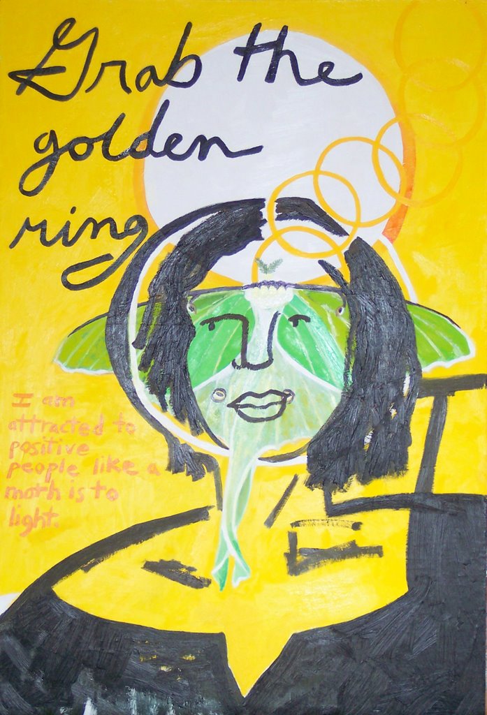
I am enjoying taking a break from narrative, although the narrative isn't totally gone, just distilled. A gold ring in the center square is like those used in some of my other paintings (see Mass Grave, and Lunar Moth Self-Portrait). I like the contrast between the formal rigidity of the square and the loose, atmospheric brushwork. The inside square is not truly "square", however. It coexists with the surrounding space, push-pull dynamic like a house being weathered by nature while simultaneously using resources to maintain itself. The golden ring is not a perfect ellipse, looking as though it has had a few hard knocks. It retains its structural integrity and is not eclipsed by the shadows of the void it inhabits. The black square and ring make a painting within a painting.
I am in the process of pursuing this idea of the square, the void, and filling it. I think of Jasper Johns' Target with Four Faces from 1955 and his lithograph, Target from 1960. I am also obsessed with packing my son's lunch in the bento box style lunchbox used by the lady at the Vegan Lunch Box blog: http://veganlunchbox.blogspot.com/ ! I am sure no serious artist would ever admit this; besides, how many serious artists are moms who would actually take pleasure in the mundane drudgery of packing lunch? This activity of filling squares with precious things also reminds me of the rituals of saving locks from the first haircut, placing photographs in albums, organizing collectibles like stamps, as well as jewelry in boxes. The paintings also remind me of washing window panes (stroking the surface of the window while seeing the yard through it), as well as the more recent and less pastoral association of the computer screen and Windows programs.

With all the activity of film, video, digital media, something still like a painting can be refreshing. It can also be perplexing, as the viewer is being led in a different way than other media. While I am hopeful that viewers can get something out of my work, it bothers me less that my audience is small. We don't always catch every sunrise, glimpse every bird, or marvel at each other. Spiritual experiences can't be forced in nature or art. Being constantly engaged would be exhausting as well as impossible, ask anyone who has ever made the mistake of trying to see an entire art museum in a day. My work is available to be experienced, but it will most often go unseen, perhaps even by people who are looking directly at it.


Thursday, June 07, 2007

Swordtails and Boxes


line etching, 4" x 3" image size

In addition to squares, I have been thinking about boxes. The squares in my work are rarely completely two-dimensional, since they have spatial references.

This image comes from a painting in an earlier post, Butterfly Box. With the figure removed, the subject is the relationship of the butterfly, something wild and free, and the box, a container. I turned the etching plate up-side-down and printed it a second time, inverted, further amplifying this duality through the mirroring asymmetry. It didn't look right printed in one pass. The overlaying forms are transparent enough to maintain their separate identities but to also fuse into one form, suggestive of fluttering. The butterfly has a geometric structure like the box even though its movement is unpredictable compared with the box's stasis. Turning the box on its head makes it airborne like the butterfly and further complicates this relationship.

To me, the image is metaphoric of the balance between responsibility and freedom in politics, ecology, and personal daily life.


Swordtail Butterflies


This one is for the Butterfly Book.

A response regarding Rob Moore


A painting by Rob Moore:
Untitled, 9.75" x 17", oil on masonite, 1984

Nicole,


Thanks for your writing about Rob Moore. I was a student of his at Mass Art from 1974 - 1978. he was the most influential instructor of my life. Being from New England and not used to southern accents, i will alway remember him in front of the class that first day when he was discussing \"Form in Spice\".


Other than a reference to \"The Package Deal\" poster (from his work with the Graphic Workshop) being in the collection at the Smithsonian American Art museum (http://americanart.si.edu/search/search_artworks1.cfm?StartRow=1&ConID=7337&format=short) - a poster that I do have a copy of and helped print - and the website you mentioned there is little on him. I\'d love to see a website with images of his work.


Thanks! Rick

Thursday, May 31, 2007

Lilies of the Valley, Crow's Feather


24" x 18", oil on panel


My friend, Brenda, often brings me flowers from her garden in generous, bug bunches. This time she brought these lilies of the valley and put a crow's feather in the middle that she found on her run. It struck me as just the right metaphor. It is very much like the daffodils with the black square in the upper center. Color and form are especially important in this painting. I really like the form of the leaves with the vertical of the feather, its split, curling top and wavy edges. The flowers were tricky to paint, as it is easy to get too fussy with frilly details. I decided not to include a table and to increase the amount of reflection in the glass so as to make the image more airy and give emphasis to the flowers and feather. It has been awhile since I have done a straight forward still life and I'm not sure how it stands next to the latest minimalist things I have done.


Some flower painters I like:


John La Farge (known for his stained glass work, but he painted as well)


Van Gogh, Irises nice close-up (of a different Iris painting)


I found a neat BBC site about a program they had, "Painting Flowers" with many examples of specific kinds like lilies, sunflowers, tulips, and roses. Check out the Sargent I adore, Carnation, Lily, Lily, Rose.


Friday, May 25, 2007

Hope, Loss


36" x 24", oil on panel
4" x 3", dry point, chine colle


This is the most minimal work I have done to date. The general theme is evoked by color, green for hope and black for loss. Emotions and color have in common that they are complex beyond words with many subtleties for which there are no names.

The green in the print looks flat compared with the juicy oil painting, but in real life it is sensous, reminding one of dewy grass.

Artists working as color field painters:

As I looked on-line for a link to put with color field painter Robert Moore, I became increasingly disheartened. I was a junior at Massachusetts College of Art, looking forward to taking his color theory class because of the high regard students had for him, when he became ill and shortly after died. This painting I am doing now reminds me of him. Artists always have other artists as role models, but my favorites are those who are amazing, caring people in addition to being great artists. Rob Moore was that kind, reputed to paint an unbelievable number of hours on top of his teaching schedule. There must be lots of paintings out there by him, but there are so few links on the web. He died in 1993, before being on the Internet became almost necessary as proof of existence. It shouldn't be so shocking, I suppose, that artists leave behind their art and become anonymous; archaeology provides countless examples. It just seems so soon for that to happen and rather unjust when there is so much art that is promoted unworthily. If I had money to collect art, I would seek out his. I saw some in person once at a Boston gallery and they were like small miracles. One would expect paintings so small and with so few elements to be arbitrary, like how students often feel at their first glance at a Morandi. Instead, they are vibrant, joyous, meaningful visual poems. I remember one that was the color of a raw cracked egg: glistening yellows, whites, made of a substance that seemed to go beyond paint. One of the things I found through Google was a short bit of writing about Rob by a former student, which was very moving and seemed to describe the qualities of the man that he also squeezed into his paintings.
I guess I am looking back so much because I need to be refreshed and re inspired as I continue to put paint on a surface. There are so many other practical things to do with time, many of which are a lot easier! I am dust if I make paintings and dust if I don't, and the paintings are dust, too. It is a meaningful process for me like no other, so I make them.